Simple features grid with centered icons - shadcn/ui
Minimalist four-column feature grid with centered icons, titles, and descriptions. Clean layout perfect for highlighting key product features or services.
Preview
Explore More Blocks
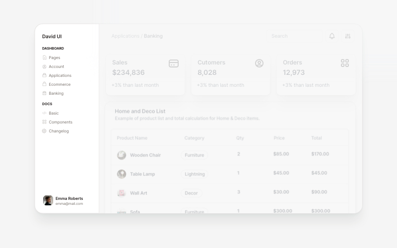
SidebarProfessional sidebar navigation and menu components for React and Next.js. Build dashboard sidebars, app navigation, crypto wallets, calendar views, task managers, and feature-rich sidebar layouts with customizable content.
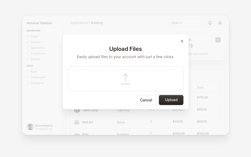
ModalsBeautiful modal and dialog components for React and Next.js. Build popups, confirmations, forms, and interactive overlay interfaces with accessible components.
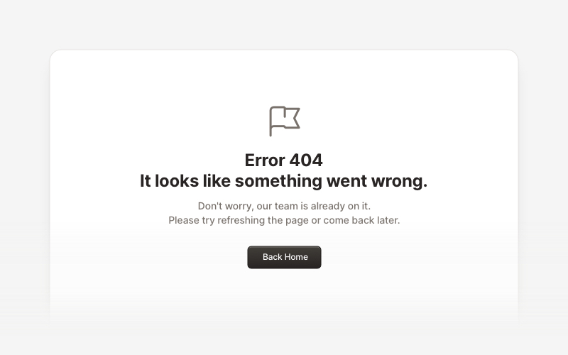
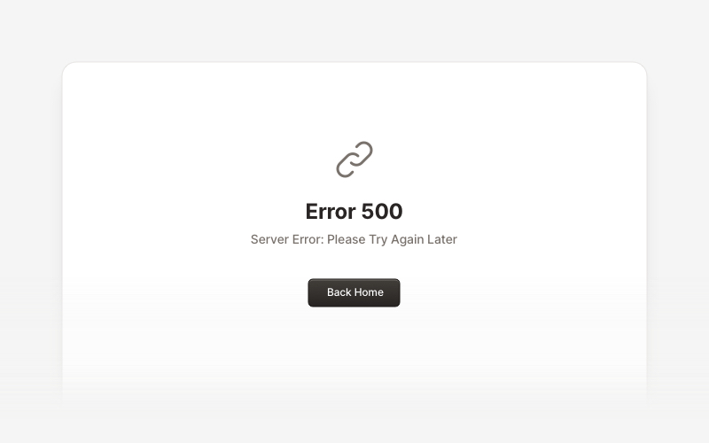
ErrorProfessional error page components for React and Next.js. Build 404 and 500 error pages with various layouts, icons, emoji, background images, and call-to-action buttons for better user experience.
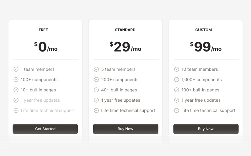
PricingProfessional pricing and plan comparison components for React and Next.js. Build pricing tables, subscription plans, feature comparisons, and pricing toggles with monthly/annual options.
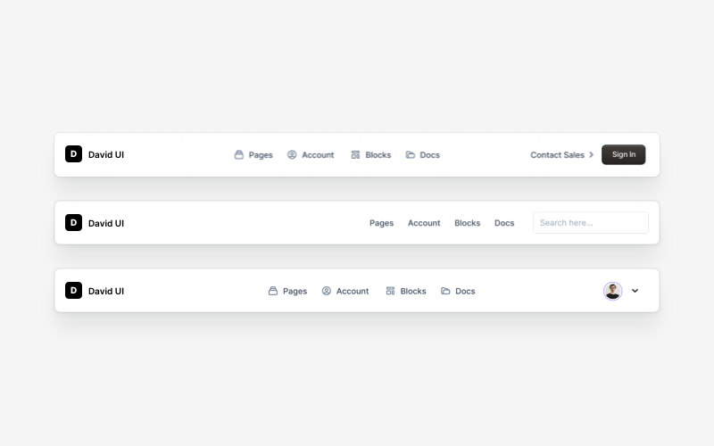
NavbarResponsive navigation bar components for React and Next.js. Build top navigation menus, mobile-friendly headers, search bars, breadcrumbs, and navigation layouts with dropdowns, icons, and user profiles.
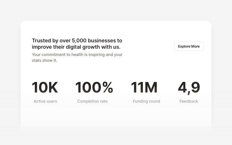
StatsProfessional statistics and metrics components for React and Next.js. Build data showcases, KPI dashboards, achievement displays, growth metrics, and performance indicators with customizable layouts and dark theme variations.
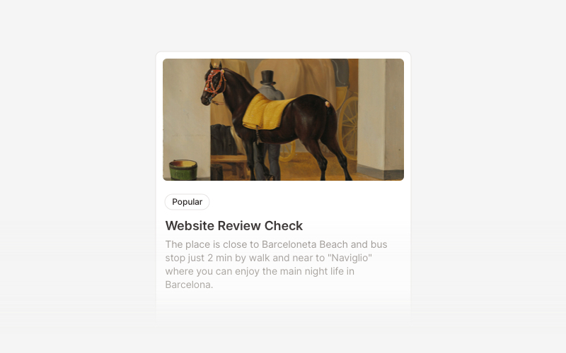
CardVersatile card layout components for React and Next.js. Build content cards with avatars, images, backgrounds, call-to-action buttons, and various layouts for displaying information in organized containers.
MaintenanceProfessional maintenance and downtime page components for React and Next.js. Build scheduled maintenance notifications, system upgrade messages, and under construction pages with email notifications and social links.