Features with image and icon cards - shadcn/ui
Three-column layout with a large feature image on the left and feature cards on the right. Each feature includes an icon, title, and description for comprehensive presentation.
Preview
Explore More Blocks
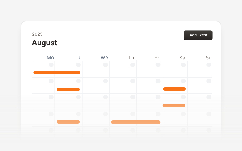
CalendarProfessional calendar and scheduling components for React and Next.js. Build event calendars, weekly schedules, daily planners, and event creation forms with date pickers and time management.
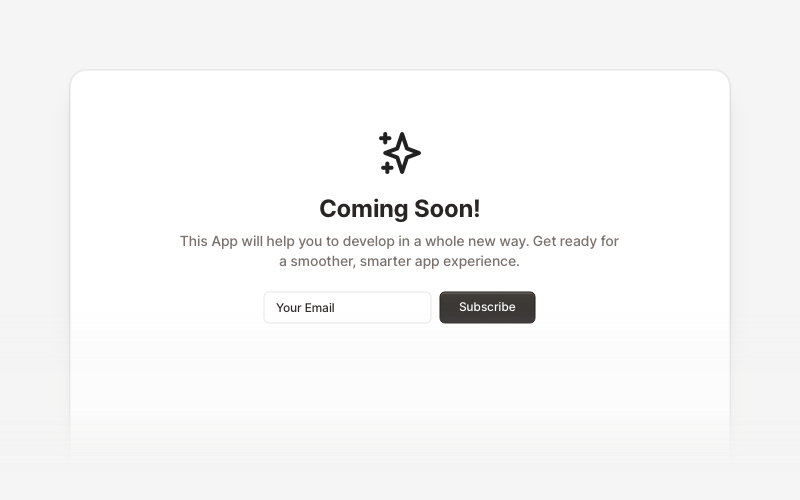
Coming SoonProfessional coming soon and launching soon page components for React and Next.js. Build launch pages with countdown timers, email subscriptions, video backgrounds, app previews, and notification signup forms.
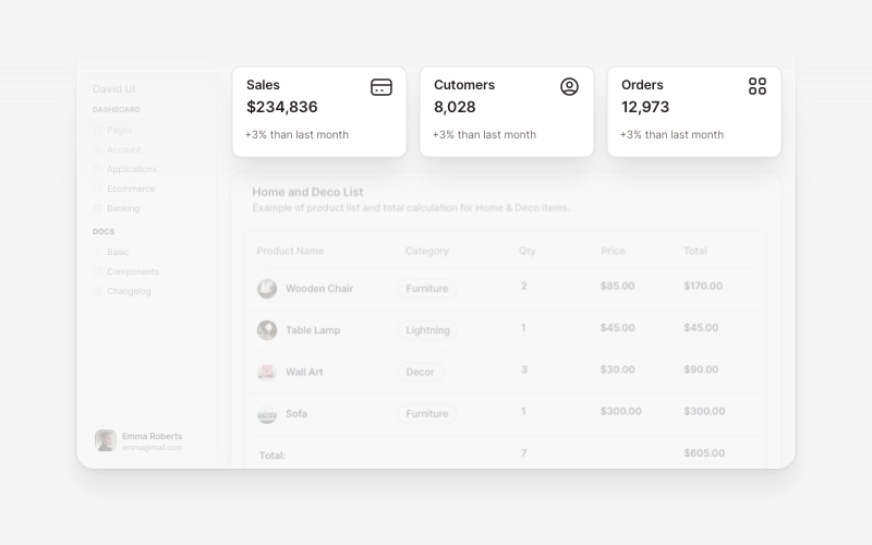
WidgetsVersatile widget components for React and Next.js. Build dashboard widgets, stats cards, join-now sections, and data visualization panels with customizable designs.
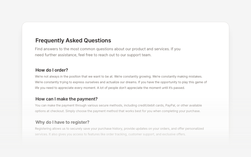
FAQsClean and accessible FAQ components and help section layouts for React and Next.js. Build knowledge bases, support pages, and frequently asked questions interfaces.
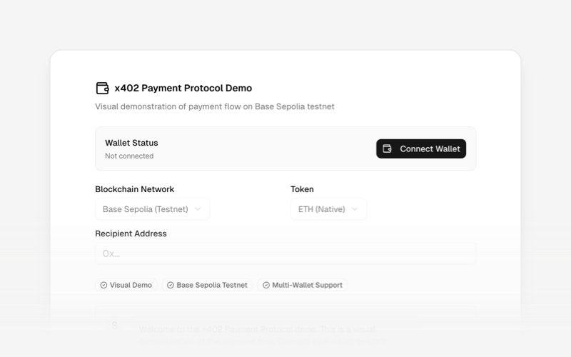
x402Internet-native payment protocol components for React and Next.js. Build AI agent payments, HTTP-based stablecoin transactions, and autonomous commerce experiences using the x402 protocol.
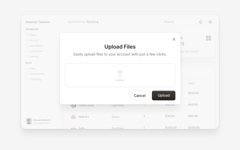
ModalsBeautiful modal and dialog components for React and Next.js. Build popups, confirmations, forms, and interactive overlay interfaces with accessible components.
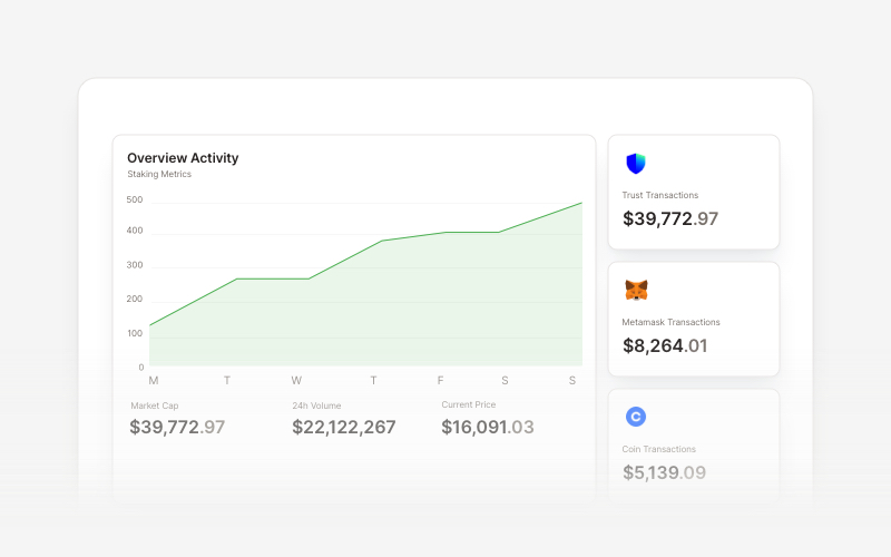
Web3 ChartsProfessional Web3 and cryptocurrency chart components for React and Next.js. Build crypto price charts, staking metrics, transaction analytics, blockchain data visualizations, and interactive dashboards with Recharts integration for displaying cryptocurrency data and market statistics.
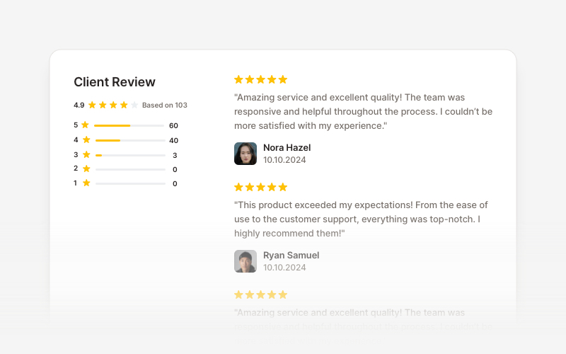
OverviewCustomer review and testimonial overview components for React and Next.js. Build review sections, rating displays with statistics, customer testimonials with profile images, and comprehensive feedback interfaces.