Features grid with featured card - shadcn/ui
PROThree-column layout with four feature cards and a featured article card. Features include icons, titles, and descriptions, with a highlighted card showing an image and CTA button.
Preview
Explore More Blocks
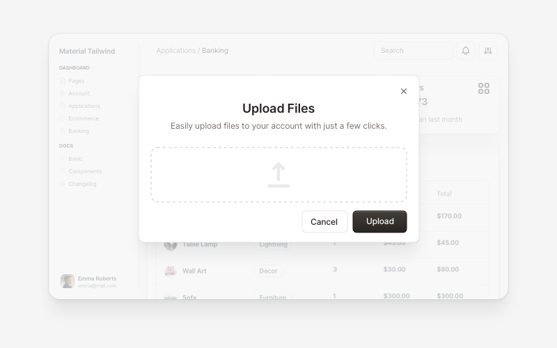
ModalsBeautiful modal and dialog components for React and Next.js. Build popups, confirmations, forms, and interactive overlay interfaces with accessible components.
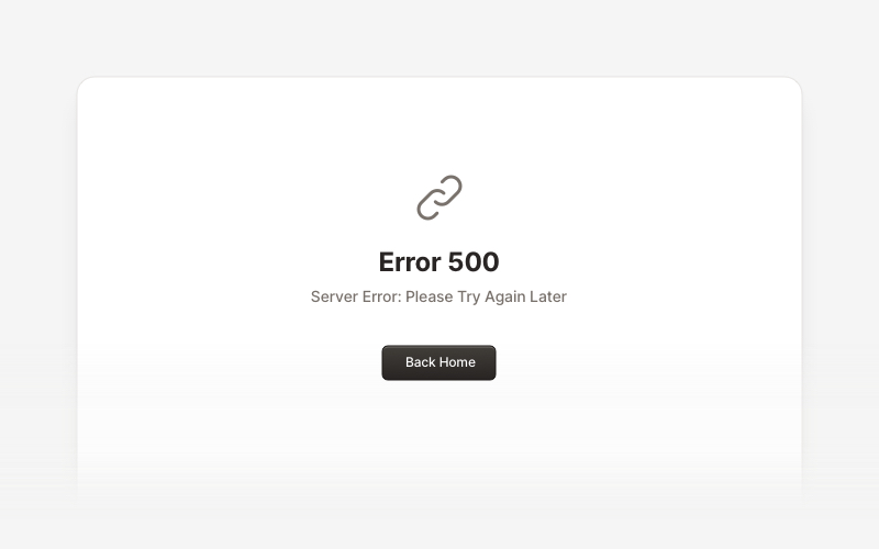
MaintenanceProfessional maintenance and downtime page components for React and Next.js. Build scheduled maintenance notifications, system upgrade messages, and under construction pages with email notifications and social links.
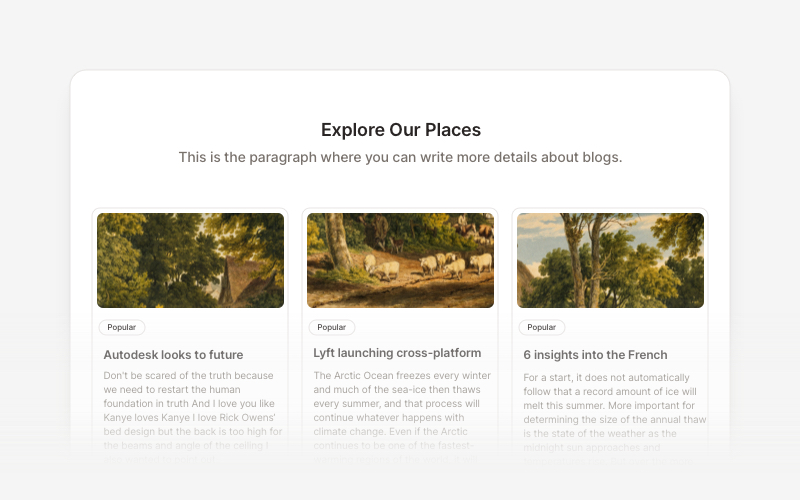
BlogElegant blog components and content layouts for React and Next.js. Create beautiful article grids, post previews, author profiles, and content-rich blog experiences.
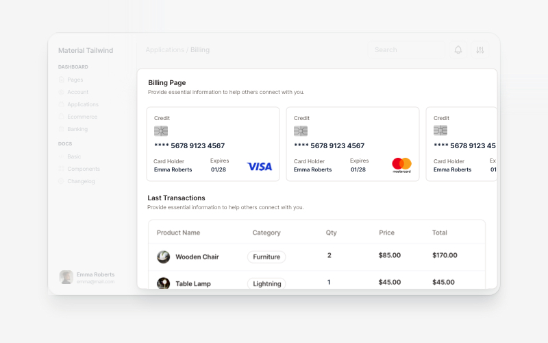
BillingProfessional billing and payment UI components for React and Next.js. Build payment forms, invoices, subscription management, and checkout flows with pre-built blocks.
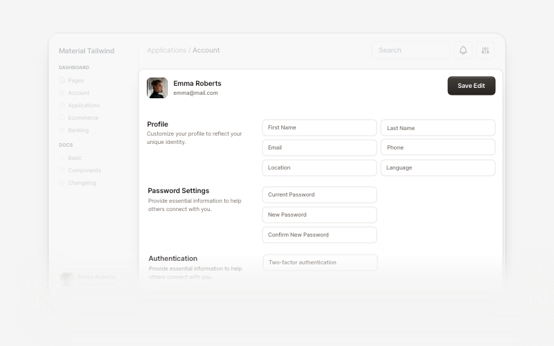
AccountBeautiful and customizable account management components for React and Next.js. Build user profiles, settings, authentication flows, and account dashboards with ready-to-use blocks.
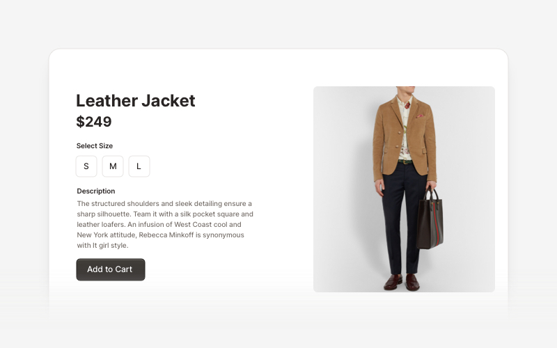
EcommerceProfessional ecommerce components for React and Next.js. Build product listings, shopping carts, checkout flows, and complete online store experiences.
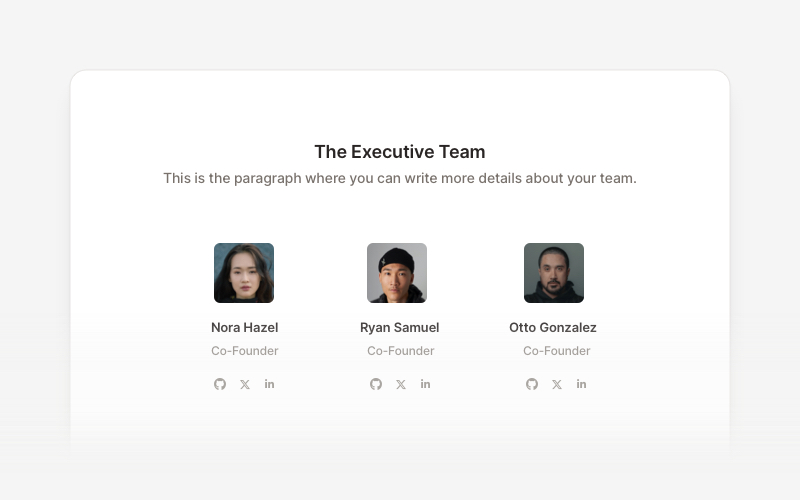
TeamProfessional team member showcase components for React and Next.js. Build team pages, member profiles, organization charts, and employee directories with customizable layouts.
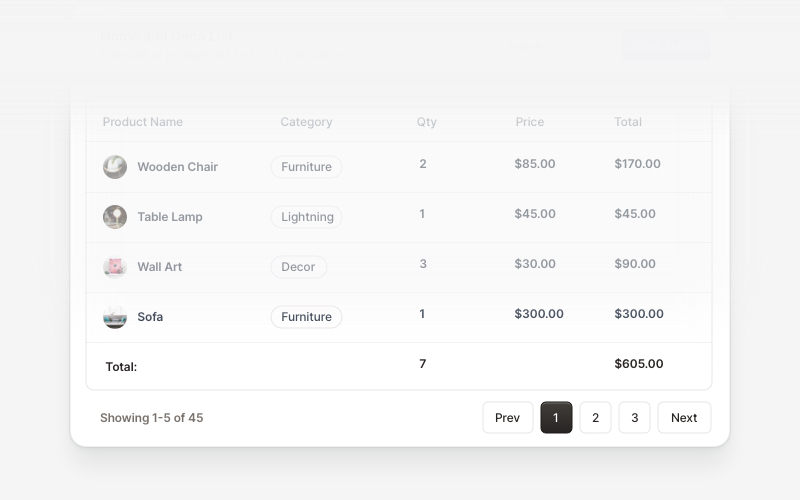
Table FooterProfessional table footer components for React and Next.js. Build pagination controls, row selection displays, date range filters, progress indicators, and action buttons for data tables with customizable layouts.