Simple card layout team block with icon header - shadcn/ui
PROTeam section with distinctive icon header and horizontal card layout combining profile images with detailed member information. Two-column grid layout for balanced presentation.
Preview
Explore More Blocks
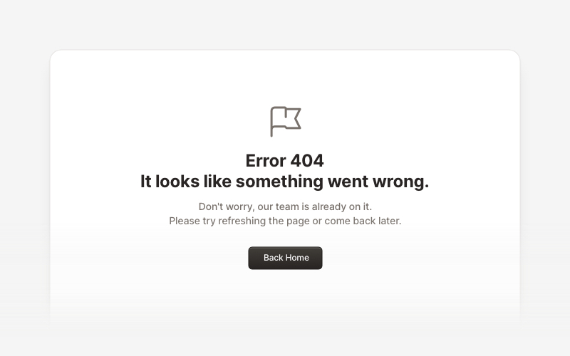
ErrorProfessional error page components for React and Next.js. Build 404 and 500 error pages with various layouts, icons, emoji, background images, and call-to-action buttons for better user experience.
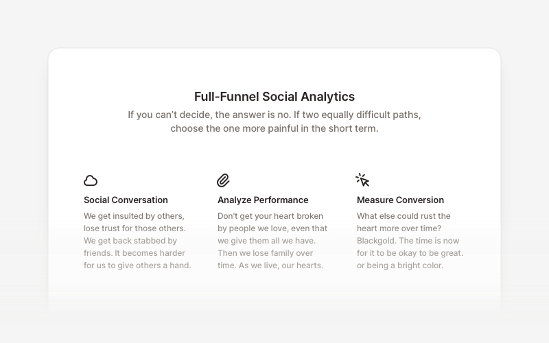
FeatureProfessional feature showcase components for React and Next.js. Build product features, service highlights, benefits sections, and feature comparison layouts with icons, images, and call-to-action elements.
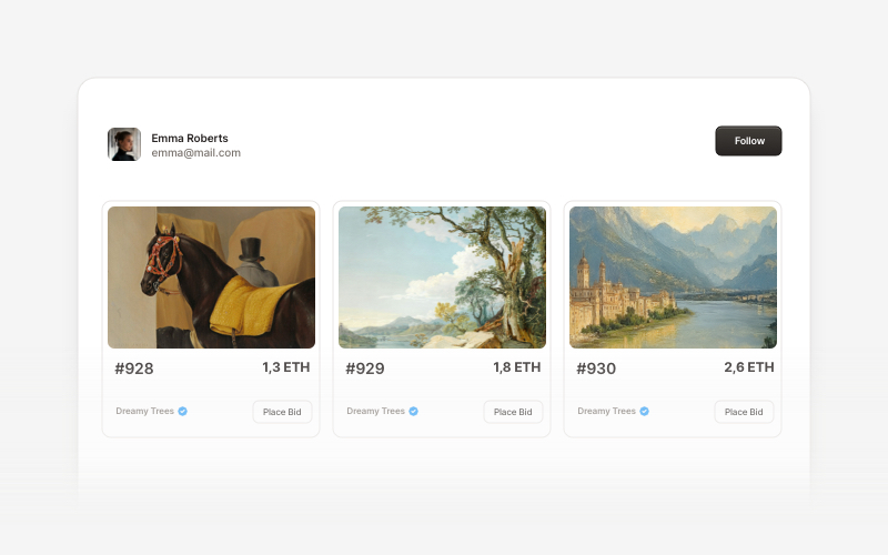
Web3 CardsModern Web3 and blockchain card components for React and Next.js. Build wallet connection cards, NFT displays, token interfaces, and decentralized application card layouts.
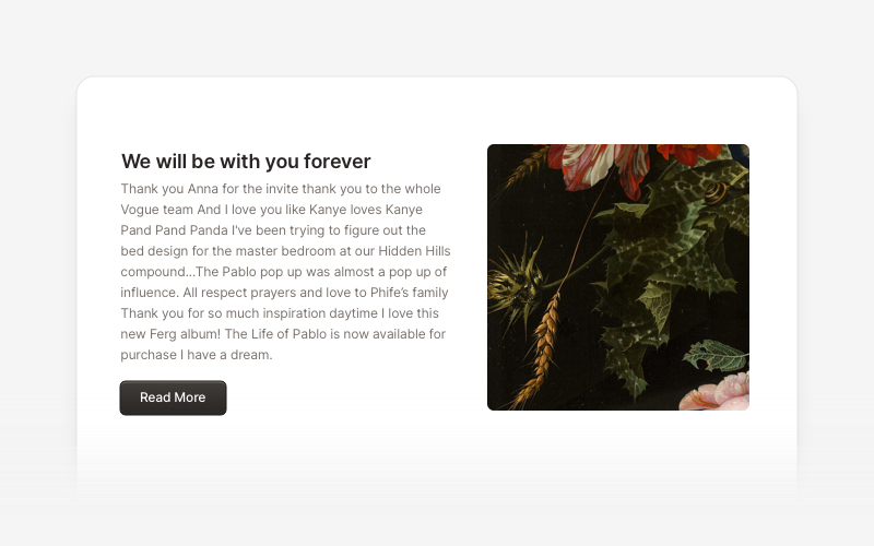
ContentVersatile content layout components for React and Next.js. Build blog posts, articles, portfolios, project showcases, comment sections, and rich content presentations with customizable designs.
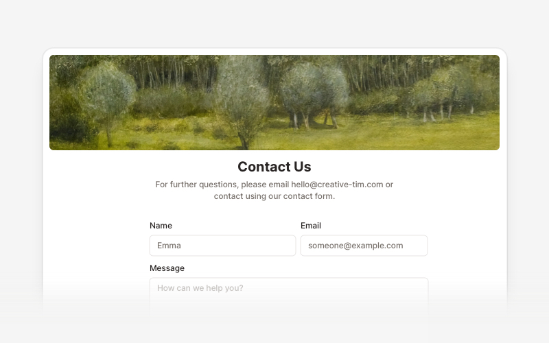
ContactProfessional contact form components and section layouts for React and Next.js. Build contact pages, feedback forms, support sections, and communication interfaces.
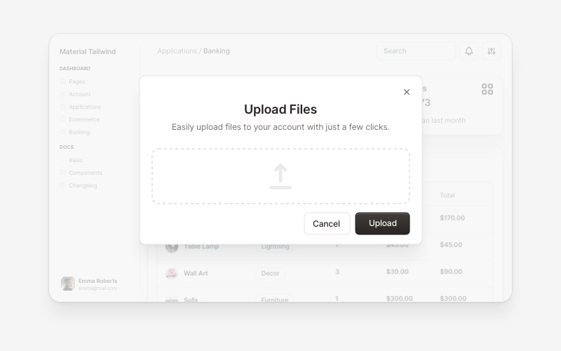
ModalsBeautiful modal and dialog components for React and Next.js. Build popups, confirmations, forms, and interactive overlay interfaces with accessible components.
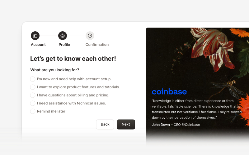
OnboardingProfessional user onboarding and welcome components for React and Next.js. Build multi-step onboarding flows, welcome cards, stepper forms, verification screens, and guided setup experiences with customizable layouts.
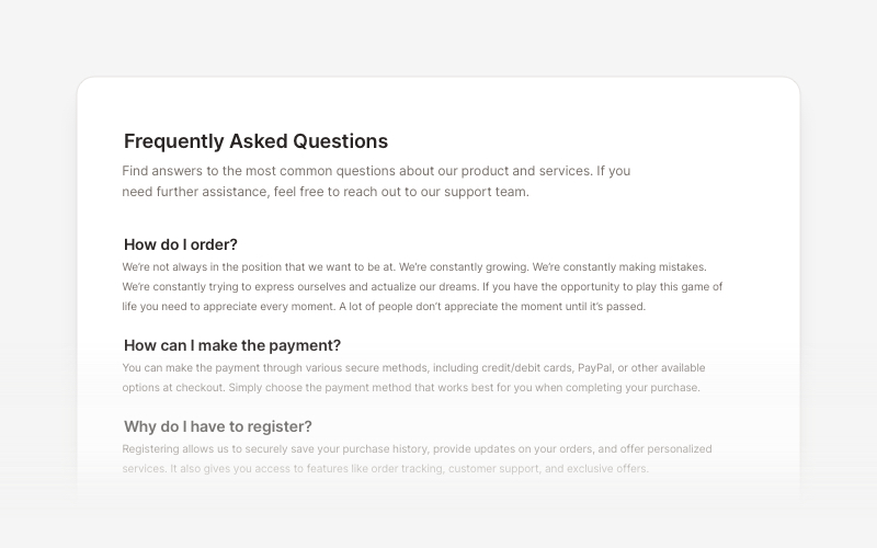
FAQsClean and accessible FAQ components and help section layouts for React and Next.js. Build knowledge bases, support pages, and frequently asked questions interfaces.