Large team grid with avatar cards - shadcn/ui
PROComprehensive team showcase supporting large teams with centered avatar cards and social links. Features a four-column grid layout perfect for displaying 8+ team members.
Preview
Explore More Blocks
LogoProfessional brand logo showcase components for React and Next.js. Build trust sections, partner displays, client logos, and company ecosystem layouts with various styles and configurations.
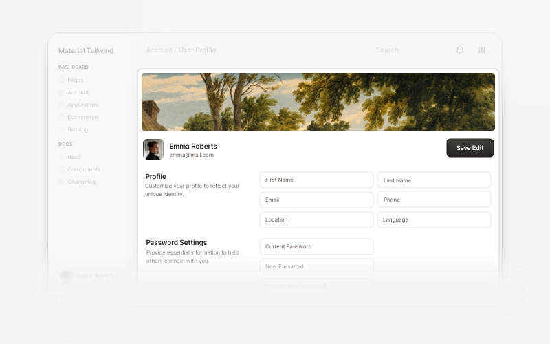
User ProfileProfessional user profile components for React and Next.js. Build user profile cards, account overviews, profile headers with statistics, social media links, and customizable layouts for displaying user information and achievements.
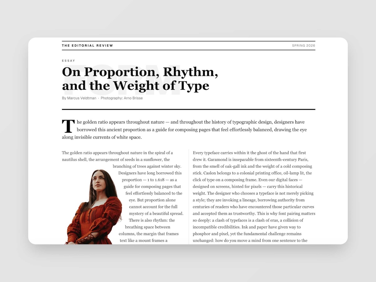
EditorialMagazine-quality editorial layouts where typography is the design. Multi-column spreads, text wrapping around images with pixel-precise line routing via Pretext, oversized words as visual anchors, pull quotes, drop caps, and the kind of spatial confidence you find in print — now in React.
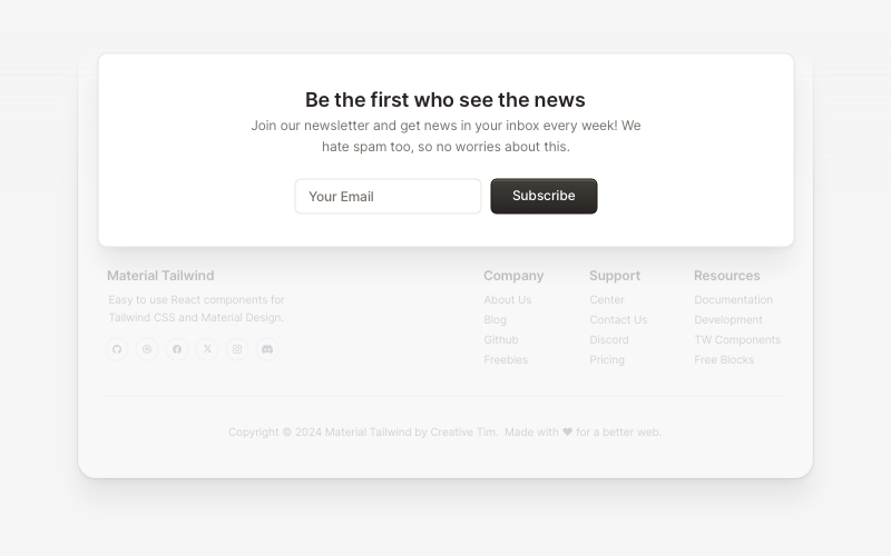
NewsletterModern newsletter subscription components for React and Next.js. Build email capture forms, subscribe popups, modals, and newsletter sections with validation and call-to-action elements.
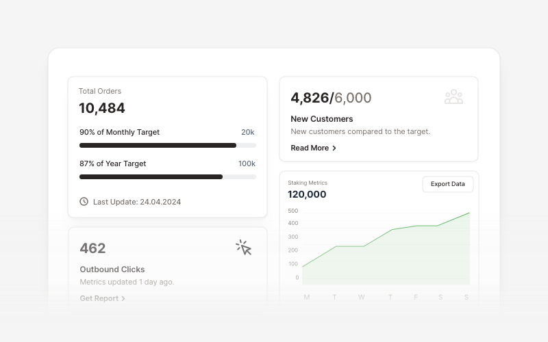
KPIProfessional KPI (Key Performance Indicator) card components for React and Next.js. Build metric displays, performance snapshots, dashboard cards with icons, badges, arrows, progress bars, charts, and action buttons to showcase business metrics and analytics.
FootersModern footer components and section layouts for React and Next.js. Build professional website footers with links, social media, newsletters, and navigation.
TestimonialsProfessional testimonial and social proof components for React and Next.js. Build customer reviews, ratings, case studies, and trust-building sections.
HeroEye-catching hero section components for React and Next.js. Build landing page heroes, call-to-action sections, lead generation forms, and compelling above-the-fold content.