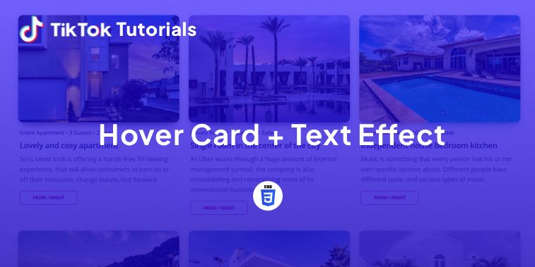
Learn with us how to create a hover card and text effect in CSS!
If you found us on TikTok on the following post, check out this article and copy-paste the full code!
Happy coding! 😻
@creative.tim Check the link in bio for the full code 🤩 #programmingexercises #csscoding #webdev #webdevelopment #coding ♬ original sound - Creative Tim
1. HTML Code
<html lang="en">
<head>
<meta charset="UTF-8" />
<meta name="viewport" content="width=device-width, initial-scale=1.0" />
<title>Hover Reveal</title>
<!-- styles -->
<link rel="stylesheet" href="styles.css" />
</head>
<body>
<div class="card-wrapper">
<div class="card-top">
<img class="image" src=https://i.im.ge/2022/11/15/SOLM3q.turquoise-katun-river-gorge-is-surrounded-by-high-mountains-majestic-autumn-sky-stormy-mountain-stream-runs-among-rocks-landscape-altai-mountains-beautiful-places-planet-1.jpg>
</div>
<div class="card-bottom">
<span class="top-text">Creative Tim</span><br>
<span class="bottom-text">UI Kits, Templates and Dashboards. Join over 2,042,768 creatives to access all our products!</span>
<br>
<button class="button">Buy Now</button>
</div>
</div>
</body>
</html>
2. CSS Code
@import url('https://fonts.googleapis.com/css2?family=Sarabun:wght@200&display=swap');
body {
position: relative;
width: 100%;
height: 100vh;
display: flex;
justify-content: center;
align-items: center;
font-family: 'Sarabun', sans-serif;
}
.image {
width: 100%;
height: 100%;
border-radius: 20px;
transition: all 0.3s ease-in-out;
z-index: 20;
box-shadow: 10px 10px 53px 0px rgba(0, 0, 0, 0.49);
}
.card-wrapper {
position: relative;
width: 400px;
height: 500px;
border-radius: 20px;
overflow: hidden;
transition: all 0.3s ease-in-out;
box-shadow: 10px 10px 53px 0px rgba(0, 0, 0, 0.49);
}
.card-wrapper:hover .image {
filter: blur(1.4px);
transform: scale(1.5);
overflow: hidden;
transition: all 0.3s linear;
box-shadow: inset -6px -1px 32px 0px rgba(0, 0, 0, 0.75);
}
.card-wrapper:hover .card-bottom {
transform: translate(0%, -50%);
transition: all 0.8s ease;
background-color: rgba(90, 24, 154, 50%);
}
.card-top {
position: relative;
width: 100%;
height: 100%;
z-index: 1;
}
.card-bottom {
width: 100%;
position: absolute;
z-index: 20;
display: nonee;
top: 50%;
background-color: rgba(110, 122, 92, 0);
padding: 100px 20px;
color: #fff;
transform: translate(100%, -50%);
}
.top-text {
font-size: 25px;
line-height: 40px;
font-weight: bold;
letter-spacing: 1px;
}
.bottom-text {
font-size: 15px;
}
.button {
position: relative;
display: block;
outline: none;
cursor: pointer;
margin-top: 25px;
border: none;
border-radius: 3px;
background-color: #00C2D1;
color: #fff;
padding: 5px 20px;
}
I hope you did find this tutorial useful!
For more web development or UI/UX design tutorials, follow us on:
Other useful resources:


