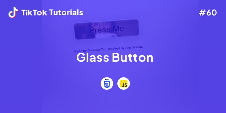
Learn with us how to create the glossiest button in CSS and Javascript!
If you found us on TikTok on the following post, check out this article and copy-paste the full code!
Happy coding! 😻
@creative.tim The perfect button doesn't exis… Check out TikTok Tutorial #60 for the full code!👆 #webdev #css #javascript #glassbutton #coding ♬ original sound - Creative Tim
Contents:
1. HTML Code
2. CSS Code
3. Javascript Code
Get your code ⬇️
1. HTML Code
<!DOCTYPE html>
<html lang="en" dir="ltr">
  <head>
    <meta charset="utf-8">
    <title>Button</title>
    <!-- CSS -->
    <link href="./assets/css/style.css" rel="stylesheet" />
    <!-- Fonts -->
    <link rel="preconnect" href="https://fonts.googleapis.com">
    <link rel="preconnect" href="https://fonts.gstatic.com" crossorigin>
    <link href="https://fonts.googleapis.com/css2?family=Inter:wght@300;500;700&display=swap" rel="stylesheet">
  </head>
  <body>
    <div>
      <button class="button">
        <video autoplay="true" id="video"></video>
      </button>
      <p>Made by <a href="https://www.creative-tim.com/" target="_blank">Creative Tim</a>. Inspired by <a href="https://twitter.com/alexwidua" target="_blank">Alex Widua</a>.</p>
    </div>
    <!-- Scripts -->
    <script src="./assets/js/script.js"></script>
  </body>
</html>
2. CSS Code
/* Body */
body{
  min-height: 100vh;
  background: #e7e7e7;
  justify-content: center;
  align-items: center;
  display: flex;
  text-align: center;
  font-family: 'Inter', sans-serif;
  -webkit-font-smoothing: antialiased;
}

/* Button */
.button{
  position: relative;
  background: #d1d1d1;
  border-radius: 15px;
  border: none;
  color: #ddd;
  font-size: 16px;
  padding: 20px 75px;
  overflow: hidden;
  text-decoration: none;
  transition: all .15s ease-in;
  box-shadow: 0 2px 60px #bfbfbf, 0 2px 8px #ddd, 0 15px 30px #ddd,
              inset 0 0 1px 1px hsl(0deg 0% 100% / 90%), 0 20px 27px 0 rgb(0 0 0 / 5%);
  cursor: pointer;
}

.button:hover{
  box-shadow: 0 2px 13px #ababab, 0 2px 8px #ddd, 0 15px 30px #ddd,
              inset 0 0 1px 1px hsl(0deg 0% 100% / 90%), 0 20px 27px 0 rgb(0 0 0 / 5%);
}

.button:active{
  box-shadow: 0 2px 4px #ababab, 0 2px 8px #ddd;
}

.button::before{
  content: "";
  position: absolute;
  top: 0;
  left: 0;
  width: 100%;
  height: 100%;
  border-radius: 15px;
  box-shadow: inset 0 0 2px #fefefed1;
  -webkit-backdrop-filter: saturate(200%) blur(30px);
  backdrop-filter: saturate(200%) blur(1px);
  background-color: hsla(0,0%,100%,.3)!important;
  box-shadow: inset 0 4px 5px #ffffffc4,
              inset 0 2px 2px #fffc,
              inset 0 -2px 4px #ffffff80;
  z-index: 1;
}

.button::after{
  content: "Press Me";
  position: relative;
  top: 0;
  left: 0;
  width: 100%;
  height: 100%;
  z-index: 2;
  color: #3a3737;
  font-weight: 400;
  font-size: 40px;
  text-shadow: 0px 1px 2px rgb(215 214 214 / 75%),
               0px 0px 1px rgb(215 214 214 / 75%);
  transform: scaleX(-1);
  font-family: 'Inter', sans-serif;
}

/* Video */
#video {
  position: absolute;
  top: 0;
  left: 0;
  width: 100%;
  height: 100%;
  border-radius: 30px;
  transform: scale(3) scaleX(-1);
  filter: blur(1px) saturate(0.5) brightness(.9);
}

/* Paragraph */
p{
  margin-top: 50px;
  color: #3a3737;
}

/* Hyperlink */
a{
  text-decoration: none;
  color: #3a3737;
}

a:hover{
  color: #0b0b0b;
}
3. Javascript Code
// Select the element that contains the video
let video = document.querySelector("#video");

// Check if the navigator.mediaDevices.getUserMedia method is available in the browser
if (navigator.mediaDevices.getUserMedia) {
  navigator.mediaDevices.getUserMedia({ video: true })
  .then(function (stream) {
    video.srcObject = stream;
  })
  .catch(function (err0r) {
    console.log("Something went wrong!");
  });
}
I hope you did find this tutorial useful!
For more web development or UI/UX design tutorials, follow us on:
Other useful resources:


