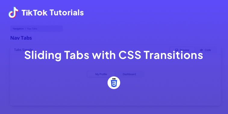
Learn with us how to create sliding tabs with CSS transitions!
If you found us on TikTok on the following post, check out this article and copy-paste the full code!
Happy coding! 😻
@creative.tim Check the link in bio for the full code 🤩 #programmingexercises #csscoding #webdev #cssprojects ♬ original sound - Creative Tim
1. HTML Code
<div class="container">
	<div class="tabs">
		<input type="radio" id="radio-1" name="tabs" checked />
		<label class="tab" for="radio-1">Upcoming<span class="notification">2</span></label>
		<input type="radio" id="radio-2" name="tabs" />
		<label class="tab" for="radio-2">Development</label>
		<input type="radio" id="radio-3" name="tabs" />
		<label class="tab" for="radio-3">Completed</label>
		<span class="glider"></span>
	</div>
</div>
2. CSS Code
@import url("https://fonts.googleapis.com/css2?family=Inter:wght@400;500;600&display=swap");

:root {
	--primary-color: #e98a15;
	--secondary-color: rgba(216, 180, 160, 30%);
}

*,
*:after,
*:before {
	box-sizing: border-box;
}

body {
	font-family: "Inter", sans-serif;
	background-color: rgba(#e6eef9, 0.5);
}
.container {
	position: absolute;
	left: 0;
	top: 0;
	right: 0;
	bottom: 0;
	display: flex;
	align-items: center;
	justify-content: center;
}
.tabs {
	display: flex;
	position: relative;
	background-color: #fff;
	box-shadow: 0 0 1px 0 rgba(#185ee0, 0.15), 0 6px 12px 0 rgba(#185ee0, 0.15);
	padding: 0.75rem;
	border-radius: 99px; // just a high number to create pill effect
	* {
		z-index: 2;
	}
}

input[type="radio"] {
	display: none;
}

.tab {
	display: flex;
	align-items: center;
	justify-content: center;
	height: 54px;
	width: 200px;
	font-size: 1.25rem;
	font-weight: 500;
	border-radius: 99px; // just a high number to create pill effect
	cursor: pointer;
	transition: color 0.15s ease-in;
}

.notification {
	display: flex;
	align-items: center;
	justify-content: center;
	width: 2rem;
	height: 2rem;
	margin-left: 0.75rem;
	border-radius: 50%;
	background-color: var(--secondary-color);
	transition: 0.15s ease-in;
}

input[type="radio"] {
	&:checked {
		& + label {
			color: var(--primary-color);
			& > .notification {
				background-color: var(--primary-color);
				color: #fff;
			}
		}
	}
}

input[id="radio-1"] {
	&:checked {
		& ~ .glider {
			transform: translateX(0);
		}
	}
}

input[id="radio-2"] {
	&:checked {
		& ~ .glider {
			transform: translateX(100%);
		}
	}
}

input[id="radio-3"] {
	&:checked {
		& ~ .glider {
			transform: translateX(200%);
		}
	}
}

.glider {
	position: absolute;
	display: flex;
	height: 54px;
	width: 200px;
	background-color: var(--secondary-color);
	z-index: 1;
	border-radius: 99px; // just a high number to create pill effect
	transition: 0.25s ease-out;
}

@media (max-width: 700px) {
	.tabs {
		transform: scale(0.6);
	}
}
3. Javascript Code
document.querySelectorAll('.button').forEach(button => button.addEventListener('click', e => {
if(!button.classList.contains('delete')) {
button.classList.add('delete');
setTimeout(() => button.classList.remove('delete'), 3200);
}
e.preventDefault();
}));
I hope you did find this tutorial useful!
For more web development or UI/UX design tutorials, follow us on:
Other useful resources:


