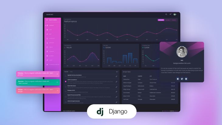
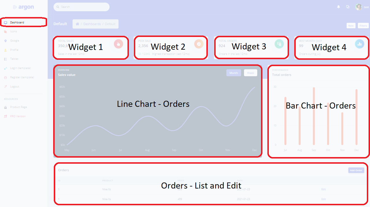
Django is a modern web framework that can be used for many types of projects from simple one-page presentation sites to eCommerce platforms, microservices but also to showcase a large amount of data visually, using graphs and charts. Django Charts Argon, the open-source sample presented in this article, provides functional code that shows different metrics regarding the sales for a 12 months timeframe: total sales, total orders, best sale, and best month (in sales value). Information is provided using charts, widgets, and a paginated data table that allows editing/adding new sales.
Thanks for reading! Please find below the relevant links:
- Django Charts Argon – LIVE demo
- Django Charts Argon – Source Code (MIT License, published on Github)
- Argon Dashboard Django – the original starter (free product)
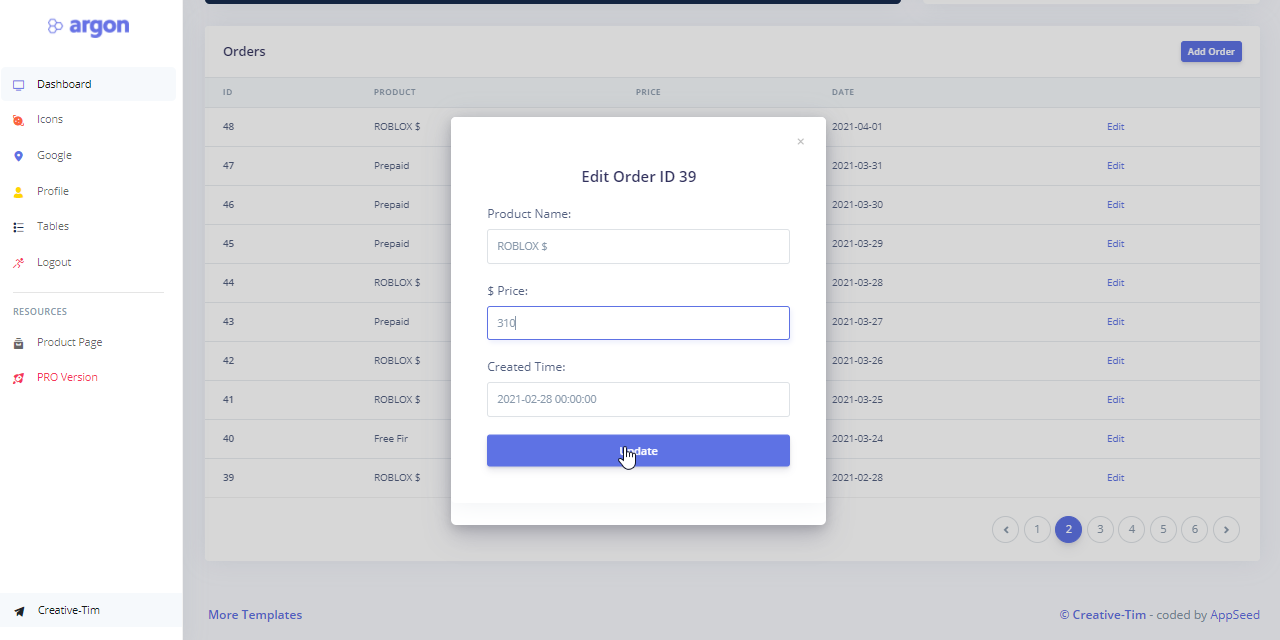
The information displayed in the charts is loaded from a sample file provided along with the source code on Github. On top of this basic provisioning, authenticated users have the option to edit and add new records. Once the new information is saved, charts are automatically updated. The project can be used by any developer with basic programming knowledge and familiarity with Python.
What’s in the box (app features):
- A beautiful, modern UI: Argon Dashboard (free version)
- Simple and modular codebase with session-based authentication
- Import/Export feature – available in the admin section for bulk import of sample data
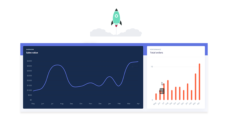
- Charts for orders and sales for a 12mo timeframe
- Widgets that counts total sales, orders, and best month selected based on the total sales value
- Paginated data table with “edit” and “add new record” option
To compile the project and play with the code, please follow the build instructions provided in the README file. The basic flow is to install the required dependencies, create the database and app tables and load the information using the admin section. Once the information is saved in the database, we can use the UI to play with the information and see the LIVE effects in the charts.
The visual features are enhanced with a table-based view of the information that allows navigating the database content with ease. The records can be edited and the charts will be refreshed automatically to reflect the latest changes.
From this point, the project can be extended with ease to support more advanced features like adding more relevant charts, compute sales predictions using the sales statistics from the previous year or add a social login to speed up the user registration.
Thank you for reading! For more resources, please access:
- A curated index with more Django Templates provided by Creative-Tim
- More Django Dashboards provided by App Generator