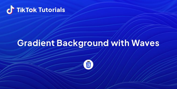
Learn with us how to create a gradient background with waves in CSS.
If you found us on TikTok on the following post, check out this article and copy-paste the full code!
Happy coding! 😻
1. HTML Code
<body>
  <div>
     <div class="wave"></div>
     <div class="wave"></div>
     <div class="wave"></div>
  </div>
</body>
2. CSS Code
body {
    margin: auto;
    font-family: -apple-system, BlinkMacSystemFont, sans-serif;
    overflow: auto;
    background: rgb(34,108,91);
background: radial-gradient(circle, rgba(34,108,91,1) 0%, rgba(101,9,121,1) 35%, rgba(147,88,56,1) 59%, rgba(50,210,244,1) 100%);
    animation: gradient 25s ease infinite;
    background-size: 400% 400%;
    background-attachment: fixed;
}

@keyframes gradient {
    0% {
        background-position: 0% 0%;
    }
    50% {
        background-position: 100% 100%;
    }
    100% {
        background-position: 0% 0%;
    }
}

.wave {
    background: rgb(255 255 255 / 25%);
    border-radius: 1000% 1000% 0 0;
    position: fixed;
    width: 200%;
    height: 12em;
    animation: wave 10s -3s linear infinite;
    transform: translate3d(0, 0, 0);
    opacity: 0.8;
    bottom: 0;
    left: 0;
    z-index: -1;
}

.wave:nth-of-type(2) {
    bottom: -1.25em;
    animation: wave 18s linear reverse infinite;
    opacity: 0.8;
}

.wave:nth-of-type(3) {
    bottom: -2.5em;
    animation: wave 20s -1s reverse infinite;
    opacity: 0.9;
}

@keyframes wave {
    2% {
        transform: translateX(1);
    }

    25% {
        transform: translateX(-25%);
    }

    50% {
        transform: translateX(-50%);
    }

    75% {
        transform: translateX(-25%);
    }

    100% {
        transform: translateX(1);
    }
}
I hope you did find this tutorial useful!
For more web development or UI/UX design tutorials, follow us on:
Other useful resources:


