Let’s begin the UX design battle between the flat design and material design in a match to discover which interface design favors more usability by encouraging better user experiences. Since Google released material design, there is an ongoing debate over material design versus flat design to conclude which is the best? If you ask the web designers, come up with multiple answers and different opinions.
Two similar design styles mostly one based on the other to become a passing fad. What are the differences between the two? Is one inherently better than the Let us begin – the difference lies in the amount of skeuomorphism in each of them. In this context, the skeuomorphism is a visual design which is meant to imitate the physical world. It takes the form of online tools to look alike in the real world.
In this article, we will discuss which the best UI design is, and we hope that you will get answers to all questions such as – Which is the best mobile design? Should you move from flat design to material design or vice versa? And much more. We shall begin by knowing what flat design and material design is.
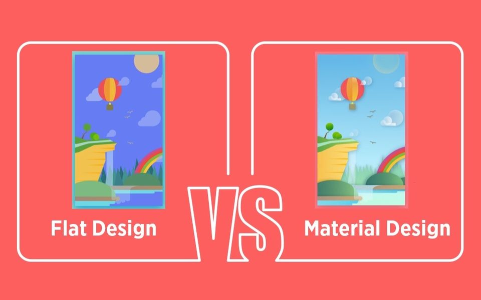
Google’s Material Design
This interface design was released by Google as a branded product with clear guidelines and principles. Each individual mobile app designer should follow these ground rules for making things look the same on every Android device. The design tries to introduce some skeuomorphism in the most simplified design. It looks flat but stays multi-dimensional by making the product feel more intuitive when it comes to navigation by maintaining its simplicity. The thing about material design is that it helps designers to get a complete design language for creating applications that look and feel the same across variant platforms.
Apple’s Flat Design
The flat icons are more uninitiated as they use simple images to deliver your message quickly as compared to detailed illustrations. This directs the user attention towards valuable content as people are less likely to examine digital art instead of content reading.
Flat design is escaped from the multi-dimensional element by making feel like all objects are laying on a single interface. It does not have any stylistic elements like gradients, textures, and shadows which makes the flat design elements look smaller by speeding up the page load time.
Material design Vs. Flat design
It is vital to understand how Google and Apple are fierce competitors with its attractive features and user expectations. Google released the material design which has become a standard for Android app design whereas Apple does not have any official name by focusing more on clarity and depth. Let us see what makes it different from one another.
 Image Source: evopedia.org
- Depth
The movement of the objects move in space and interact with each other while depending on light and surface. Both Google and Apple have various opinions when it comes to interaction with apps and devices. Apple believes that mobile devices are seen as a window into another world by embracing infinite depth in their apps whereas google supports that humans should interact with the components like they are stacked over one another. It believes that users should feel that they are holding the screen on the palm of their hand.
- Clarity
This feature can be platform specific and depends on what you are familiar with. Android users may recognize iOS icons instantly as Apple promotes gradients and blurred design while Google gives importance to drop shadows. Both the platforms replicate in real life in different ways as the center principle is simplicity for achieving perfect results indeed.
- Navigation
When it comes to a better UI one cannot afford to ignore the navigation as your app structure should be organized according to the contents and tasks the user wants to see. Google has made a fewer rule for navigation to give a significant level of flexibility for the designer by keeping a variety of action buttons and components that reveal various options. On the other side, Apple utilized a variant navigation system which is easy to understand and use.
When it comes to web development, both Google and Apple have an extensive belief system, as Google’s material design leans more on the human side of design while Apple’s flat design makes the users go straight into the facts. But still, both the companies believe in creating a tactile OS experience which makes the user feel unique in the arena of user interface design.
Summing up!
In current times, Apple’s flat design and Google’s material design are trendier with their own unique features. It actually sounds stupid to debate over the pros and cons for both the platforms. Material design was just a response to the radical flat approach, and flat design was evolved over the years which is already not flat. Nothing hinders you from combining these two designs to create your own excellent design version and reminds of the real-time world to make the intuitive interface. Keep Learning!

![15+ Top Black Friday & Cyber Monday Deals for Developers and Designers [2023]](/blog/content/images/size/w960/2021/11/black-friday-deals-developers-1.jpg)