It is impossible to overestimate the importance of a user interface (UI) that is both aesthetically pleasing and straightforward to use. Google's Material Design language has become a standard for creating intuitive, flexible, and visually appealing interfaces.
About Material Design
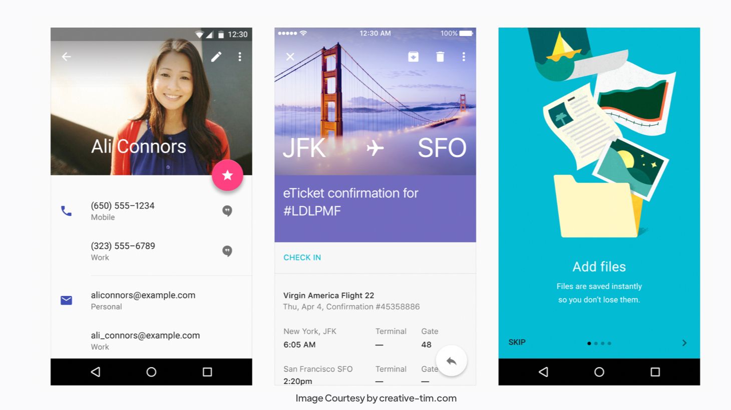
In 2014, Google chose to share with the public the new design system that it developed; Material Design. When Google released Material Design, a new era in online design and development began. On the material.io website, Google published the whole design language, design system, and documentation.
Material Design's original purpose was to aid in the creation of Android apps. The objective was to establish a design language that was consistent and easy to use across all platforms. After adopting Material Design, Google redesigned all of its applications to be more streamlined and straightforward.
Material Design covers all aspects of design, from typography to images and everything in between. However, Material Design goes beyond only instructing designers on aesthetics. It helps artists produce works of deliberate design, complete with hierarchy, purpose, and end-goal focus.
What is a Design System?
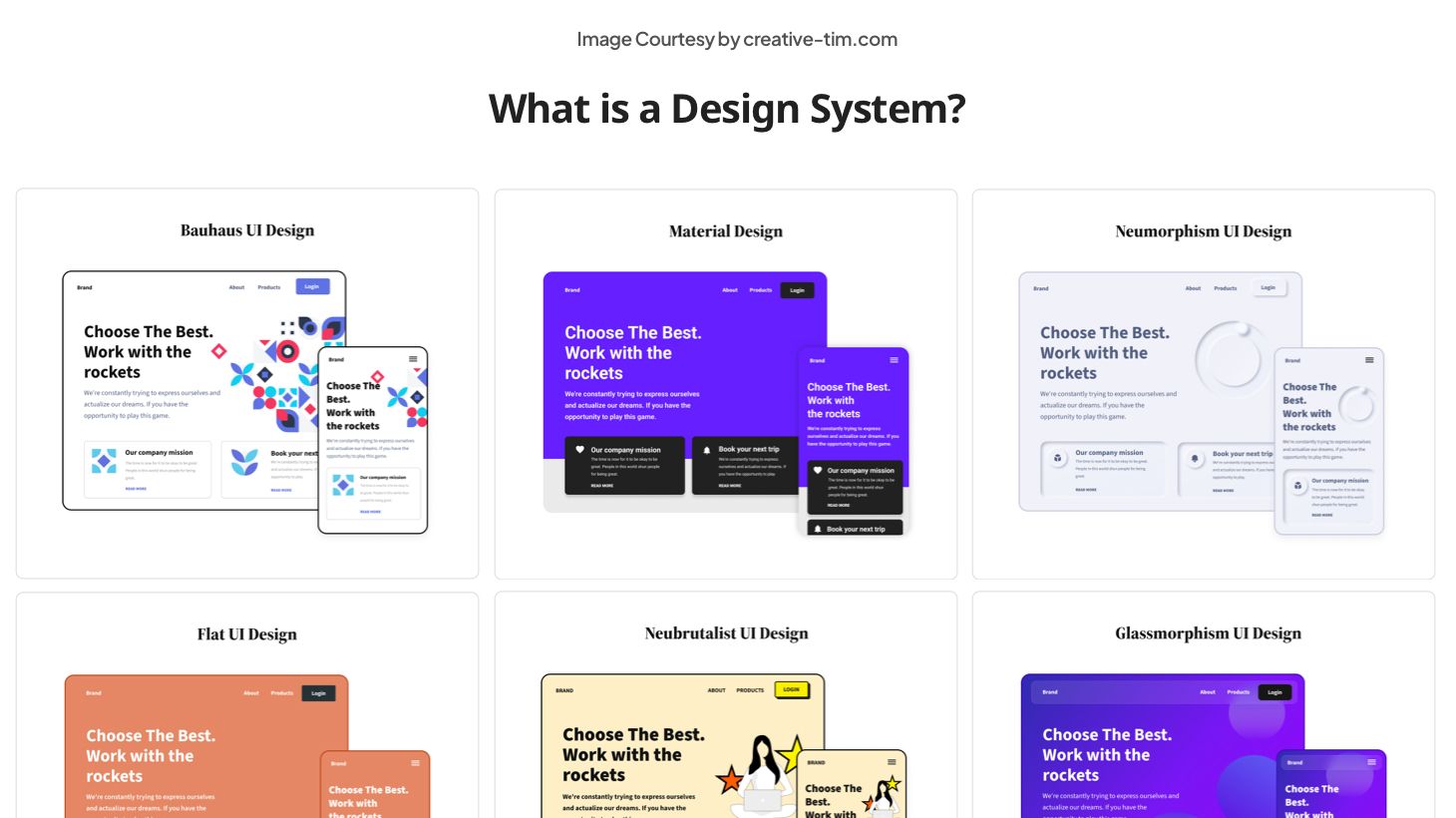
We can not fully understand Material Design if we first don’t learn what a design system is and what purpose it serves.
Systematically structured to produce and maintain a consistent visual and functional language across several products or platforms, a design system is a complete set of standards, concepts, and reusable components. It's a hub for designers and developers to work together and maintain consistency in the user experience.
Key components of a design system typically include:
- Design Principles: Fundamental guidelines that inform decision-making and provide a foundation for design choices.
- UI Components: Reusable elements, such as buttons, form fields, typography, and icons, designed to maintain consistency in appearance and behavior throughout the application or website.
- Color Palette: A defined set of colors that harmonize with the brand identity and establish a consistent visual language.
- Typography Guidelines: Specifications for font choices, sizes, and styles to maintain a cohesive typographic hierarchy.
- Layout Guidelines: Rules for spacing, grid systems, and overall page structure to ensure a consistent and visually pleasing layout.
- Iconography: Standardized icons and symbols that contribute to a unified visual language and enhance user understanding.
- Accessibility Standards: Guidelines to ensure that the design is inclusive and accessible to users with diverse needs.
- Documentation: Comprehensive documentation that outlines the usage and implementation of design elements, making it easy for team members to understand and apply the design system.
😍 Interested in learning more about UI/UX Design? Check our book "Roots of UI/UX Design" that contains 322 Pages of Insights and Practical Examples, Figma Files, and useful AI Prompts to help you create intuitive digital experiences.
Material Design’s Impact on Web Design
Material Design has been a cornerstone in creating user interfaces with its streamlined aesthetics and straightforward ideas. New resources and frameworks have arisen in the design world to supplement and improve upon the Material Design process.
Popular frameworks like Material UI (based on React) and Material Tailwind (based on Tailwind CSS) incorporated Material Design ideas into React apps without any difficulties.
Figma emerged as a market leader because of the importance of design cooperation in today's development process.
Angular Material became an essential tool for developers working in the Angular ecosystem. It provides a uniform and unified user experience by incorporating Material Design components into Angular apps.
What is Material Design 1?
Since its birth in 2014, Material Design has evolved. The original version of this design framework is now known as Material Design 1, now being followed by two more versions: Material Design 2 and Material Design 3.
What is Material Design 2?
Like any product or system, after a while, the original Material Design started to show its flaws. Perhaps the biggest one was that individual development effort from the designer was needed to reproduce every part. From fresh fonts to a flattened white background, Material Design 2 distanced itself and became a brand new – and better – design system.
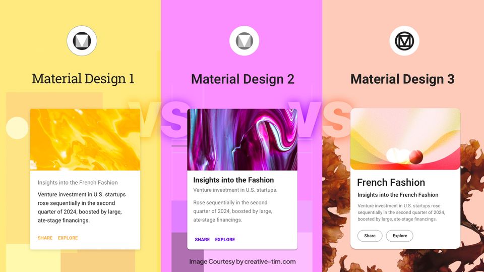
Material Design 1 vs Material Design 2 — What are the differences?
There are 7 major differences we can highlight between the old design system and its revamped version:
1 - Translucency and White Space
One key distinction between Material Design and Material Design 2 is the increased use of white space. This has been done to achieve a more basic appearance, but it has caused quite a stir. The new design also includes refinements to the way translucency works.
2 - Icon Colors
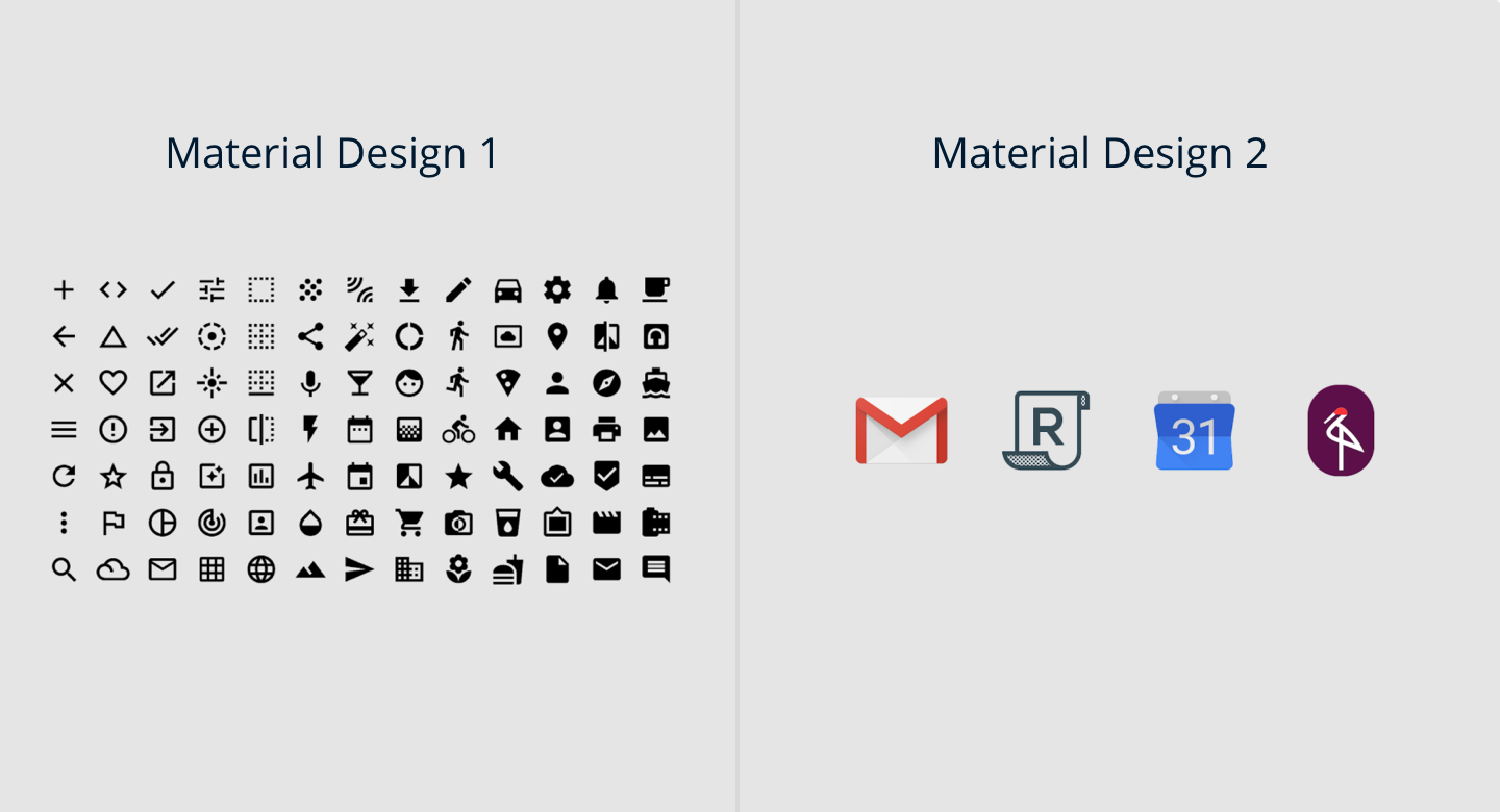
There are several new features and what appear to be updated Material Design icons in the Settings app. It would appear that with Material Design 2, Google is moving in the direction of more vibrant color schemes.
3 - Google Sans
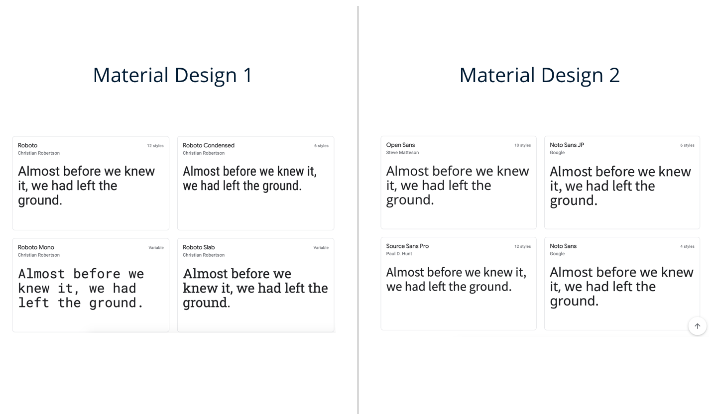
With Material Design 2, Google Sans is gradually replacing several of the Roboto typefaces that were previously used for headers. The Wear OS website, several Google Tasks applications, Google I/O 2018, and the email headers of the new Gmail all make use of Google's new material design typeface.
4 - Rounded Corners
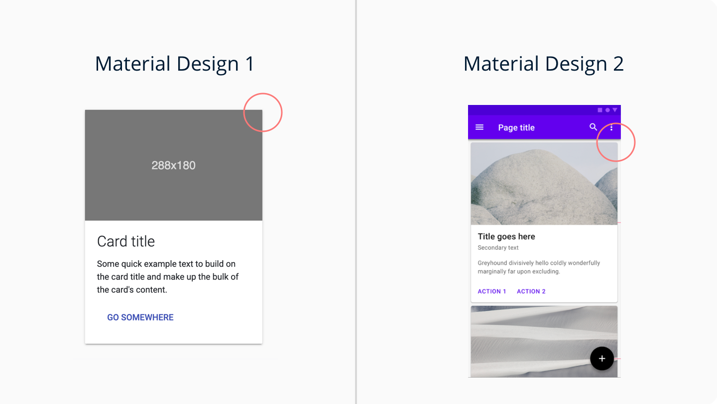
Material Design 2 also introduces a large number of rounded edges. Apps like Google Feed and Google Tasks, as well as Google Pay on the web, have adopted a rounder radius. The corners, which were originally already rounded in the original Material Design, now have a significantly softer radius.
5 - Rounded Tab Indicators
In contrast to the old-fashioned highlight that covered the whole tab (and occasionally even spread to neighboring tabs), the new Material 2 pop-up has rounded corners. There are now rounded tab indicators in Gmail for the web, the new Google Account settings page, and Google Maps for Android.
6 - Rounded Selection Highlights
Highlights for making selections in menus now have rounded corners, another noticeable difference in the new Google Material Design.
7 - Larger BottomAppBar
The increased size of modern smartphones makes it more challenging to use their software. Therefore, the BottomAppBar, which was introduced with Android P in the first Material guidelines, has been updated.
The most noticeable difference is that the Tasks option, represented by a large floating button, is now located at the very top of the BottomAppBar. The vast majority of Google's native applications will soon have these BottomAppBars.
What is Material Design 3?
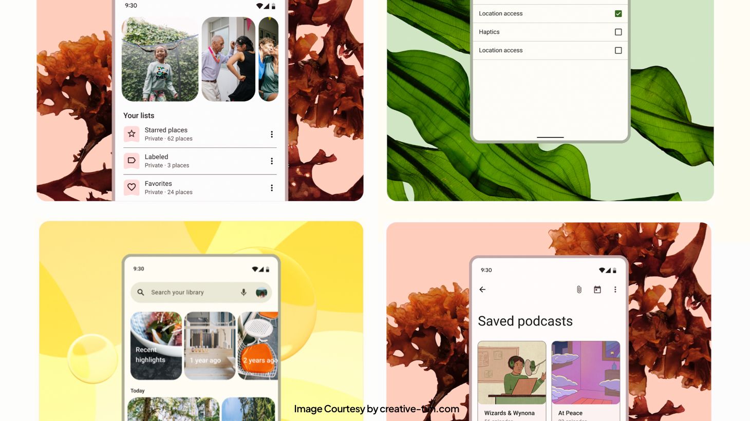
Material You, better known by its technical name Material Design 3, was announced in early 2021 through a Pixel 6 commercial and brings development and design for Android to a whole new level.
Material You wants designers to make unique designs possible, universally accessible, and visually appealing on screens. The goal here is to customize Android applications to the individual's tastes and lifestyle.
Material Design 2 vs Material Design 3 — What are the differences?
As with anything that evolves, there are numerous changes brought with Material Design 3 that make it distinct from its predecessor, Material Design 2.
1 - Dynamic Colors
The most fascinating new feature of Material Design 3 is its use of dynamic colors, which is a daring development. A color scheme generator that takes inspiration from users' background photos is included in Material Design 3.
Next, a palette with distinct color functions is built and used in any program that supports dynamic colors. Designers may develop a custom color scheme and preview it to see how it works with their app, all within the Material Theme builder.
Text, symbols, backgrounds, and graphics may all be styled to match your preferences, across the board or locally. A user's profile page, for instance, could benefit from dynamic coloration, but the homepage would not.
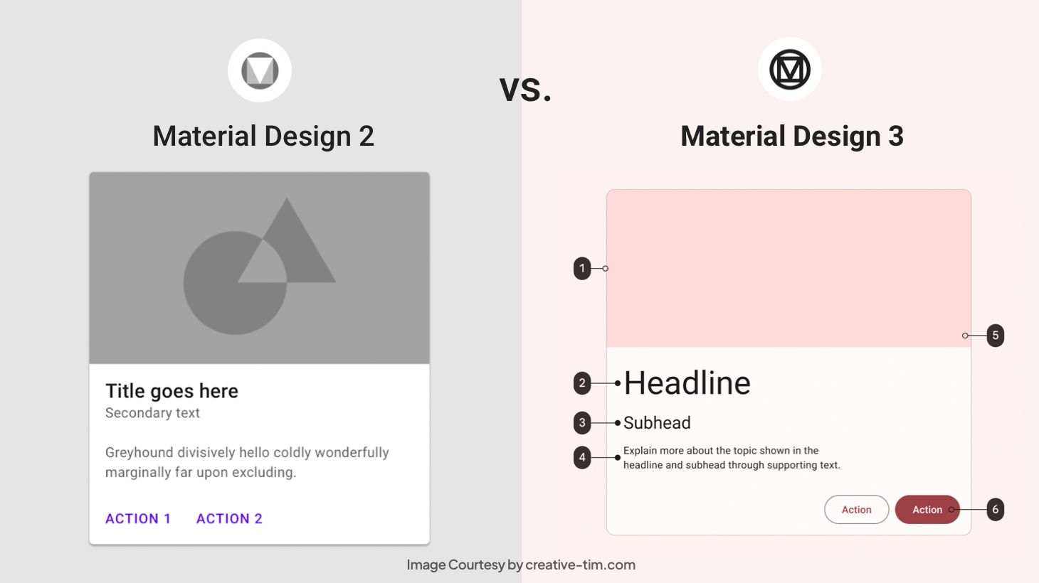
2 - UI Components
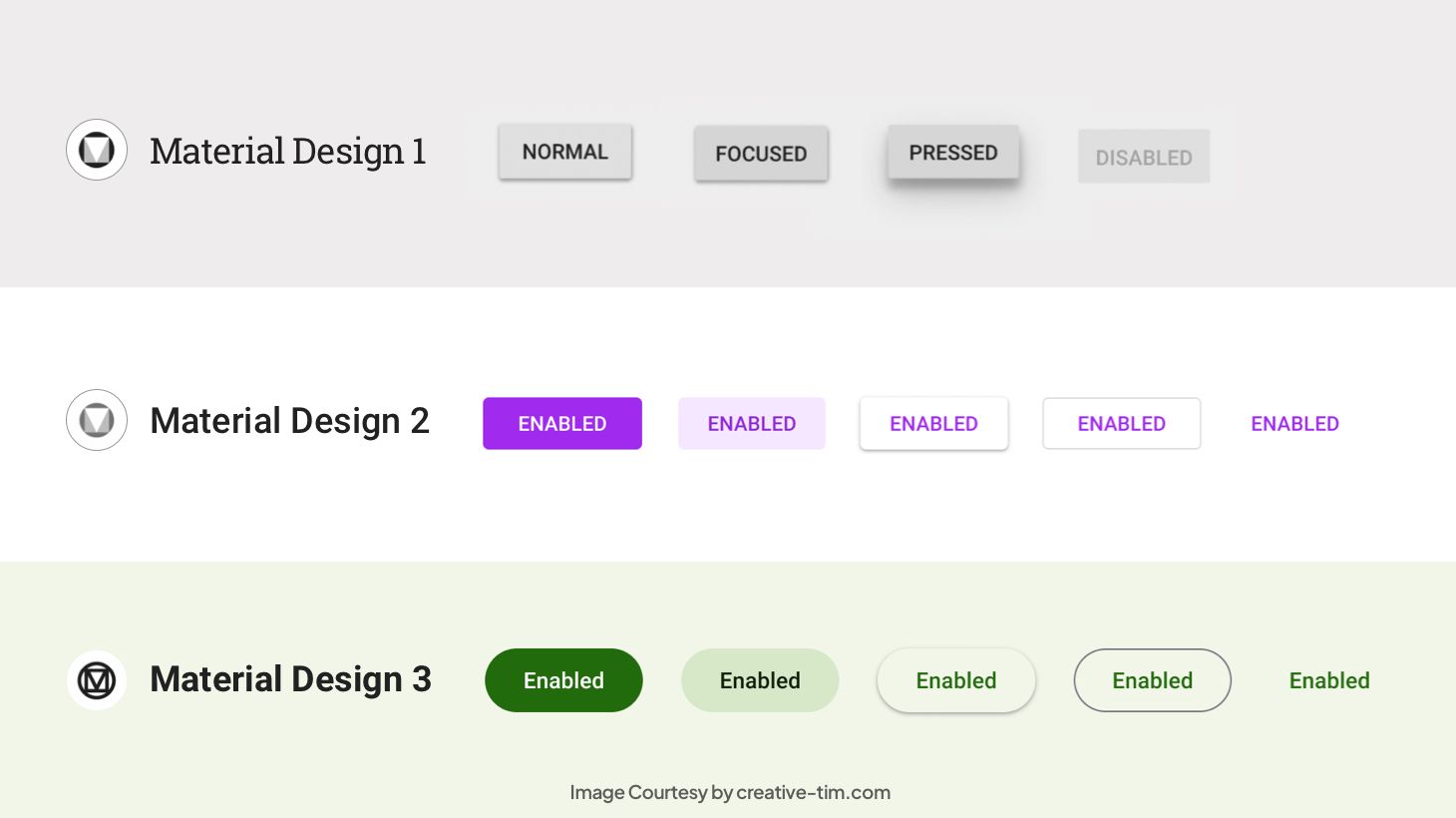
There was also a cosmetic update to the UI Components. In general, the appearance of Material Design 3 is less serious and more fun. It's optimized for dynamic colors and has rounded corners, less dramatic shadows, more white space, and new active states.
For example, the bottom navigation bar is now the top navigation bar, and it is higher and does not cast a shadow. The same holds true for the app bar at the top and the navigation rail. At the same time, floating action buttons (FABs) are now more square-shaped and accessible in a new, bigger version to adapt to larger screens.
For cards, there are three distinct styles available. Finally, dialog modals have been given extra padding to account for their boxier form, and their headings have been made larger for easier reading.
3- Adaptations for Foldable Phones
There are several steps that Material Design 3 took to make the transition to foldable devices easier for designers:
- Compositions: These are responsive and adaptable layouts for big, foldable displays.
- Motion: Material Design 3 enables motions for navigation bars, for switching from folded to open landscape, and for dialogs.
- Adaptive type scale: Instead of utilizing fixed numbers for font sizes across all screen resolutions, Google now recommends a scale from small to large to be used by designers.
4 - Design Tokens
Tokens are a recent addition to Material, with the goal of fostering greater uniformity and teamwork in the design process. The time they can save on complex software builds with several developers is significant.
Colors, fonts, dimensions, and even tokens themselves may all be used as dynamic style values that can be modified across an entire project with the use of tokens.
What did not change in the new versions of Material Design?
When Material Design upgraded to Material Design 2, the changes were useful, but not drastic. The design system was still standardized, but it underwent a number of cosmetic changes. However, the same can not be said for Material Design 3.
Whereas the first two versions were standardized, this one placed its focus on personalization. At first glance, it’s almost impossible to determine what has not changed. At closer inspection during the migration process, we do discover some things:
First of all, most Components and Layouts that can be found in M2 make the transition to M3. However, there are also numerous additions, as well as subtractions from the previous version. Moreover, M3 brings more variations to the components that it maintains from M2.
Upon further inspection, we also find that M3 contains all the button composables from M2 (but adds many more to the list). Backgrounds do not bring significant changes either, other than the name change to Container. It’s enough to replace background parameters in M2 to container parameters in M3.
Material Design Examples
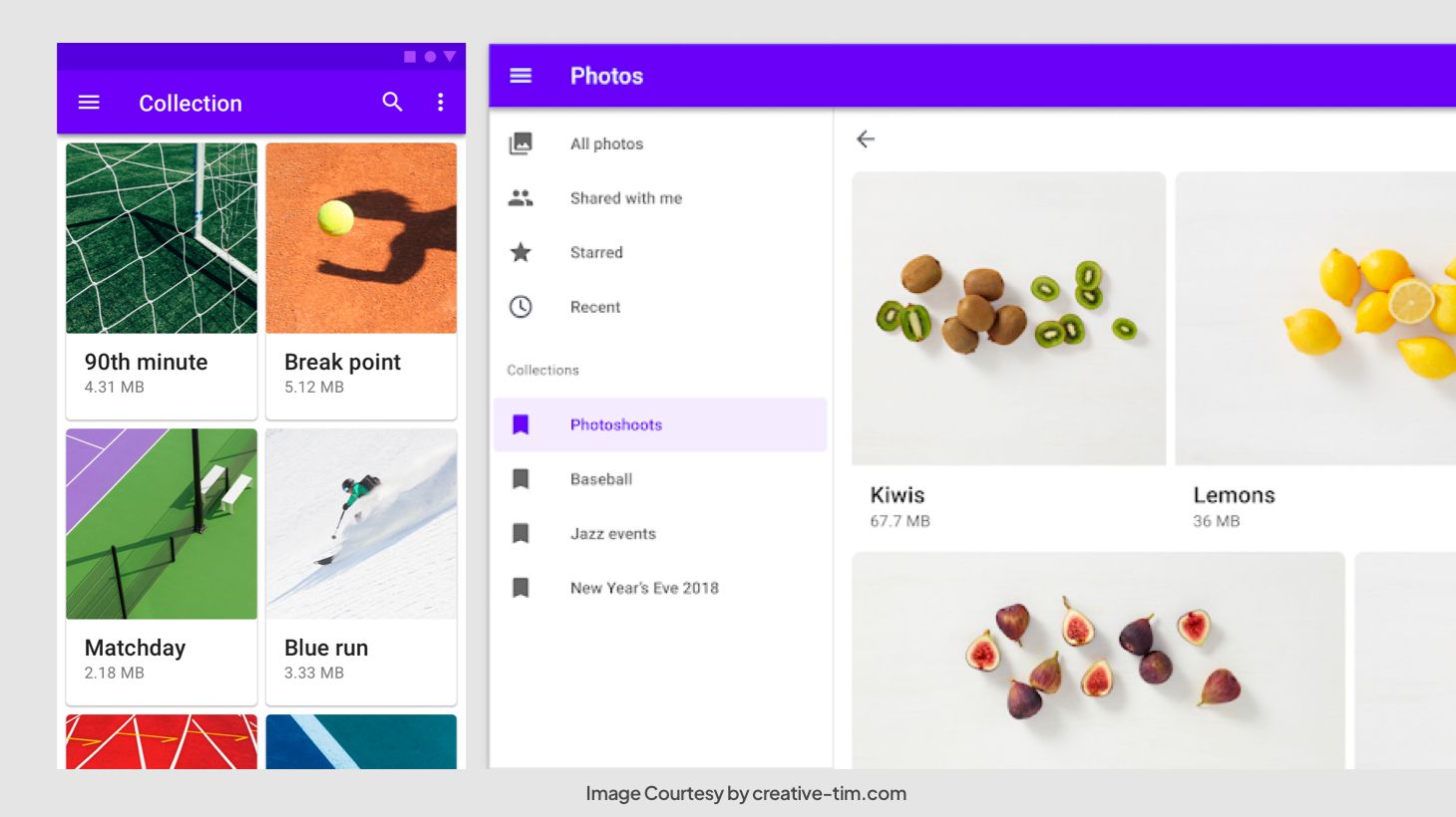
Inspired by Google’s Material Design, Creative Tim has created a lot of material design examples that you can use to create effortless, beautiful, material design inspired themes, and dashboards. Some examples are listed below:
Material Kit 2
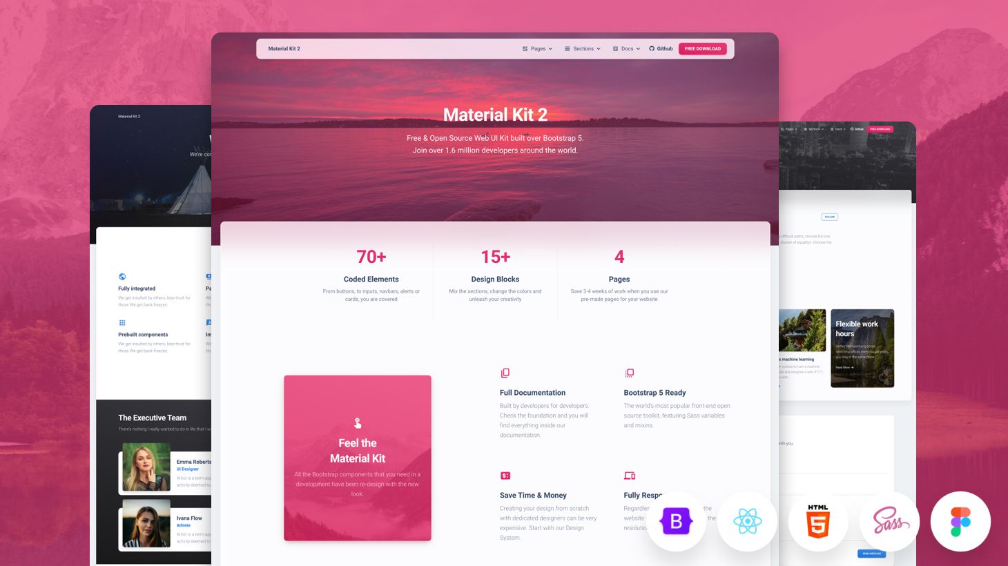
This Free Bootstrap 5 UI kit has a fresh, new, Material Design inspired design with a beautiful set of components, deliberate color choice, and large scale typography.
Material Dashboard PRO 2
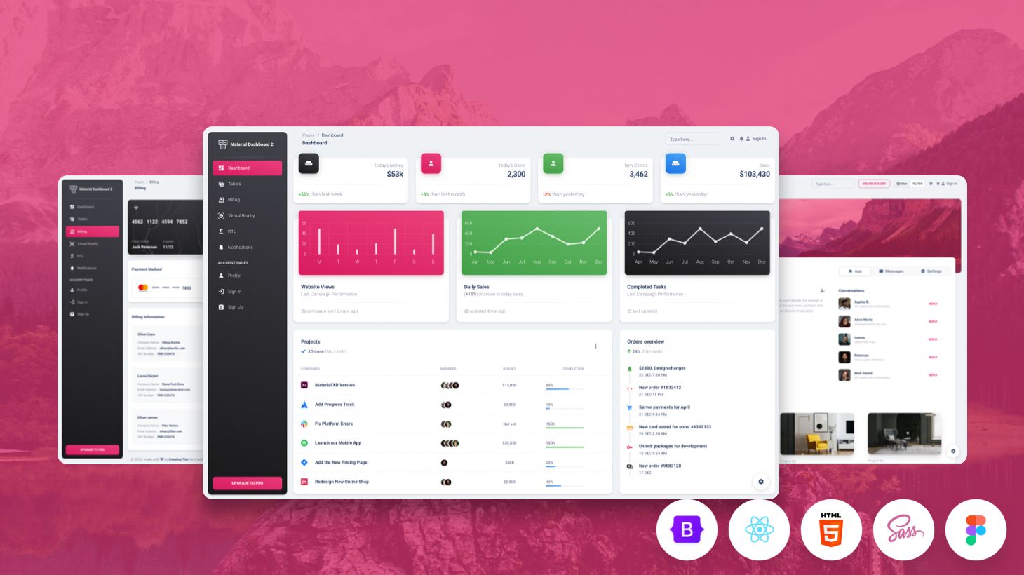
Yet another dashboard inspired by Google’s Material Design, the Material Dashboard 2 Pro uses surface, light, and movement to make dashboards resemble sheets of paper. It offers the necessary tools required for creating a complex web product.
Material Tailwind
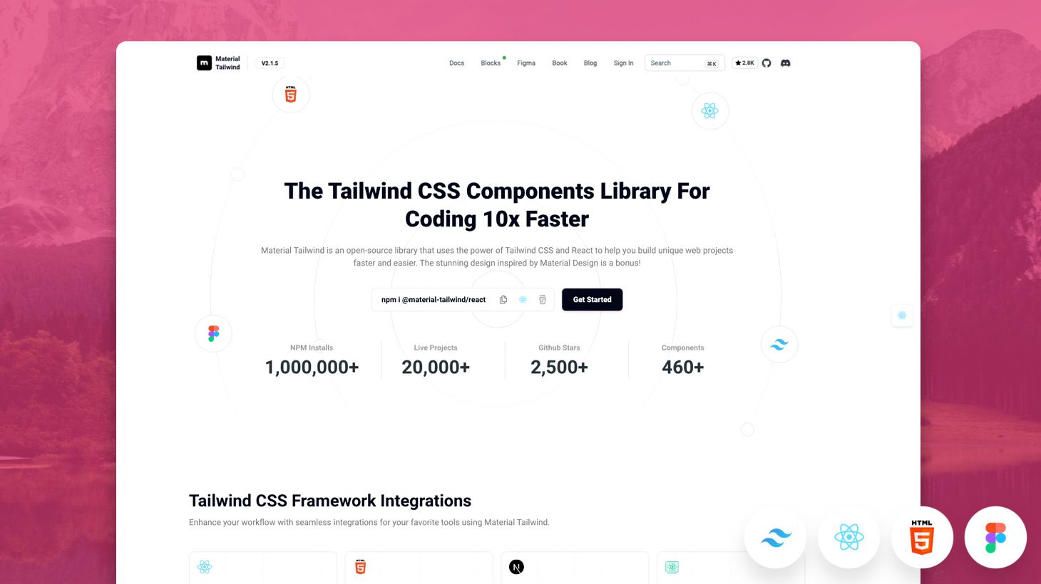
Material Tailwind is an open-source components library that expertly blends the principles of Material Design with the flexibility of Tailwind CSS. The UI components in Material Tailwind are meticulously crafted to adhere to Material Design's guidelines, ensuring a cohesive and user-friendly interface.
Conclusion
The jump from Material Design to Material Design 2 was a subtle one, that brought improvements but kept the same overall standardized version. With Material Design 3, a complete revamping of Google Design took place that shifted the system from standards to personalization.
The new Material Design guidelines are as useful as ever, aiming to adapt to the fast-paced market of devices that continue to grow in size and features (e.g. foldable phones). Don’t know where to start with Material Design concepts? Try the easy-to-use components and templates offered by Creative Tim.