This is the second part of a two-part article aimed at describing what user onboarding is and what are the best practices in setting up your own. If you are haven’t gone through the first part, you can find it here. It covers what the process of onboarding process is and it provides tips, tricks and best practices for designing and implementing it. In this blog post we will cover common mistakes and how to avoid them, learn about testing the onboarding process and some resources that can help you.
Common mistakes
- Don’t count on the interface to do what a message should say
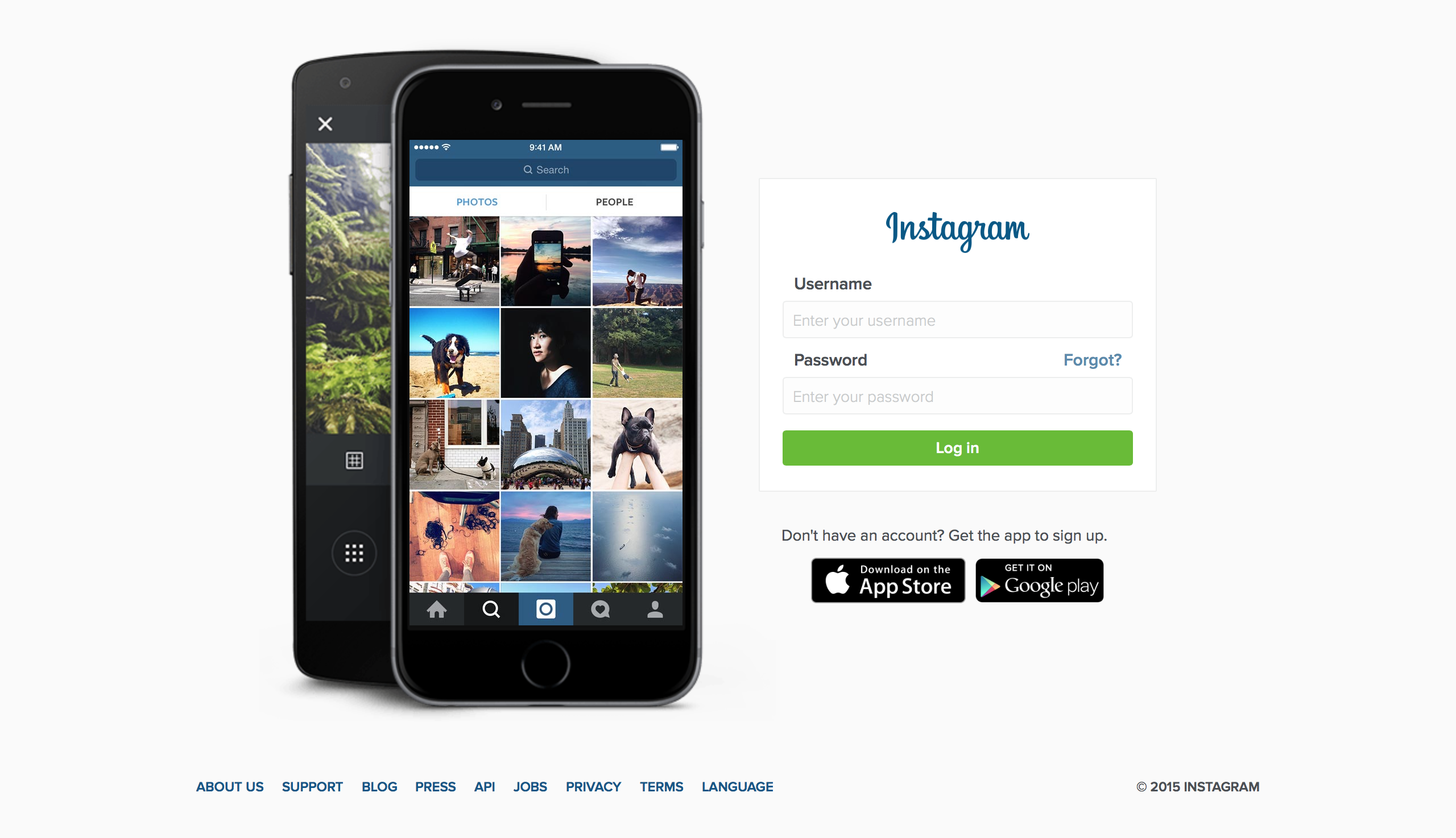
If you didn’t know about Instagram and what is is used for, would you understand it from their page? Would you sign up?
This first mistake of not stating what you do and why your users should sign up is quite common. Try not to fall into it. Let the user know what you have to offer, actually write it down. It will be much easier for him to understand why he completes the following steps. Adding pictures that a user can emphatise with is always nice, but it doesn’t have the same effect without a message. It is like you are given someone the ingredients and the recipe to cook something, but you are not telling them what exactly they are preparing.
- Failing to recognise the user’s progress.
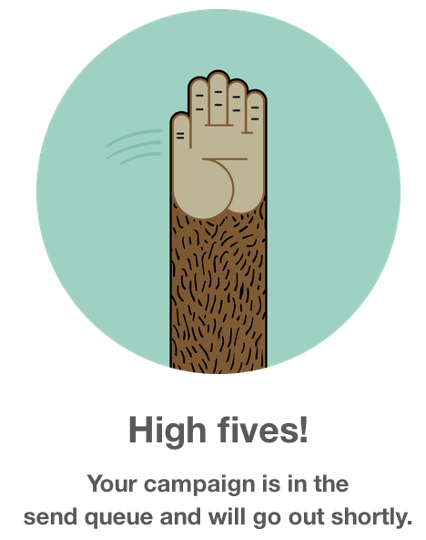
It’s great to cross something off your to-do list, and it’s even better to get it all done. When there is someone there to celebrate it with you, it makes the process more human. If you got your users through a complex onboarding, be sure to let him know he did great. I personally love it when the monkey from MailChimp is giving me a high five.
- Killing momentun with too many or too little actions
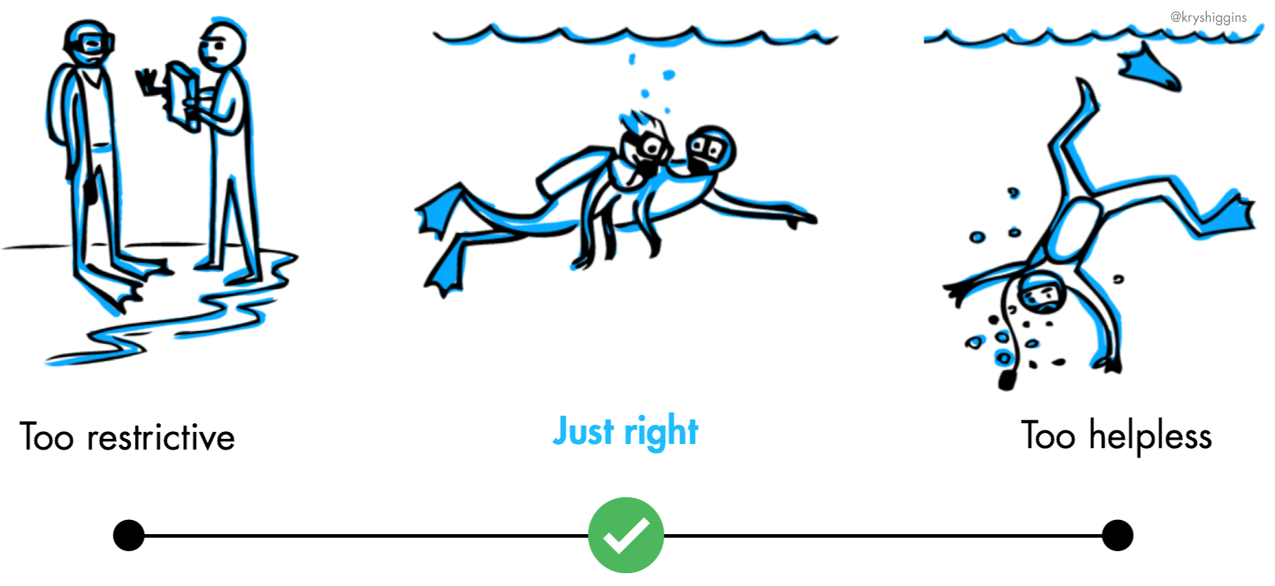
Like the drawing above is trying to illustrate, it is difficult to find just the right pace. If you have too many actions for the user, he will get confused; if there is too little guidance, he will be helpless. Try to make the first time experience seamless and convert the users towards a small win. Give them a small taste of how the product will improve their life, but don’t overdue it. Remember, an user is not looking to see all your pretty design items and things he can do with your products. He is just testing the waters, give him a little something to come back to.
Don’t be Afraid to Test
Evolution is important as well. Remember how difficult signing up for Twitter used to be? Look at how they do it now. Keep an eye out for new ways to get your customers onboard and have the courage to try something new. Keep innovating and keep your customers’ wants first, these are the keys to having a successful onboarding process.
There is not just one solution to this subject, it takes both gut instinct and testing a lot of alternatives. But done right, it will have an visible impact on the way you get people from viewing your product to interacting with it.
To see a live example of multiple iterations during the design of the onboarding process, you can also read this blog post from InvisionApp: https://blog.invisionapp.com/an-intro-to-user-onboarding-part-2-testing/
More Resources
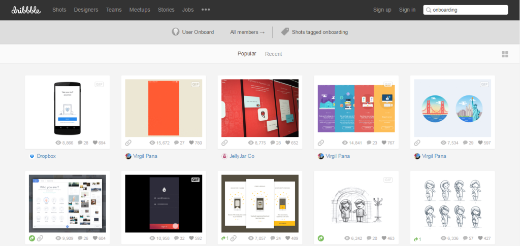
- Dribble is always there to provide amazing ideas and inspiration. If you want to see how other people imagine or actually do the design of onboarding, you can see this shot or this one. And even more here:
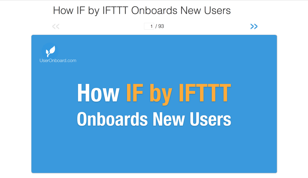
- The good people at UserOnboarding are providing in-depth analysis of how popular sites do their onboarding. If you would like to see details, here is the list with their latest teardowns: https://www.useronboard.com There is a lot you can learn by watching how others do it, where they fail and where they get the best results.
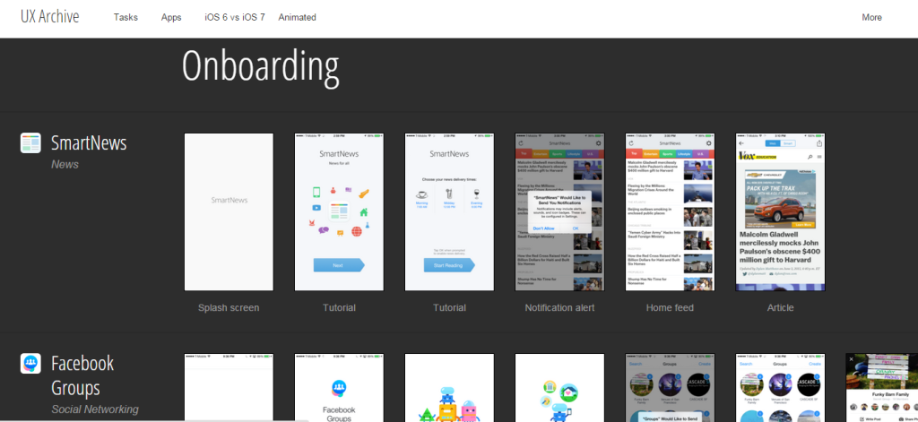
- UX Archive(https://uxarchive.com/tasks/onboarding) provides the visual description for onboarding on popular apps: from Google’s Inbox to facebook Groups, you can see the case study of what happens after signup. Great for inspiration!
- AutoSend have done a fantastic job at describing how you can add email marketing to increase the activitation and retention rate for your onboarding process: https://autosend.io/blog/how-to-onboard-users-email-sms-push/ A must read!
- FirstTimeUX is a blog that describes the experimenting with onboarding process: https://firsttimeux.tumblr.com It is very funny and informative!
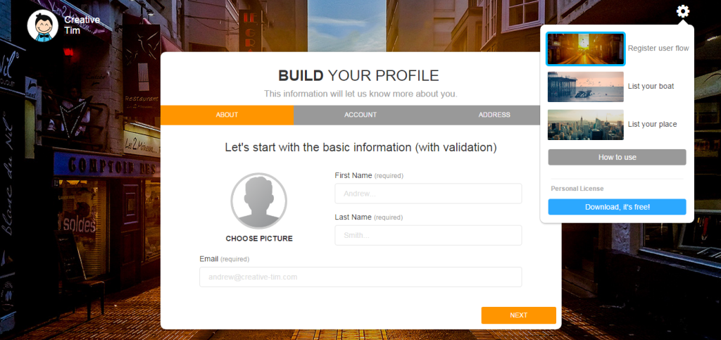
- Me and my team at Creative Tim have a great a multipurpose wizard, that may be an option for designing your user onboarding. If this model fits, you can break down the information you will get from your users into chuncks and guide them step by step: https://www.creative-tim.com/product/bootstrap-wizard Don’t worry, it’s free.
Final thoughts
Designing an effective and beautiful user onboarding process is tough. People are just getting busier and their attention span gets shorter. Competition is always around the corner and first impression really do matter. If you are working on a great product and you want to share it with the world, don’t lose your first wind. Invest time, money and energy into figuring out what is the best way to explain and engage your users from the first round. Try and do everything in your power to perfect your onboarding – this is the step that will get your users to come back for more.

![15+ Top Black Friday & Cyber Monday Deals for Developers and Designers [2023]](/blog/content/images/size/w960/2021/11/black-friday-deals-developers-1.jpg)