![50 Best Free Fonts for Websites – The Ultimate Collection [2023]](/blog/content/images/size/w960/2023/09/cover-fonts-ct.jpg)
When creating an outstanding website, design is a vital component that can make or break the user experience. From captivating visuals to seamless navigation, every element plays a crucial role in engaging visitors and conveying the desired message. Among these elements, typography stands tall as a powerful tool to establish the tone, personality, and readability of a website.
In the ever-evolving world of web design, staying up to date with the best web fonts and the latest font trends is essential for UI/UX. Fonts can evoke emotions, enhance visual appeal, and improve the overall aesthetics of a website. Whether you're building a personal blog, an e-commerce platform, or a corporate website, finding the best free font that strikes the perfect balance between functionality and aesthetics is paramount.
As we step into the year 2023, it's time to explore the freshest and most remarkable free fonts available for websites. In this article, we present you with the ultimate collection of meticulously curated 50 best free fonts. These fonts have been chosen based on their versatility, uniqueness, readability, and their ability to make your website stand out with the best-looking font options.
So, if you're ready to enhance your web design game and add a touch of creativity to your projects, join us on this typography journey. Explore the diverse range of fonts, discover their unique features, and witness how they can transform the visual experience of your website with the best-looking font choices.
About Typography
The first step in embarking on this journey is understanding why we are taking the journey in the first place.
What is typography?
It is the art and method of arranging typefaces, fonts, and characters to produce aesthetically pleasing and legible written communication. In order to transmit meaning and improve the overall design, it entails the choice, positioning, and arrangement of different typographic components, including letters, numbers, symbols, and special characters.
In communication design, typography is essential for print products, websites, commercials, logos, and more. It involves more than just picking a font; it also takes into account things like font size, spacing, line length, alignment, and hierarchy to make written material look aesthetically pleasing and effective.
Typography that works well blends beauty and utility. It entails choosing fonts that are suited for a design project's tone, purpose and intended audience. In order to ensure that the text is simple to understand and doesn't strain the reader's eyes, typography also takes legibility and readability into account.
Typography’s Role in Web Design
Typography is important in web design because it has a big impact on how well a website communicates with its users.
Here are a few crucial elements of typography's function in web design:
-
Readability: Making text clear and simple to read is one of the main aims of typography in web design. Web designers must select typefaces and font sizes that are legible and usable on a variety of screens and devices. For improving readability, proper line spacing, letter spacing, and background and text contrast are other crucial factors to take into account.
-
Visual Hierarchy: On a web page, typography aids in creating a visual hierarchy that directs users' attention and prioritizes the significance of various content pieces. Designers may construct a hierarchy that accentuates headlines, subheadings, and body text and makes it simpler for users to read and comprehend the material by varying font size, weight, and style.
-
Branding and Personality: Typography may enhance a website's overall identity and personality. A unified and memorable user experience is produced by selecting a typeface that is consistent with the brand's tone and values. Typography creates particular emotions and communicates the desired brand image, whether it's a contemporary, minimalist font or a fun, ornamental typeface.
-
Visual Appeal: A website's aesthetic value and visual appeal are enhanced by good typography. Designers produce aesthetically suitable text components that enhance the overall design and make the content more engaging and appealing to consumers. They do so by carefully choosing complimentary fonts and applying typographic methods like kerning, tracking, and leading.
-
Responsiveness and Adaptability: The importance of responsive web design has increased with the adoption of mobile devices. In order for the text to be readable and preserve its intended appearance on screens of all sizes and resolutions, typography is crucial. To maintain a consistent and ideal reading experience across various platforms, designers must take responsive typographic strategies into account, such as fluid type scaling and the use of suitable font stacks.
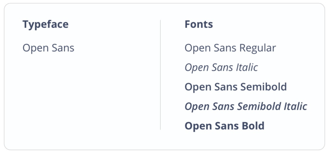
Typeface vs. Font
Have you ever wondered what is the difference between font and typeface? Well, a typeface is the overall set or family of font styles (like Open Sans, Roboto, Helvetica), while a font is a particular style or variation within that typeface (like Regular, Light, Italic, Bold, SemiBold).
See below exactly the differences:
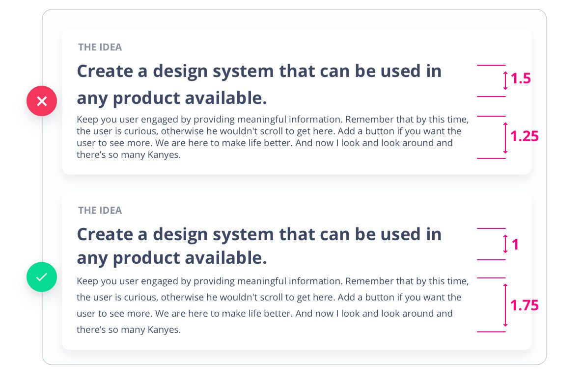
Choosing The Right Line Height
The line height and the font size are inversely proportional.
When dealing with big texts, a shorter line height is ideal, while a taller one is better for smaller texts. To determine the appropriate line height for small texts, multiply the font size by 1.6. For instance, if the font size is 16pt, the line height should be around 25.6, which can be rounded to 26pt.
However, this formula is not suitable for bigger texts exceeding 32pt. In such cases, multiplying the font size by 1.3 or 1.1 can produce a better visual effect.
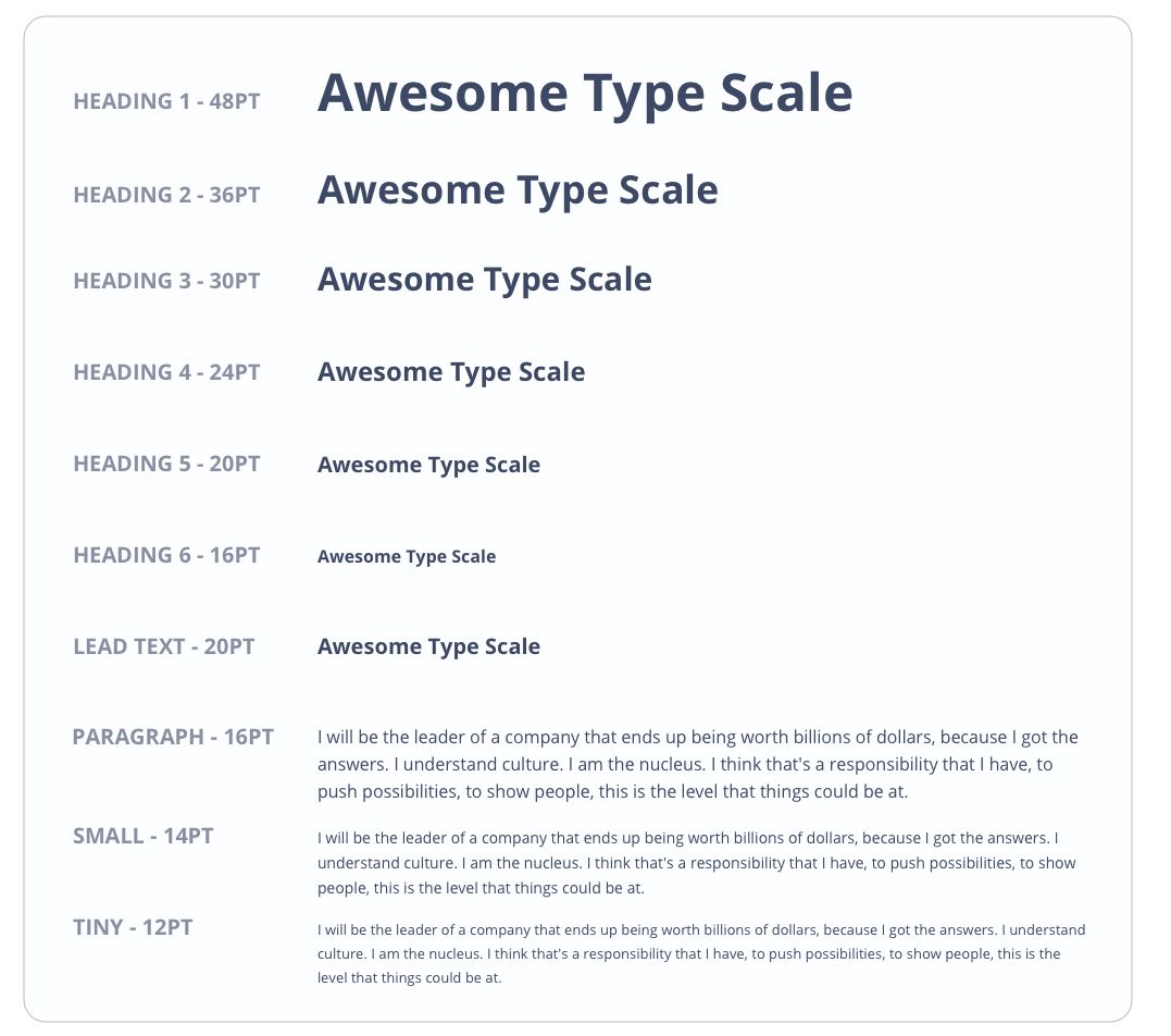
Type Scale Usage
A type scale is a set of 10 or more styles in a type system that provides consistent text sizes for your project.
For creating your specific type scale, in the beginning, it is necessary to set a base size which can be 14pt or 16pt. The next step is to multiply and divide the base size by 1.618, so the type scale will have a structure related to the Golden Ratio. Avoid texts smaller than 12px, they are difficult to read.
Find The Font From Any Page
Identifying the font used on a webpage can be an intriguing task that allows you to delve into the design choices made by the website's creators. Here's how you can find the font used in any web page:
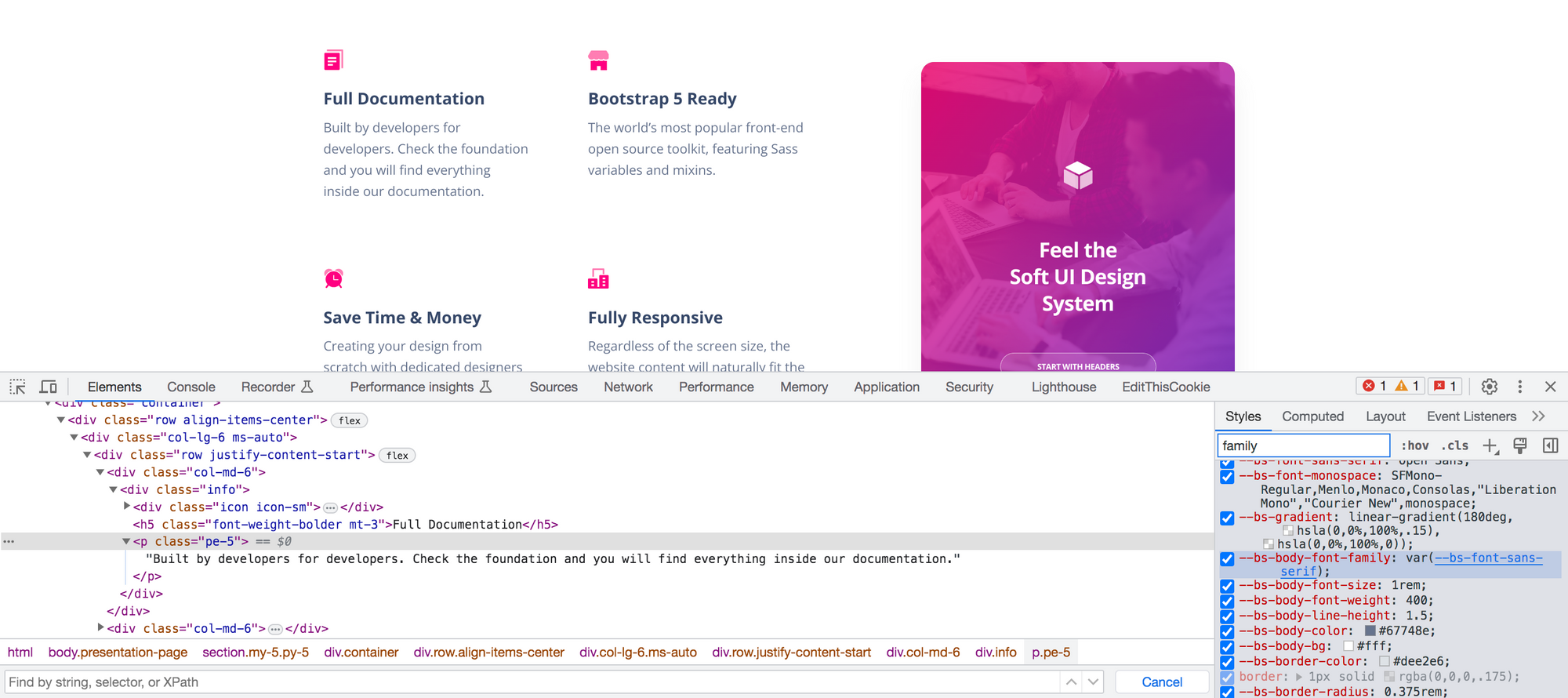
Instructions: To begin, right-click anywhere on the page and select "Inspect" or "Inspect Element" to open the browser's developer tools. This tool provides a window into the webpage's HTML and CSS code, which is where you'll find the information you're looking for. Locate the specific text element whose font you want to identify by hovering over the text and observing the corresponding HTML code highlight.
Within the developer tools, navigate to the CSS Styles panel, which reveals the applied CSS rules for the selected element. Look for the "font-family" property, which specifies the font used. The font name will typically be listed after this property, enclosed in quotation marks. Pay attention to any additional font properties, such as size, weight, or style, as they provide valuable information for replicating the font elsewhere.
In some cases, you may also come across URLs associated with the "font-family" property, indicating the use of custom web fonts. Copying and visiting these URLs allows you to explore more about the font or even download it for future use.
To make things even easier for you, here are two examples of free tools you can use to find the fonts from any web page:
-
WhatFont (Browser Extension): WhatFont is an add-on for Chrome and Safari that has gained a lot of popularity. The extension is activated by clicking its icon in the browser's toolbar once it has been installed. Once installed, WhatFont can be used to identify the font family, size, line height, and color of any text on a webpage simply by hovering over it. It also includes other data like the CSS stack for the font family and the web fonts' URL. Without inspecting the page's code, determining what typefaces are in use is a breeze with WhatFont.
-
Fount: Fount is a web app for determining the typefaces used in any given website. The Fount bookmarklet can be added to your browser's bookmarks bar by visiting the Fount website. Simply click the Fount bookmarklet whenever you see a typeface on a website that you'd like to learn more about. The font family, size, weight, and style can all be seen in a tiny pop-up window that appears when you click on the text element you're interested in using Fount with.
How To Set Text Styles With Your Fonts in Figma
To set text styles and take advantage of the best Figma fonts, you can follow these steps:
-
Select the Text Layer: Click on the text layer in the Figma canvas or in the Layers panel to activate it.
-
Access the Text Style Panel: On the right-hand sidebar, locate the Text section, which features an icon with an uppercase "T." Click on this icon to open the Text Style panel.
-
Create a New Text Style: In the Text Style panel, click on the "+" button to create a new text style.
-
Define the Font Family and Properties: In the Text Style editor, you can set the font family, font weight, font size, line height, letter spacing, and other properties. To use your own font, select the desired font family from the dropdown menu. If your font is not available in the Figma font list, click on the "More fonts" option at the bottom to upload and use your custom font.
-
Apply the Text Style: Once you've defined the text style, click "Create" to save it. The text layer on the canvas will now adopt the selected text style.
-
Apply the Text Style to Other Layers: To apply the text style to other text layers, select the desired text layer, and then click on the created text style in the Text Style panel. This will instantly update the selected text layer with the chosen text style.
How To Choose The Right Font
You need to know the purpose of your website, your intended audience, and the overall tone and style you're going for before you start sifting through thousands of typefaces. Selecting a font that is appropriate for your project's content and setting is essential. A font that is suitable for an insurance firm, for example, won’t be as suitable for a children’s website.
Let’s narrow it down to a few points to keep in mind when picking a font:
1 - Take Readability Into Consideration
The readability refers to how simple it is for your target audience to read and comprehend your text. Pretty self-explanatory when you put it this way. Font size, weight, color, line height, letter spacing, word spacing, and contrast are all crucial to readability.
When dealing with big amounts of text or limited screen space, it is extremely important to select a font that is easy to read. Avoid fonts that are too small, too large, too plain, or too similar to others. The body text should be set in a simple, consistent font, while the headers and titles can benefit from a more eye-catching and potentially emotive font.
2 - Check Out Web Standards
Web standards are recommendations and best practices for developing user-friendly, accessible, and compatible online sites. Using web-safe fonts or web fonts is part of web standards. Fonts like Arial, Times New Roman, or Verdana are examples of web-safe fonts that come pre-installed on the majority of devices and browsers.
Web fonts are those that may be downloaded from websites, like Google or Adobe. Web fonts have a wider range and allow for greater customization, but they also use more bandwidth and take longer to load. Use web fonts sensibly, and always have a web-safe font available as a backup in case the web font is unable to load.
3 - Test Your Choice
The hunt for your font doesn’t end when you make your choice. You have to also evaluate it, and be flexible in case it turns out a change is necessary. Test and evaluate how your font appears and functions on various devices, browsers, and screen sizes. To explore and contrast various fonts and combinations, utilize programs like Google Fonts or FontPair.
To find out how others feel about your font selection, you may also seek input from colleagues, customers, or users. You should strive to use a font that works well on all platforms and in all situations.
The Best Fonts For Your Project
Without further ado, let’s talk about the 50 best free font options for your websites!
1. Montserrat
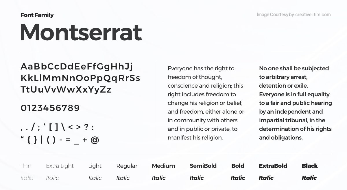
The adaptable sans-serif typeface Montserrat exudes sophistication and modernity. It was created by one of the best font designers, Julieta Ulanovsky, and boasts simple lines and proportions that make it perfect for a variety of design applications. Montserrat, which comes in a variety of weights and styles, is a well-liked option for both headings and body text since it offers versatility and readability.
2. Poppins

Poppins is a contemporary sans-serif font known for its excellent legibility and versatility. Created by Indian Type Foundry, it offers a harmonious balance between geometric shapes and humanist influences. With its wide range of weights and widths, Poppins is suitable for both headlines and body text, providing a modern and clean aesthetic.
3. Roboto
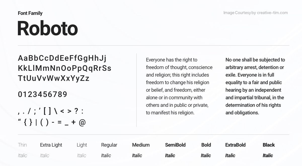
Google created Roboto, a popular and very adaptable sans-serif font, for the Android operating system. Roboto has a sleek, contemporary design and provides outstanding readability across a range of sizes and screen resolutions. It is a popular option for both digital and print projects because of its geometric curves and open letterforms.
4. Open Sans
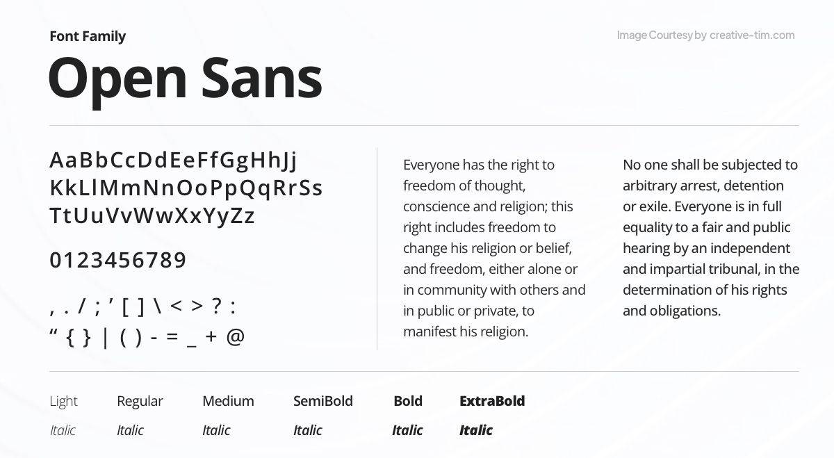
Open Sans, a friendly and approachable sans-serif font, was created by Steve Matteson. With its clean and legible design, Open Sans is widely used for both digital and print projects. Its versatility and extensive range of weights and styles make it suitable for various applications, conveying a modern and professional look.
5. Bebas Neue
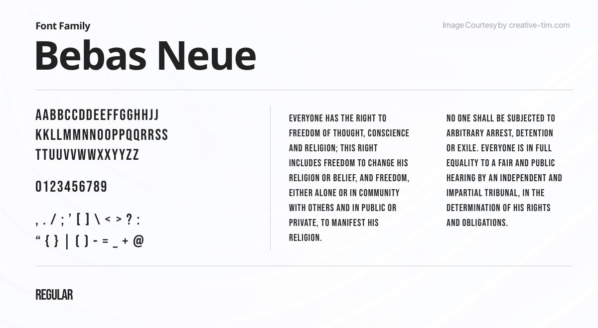
Bebas Neue is a bold and impactful display font designed by Ryoichi Tsunekawa. Its strong geometric shapes and condensed letterforms create a distinctive and powerful aesthetic. Ideal for headlines, posters, and branding projects, Bebas Neue demands attention with its modern and edgy style, adding a touch of dynamism to any design.
6. Inter
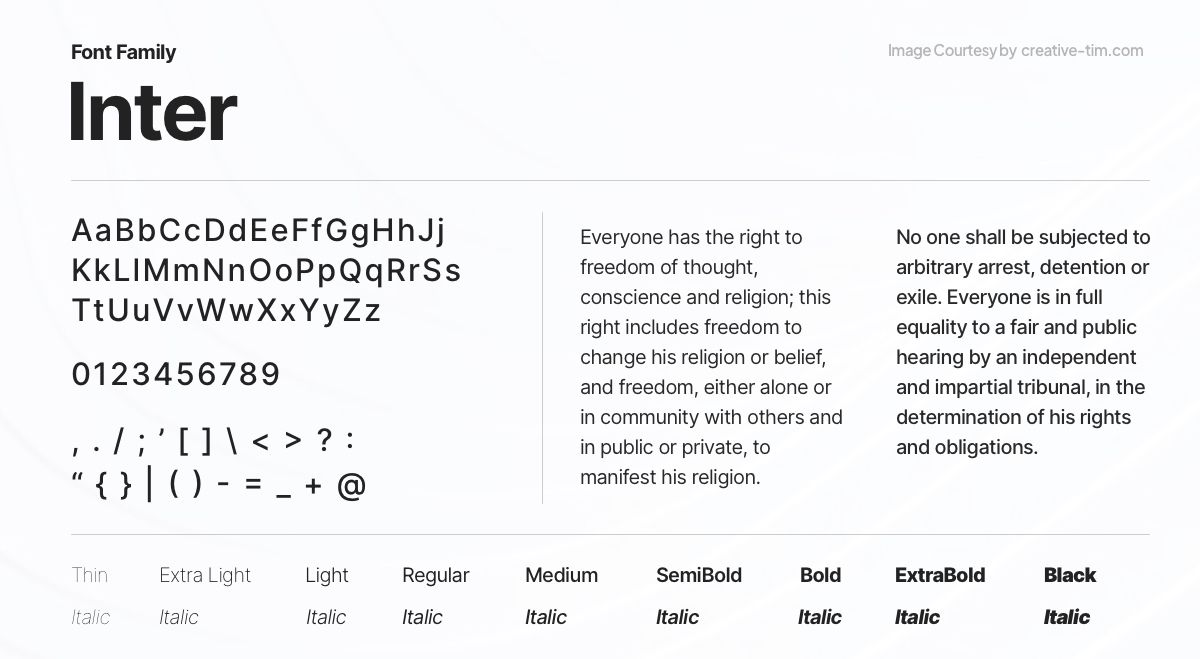
Rasmus Andersson created the incredibly adaptable and readable sans-serif font known as Inter. Inter is made to function effectively in a variety of digital and print settings because of its harmonious and contemporary style. It is a well-liked option for user interfaces, websites, and editorial designs since it provides good readability at both tiny and big sizes.
7. Lato
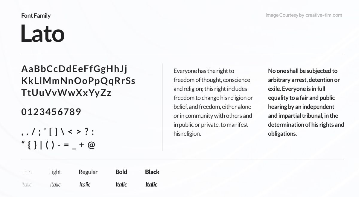
Ukasz Dziedzic's modern sans-serif font Lato exhibits a tasteful fusion of humanist and geometric design components. Lato, which is renowned for its adaptability, is frequently used on both print and digital media. It is suited for a number of design projects since it comes in a broad range of weights and styles, has outstanding readability, and has a contemporary, welcoming appeal.
8. Great Vibes
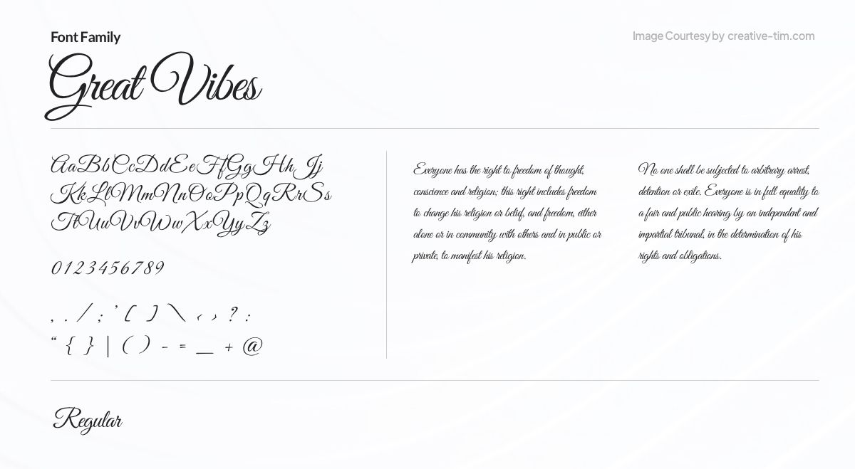
The script font known as Great Vibes was created by Robert E. Leuschke. It has complex, flowing letterforms that provide a feeling of refinement and charm and are influenced by traditional calligraphy. Great Vibes provides a touch of elegance and beauty to invitations, branding, and other sophisticated design projects with its ornamental flourishes and fine details.
9. EB Garamond
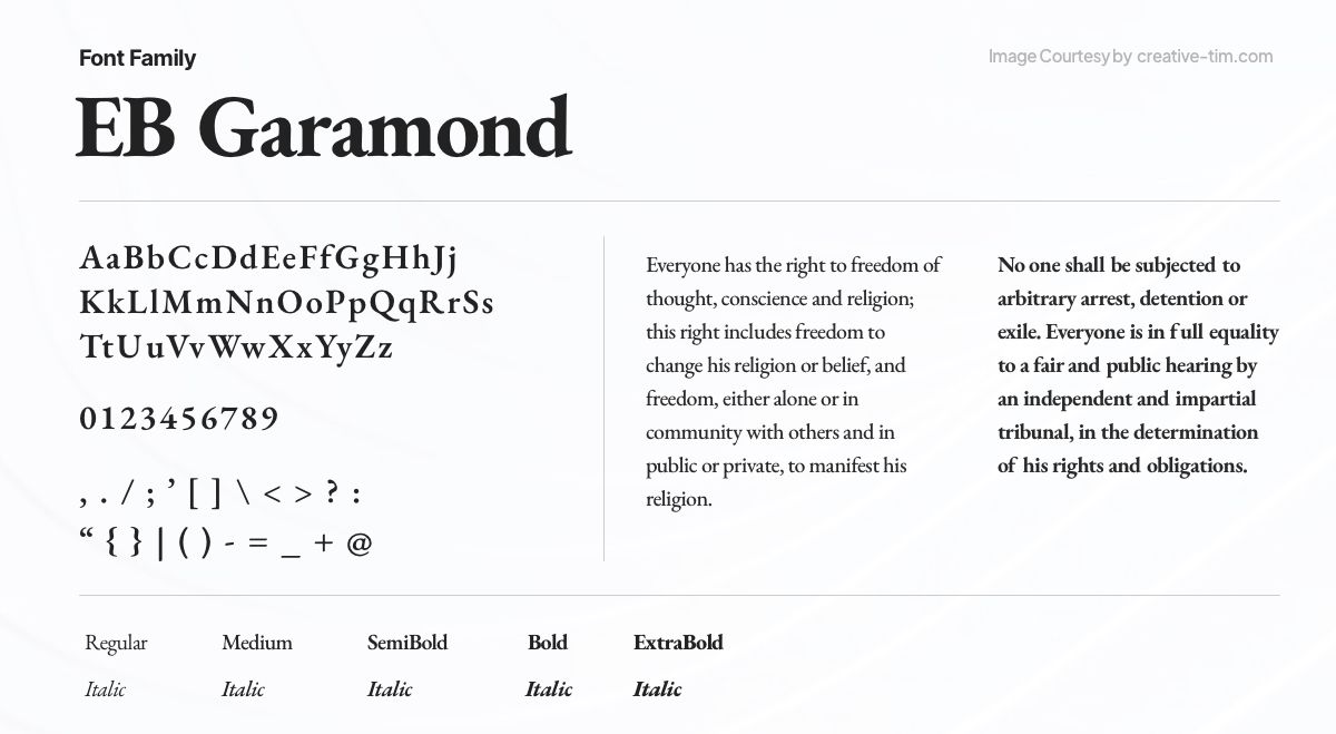
Georg Duffner designed the elegant and classic serif font called EB Garamond, which is based on the traditional Garamond typeface. The letterforms in EB Garamond are delicate and well-balanced, capturing the spirit of classic typography. This typeface emits an air of refinement and adds a touch of class to any project, making it perfect for sophisticated editorial graphics.
10. Libre Baskerville
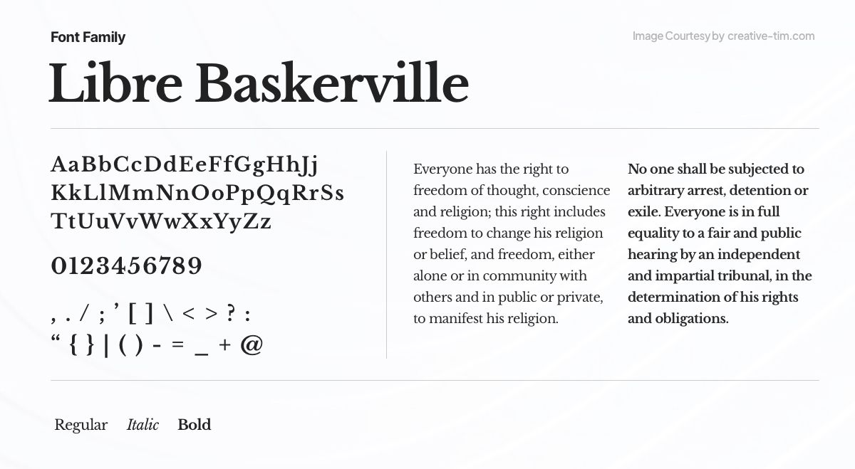
Libre Baskerville, a refined serif font inspired by the timeless Baskerville typeface, brings a touch of sophistication to any project. Designed by Pablo Impallari, it offers a perfect balance between classic elegance and modern readability. With its graceful letterforms and high legibility, Libre Baskerville is an excellent choice for editorial design, body text, and elegant branding.
11. Oswald
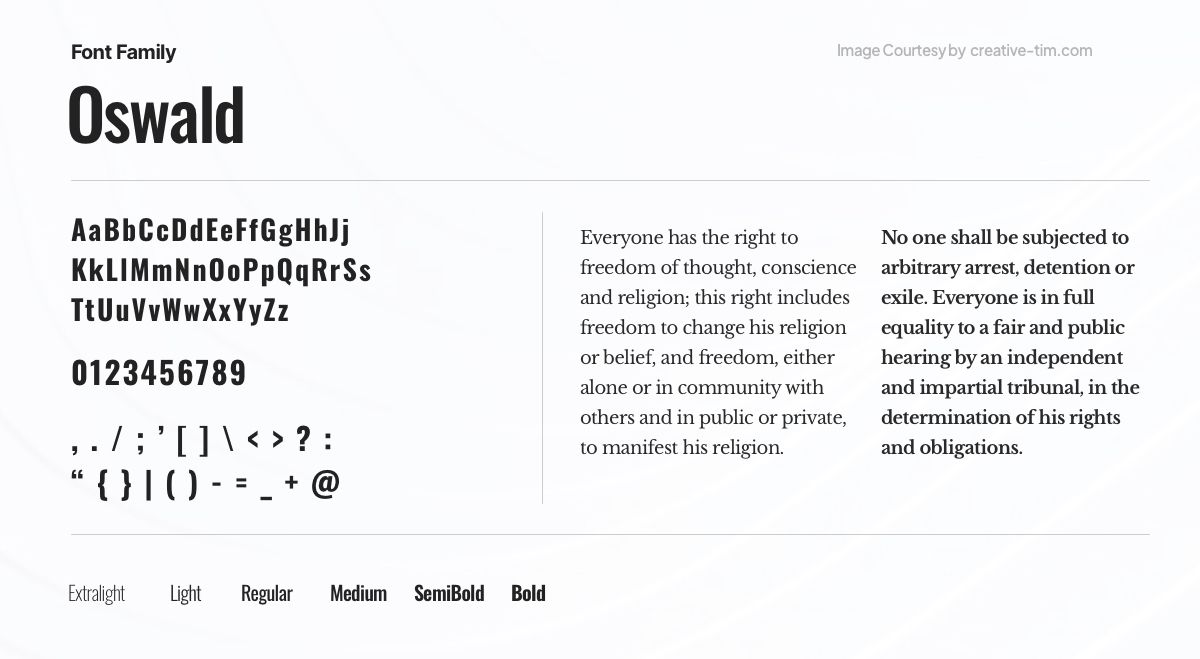
With its robust and geometric letterforms, the sans-serif font Oswald grabs attention. Oswald, a font designed by Vernon Adams, emanates power and modernism, making it perfect for headlines, logos, and display graphics. With its own personality and adaptability, Oswald gives any project a dash of modern flair and aesthetic impact.
12. Playfair Display

Playfair Display is a sophisticated serif typeface that mixes old and modern elements. It was created by Claus Eggers Sørensen and emanates a classic appeal that works well for high-end branding, magazine layouts, and graphics. A touch of refinement is added to any project by Playfair Display's beautiful letterforms and traditional proportions.
13. Lobster
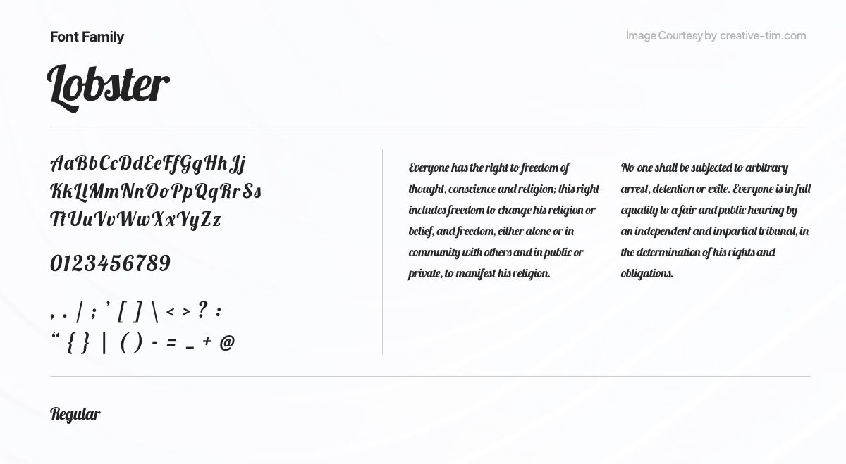
Lobster, a distinctive and playful script font, captures attention with its lively and hand-drawn letterforms. Created by Pablo Impallari, Lobster adds a touch of whimsy and creativity to branding, packaging, and display designs. With its bold strokes and charming character, Lobster brings a sense of fun and uniqueness to any project.
14. Quicksand
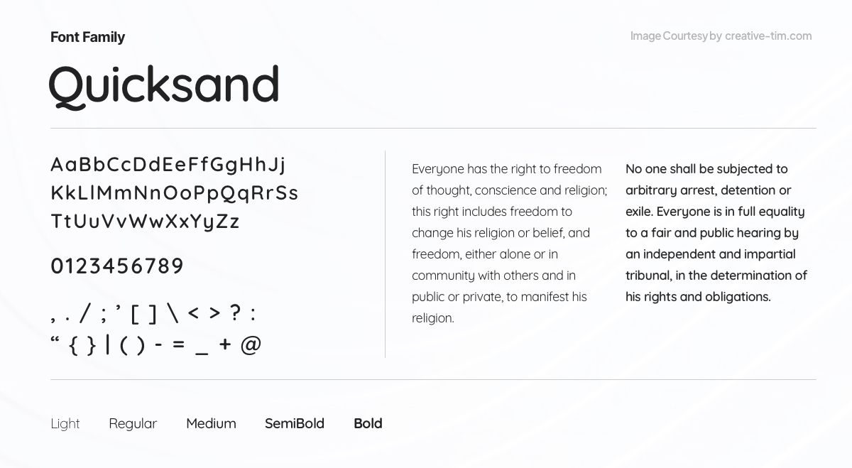
Quicksand, a modern and versatile sans-serif font, offers a clean and minimalistic aesthetic. Designed by Andrew Paglinawan, Quicksand strikes a balance between simplicity and legibility. With its rounded letterforms and friendly appearance, Quicksand brings a contemporary and approachable feel to any project, from web design to branding.
15. League Spartan

With its robust and striking letterforms, the bold and assertive sans-serif typeface League Spartan attracts attention. Its sleek, strong design, created by The League of Moveable Type, makes it ideal for headlines, posters, and branding initiatives. League Spartan infuses every design with a dash of boldness and vitality thanks to its razor-sharp edges and assured elegance.
16. Anton
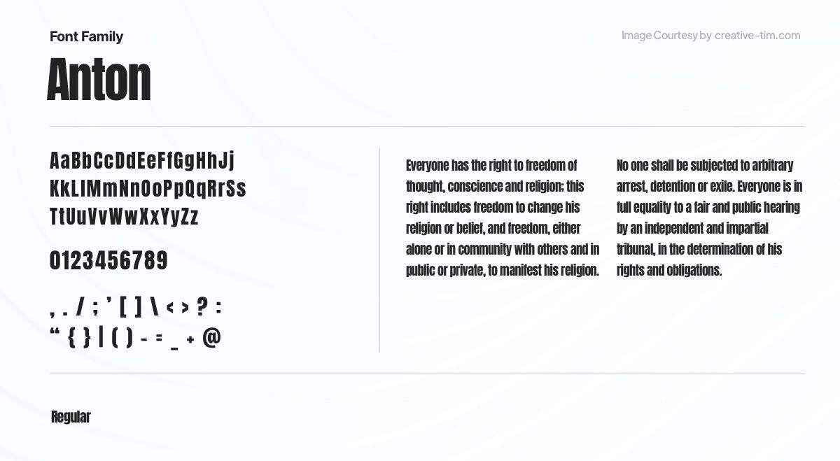
With its high contrast and geometric letterforms, Anton, a strong and eye-catching sans-serif typeface, produces a powerful impression. The attention-grabbing font Anton, created by Vernon Adams, is ideal for headlines, logos, and display projects that demand a strong visual presence. Any project benefits from the boldness and modernism that Anton brings with its angular edges and powerful appearance.
17. Pacifico
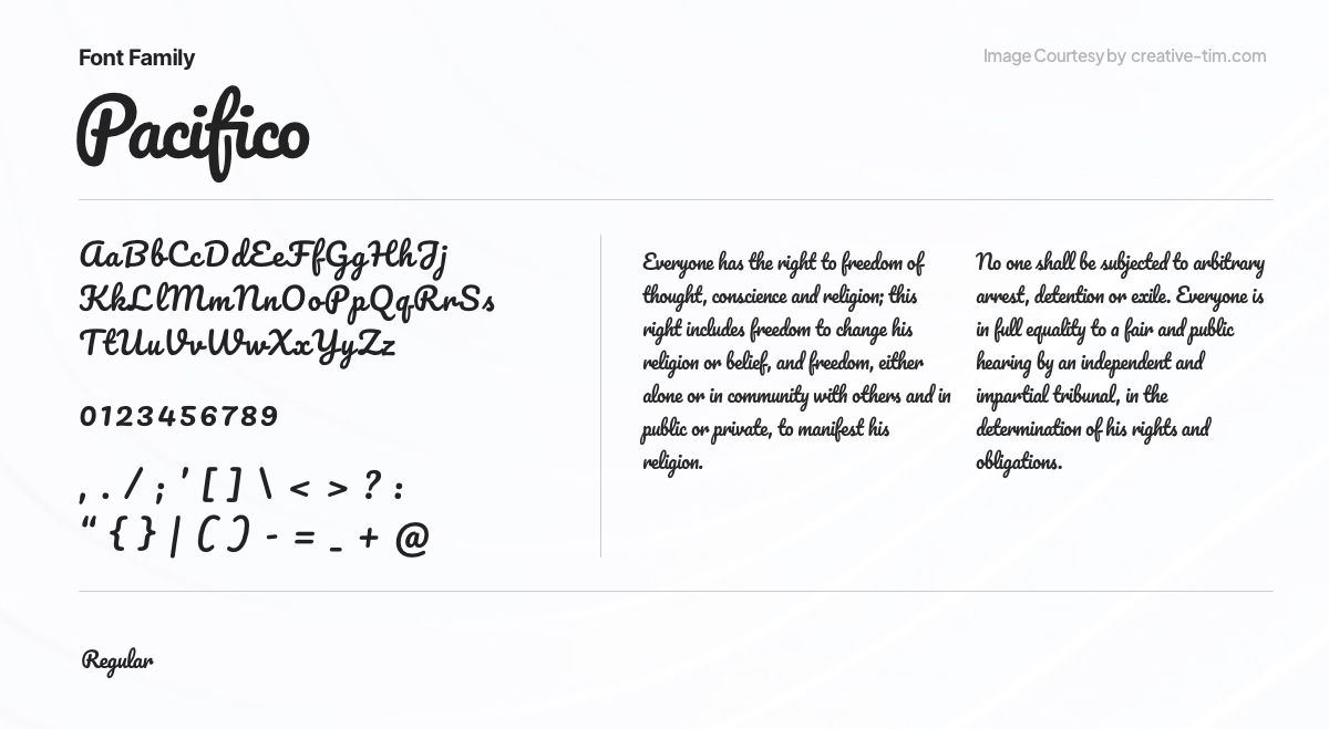
A playful and liberated script typeface, Pacifico exudes a relaxed, hand-drawn appeal. Pacifico, which was designed by Vernon Adams, perfectly encapsulates the spirit of informal elegance, making it ideal for branding, logos, and other visual elements that want to generate a feeling of creativity and warmth. Pacifico adds charm to any project with its flowing letterforms and playful character.
18. Space Grotesk
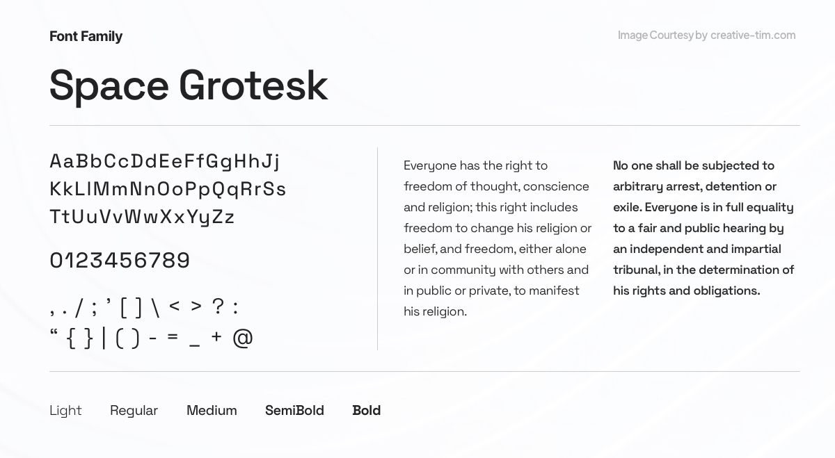
Space Grotesk is an adaptable, futuristic sans-serif typeface with a clean, modern look. It was created by Florian Karsten and strikes the perfect mix between geometric accuracy and contemporary simplicity, making it perfect for editorial projects, branding, and digital interfaces. Space Grotesk gives a sense of modernism and refinement to any project with its simple lines and futuristic design.
19. Hubot Sans

Introducing Hubot Sans: a contemporary sans-serif font designed by the renowned artist Hubot. Seamlessly blending modern aesthetics with exceptional legibility, Hubot Sans exudes a distinct personality. With its clean lines and versatile weights and styles, this font brings a touch of contemporary sophistication to a wide range of design applications.
20. Nunito
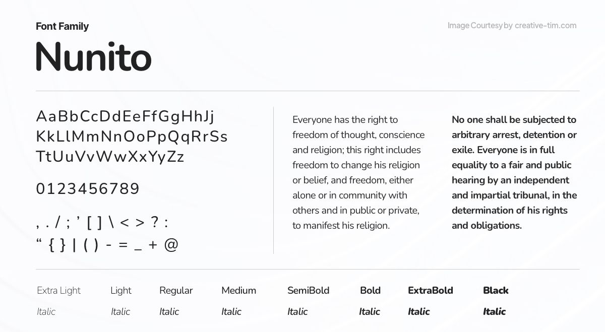
Nunito, a versatile and modern sans-serif font designed to provide optimal legibility and visual harmony. Created by Vernon Adams, Nunito strikes a perfect balance between elegance and functionality. With its gentle curves and balanced letterforms, Nunito adds a touch of sophistication to a variety of design projects, from branding to editorial layouts.
21. Satoshi
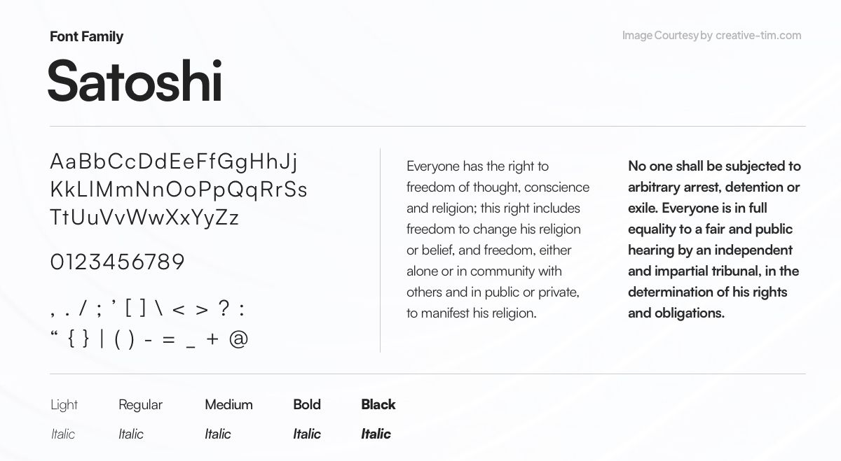
Presenting Satoshi, a sleek and futuristic display font that captures the essence of modern design. Crafted with meticulous precision, Satoshi showcases clean lines and geometric forms that exude a sense of technological sophistication. With its sharp edges and contemporary style, Satoshi is perfect for branding, tech-related projects, and designs that seek to make a bold statement.
22. Lora
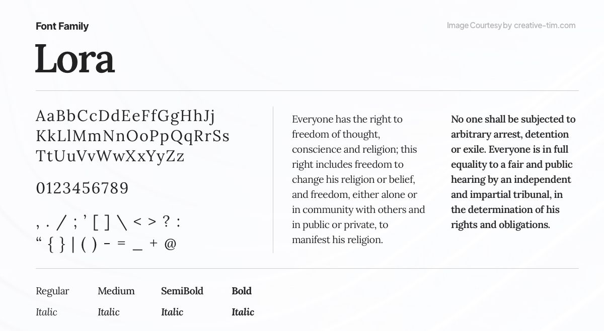
Lora is a graceful and adaptable serif typeface that combines traditional beauty with modern appeal. Olga Karpushina's Lora boasts a perfect blend of graceful curves and robust letterforms. With its timeless charm and excellent readability, Lora is an excellent choice for editorial designs, branding, and projects that require a touch of refined sophistication.
23. General Sans

A pragmatic and adaptable sans-serif font designed for versatile applications. With its clean lines and well-balanced proportions, General Sans offers a functional and straightforward approach to UX typography. Prioritizing legibility and usability, this font is a reliable choice for a wide range of design projects, ensuring clear communication and a modern aesthetic without unnecessary embellishments.
24. Epilogue
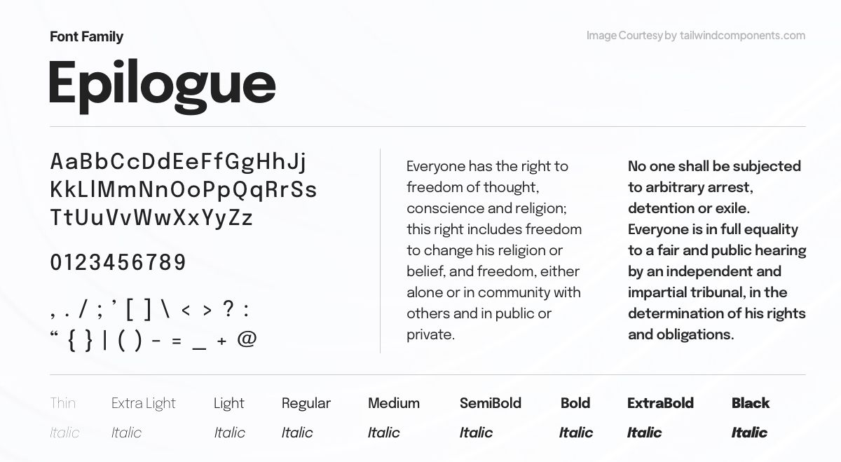
Epilogue is a versatile sans-serif typeface family consisting of 18 styles, including 9 Uprights and 9 Italics. With the addition of a variable style with a weight axis, Epilogue offers flexibility in design choices. Supporting a diverse range of languages within the Latin script scope, this project is led by Tyler Finck, a talented type designer at Etcetera Type Co based in Ithaca, New York, USA. Epilogue combines functionality, aesthetic appeal, and linguistic support.
25. Clash Display
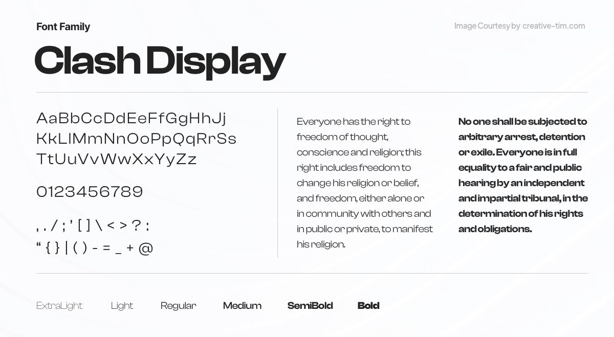
Clash Grotesk Display, a sans-serif font family designed for large sizes, boasts a neo-grotesk style with a unique twist. Its letterforms feature small 'apertures,' creating a distinctive look with almost closed counters. Eye-catching yet balanced, Clash Grotesk Display suits corporate branding and excites editorial designers. It has a companion font, Clash Grotesk, for smaller text, with optically monolinear strokes and proportional lining figures. The fonts' tall x-height, ascenders, and contrasting stroke connections make Clash Grotesk Display's appearance striking, with a double-story 'a' and single-story 'g.'
26. Bespoke Serif
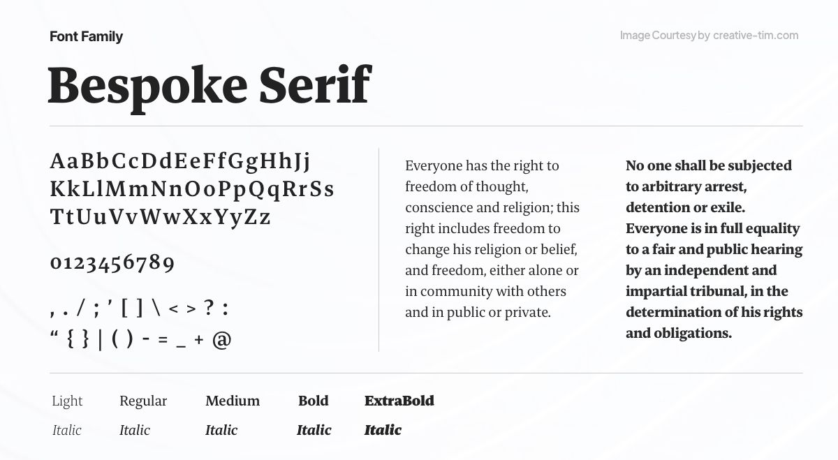
Bespoke Serif, a versatile serif font family crafted for optimal legibility in text sizes, is designed for effortless reading. Its wedge-shaped serifs and open counter forms enhance clarity. As part of the Bespoke superfamily, which includes Bespoke Sans and Bespoke Sans Stencil, this font series excels in branding, corporate communication, and editorial design. It is a collaborative effort by Jeremie Hornus, Theo Guillard, Morgane Pambrun, Alisa Nowak, and Joachim Vu.
27. Dancing Script
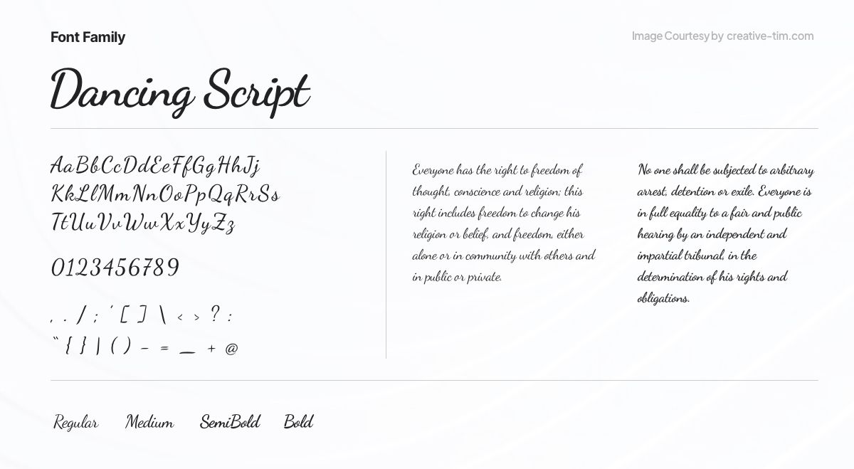
Dancing Script, a lively and casual script font, exudes a playful charm with its bouncing letters and slight size variations. Its prominent capitals extend below the baseline, paying homage to popular 1950s script typefaces like Murray Hill and Mistral. Designed by Pablo Impallari of Impallari Type, Dancing Script adds a friendly, informal, and spontaneous touch to your designs.
28. Switzer
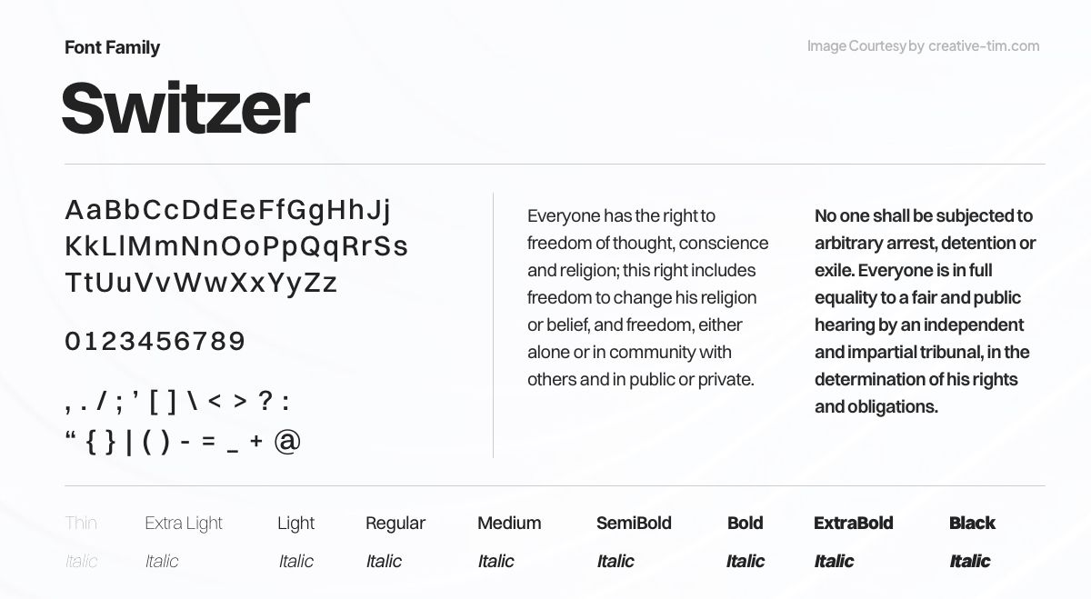
Introducing Switzer, a Latin-script typeface family consisting of 18 styles, including nine italics. With its neo-grotesk design, Switzer presents a classic and timeless appearance, reminiscent of earlier typefaces yet crafted for contemporary usage. While the neo-grotesk style has global origins, renowned Swiss designers have contributed to its popularity. Switzer captures the essence of this influential design tradition.
29. Teko
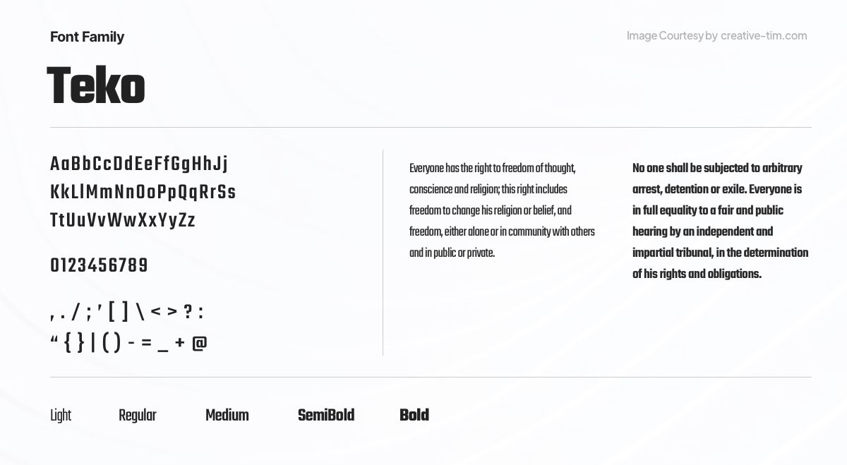
Teko, an open-source typeface by Indian Type Foundry, is designed for impactful headlines and display-sized text. With low stroke contrast and square proportions, its visually simple structure is versatile in both screen and print. The Regular, Medium, and Semibold fonts suit long headlines, while Bold emphasizes shorter phrases. Teko's Light variant shines in large headlines, making it an excellent choice for advertising and news tickers.
30. Chillax
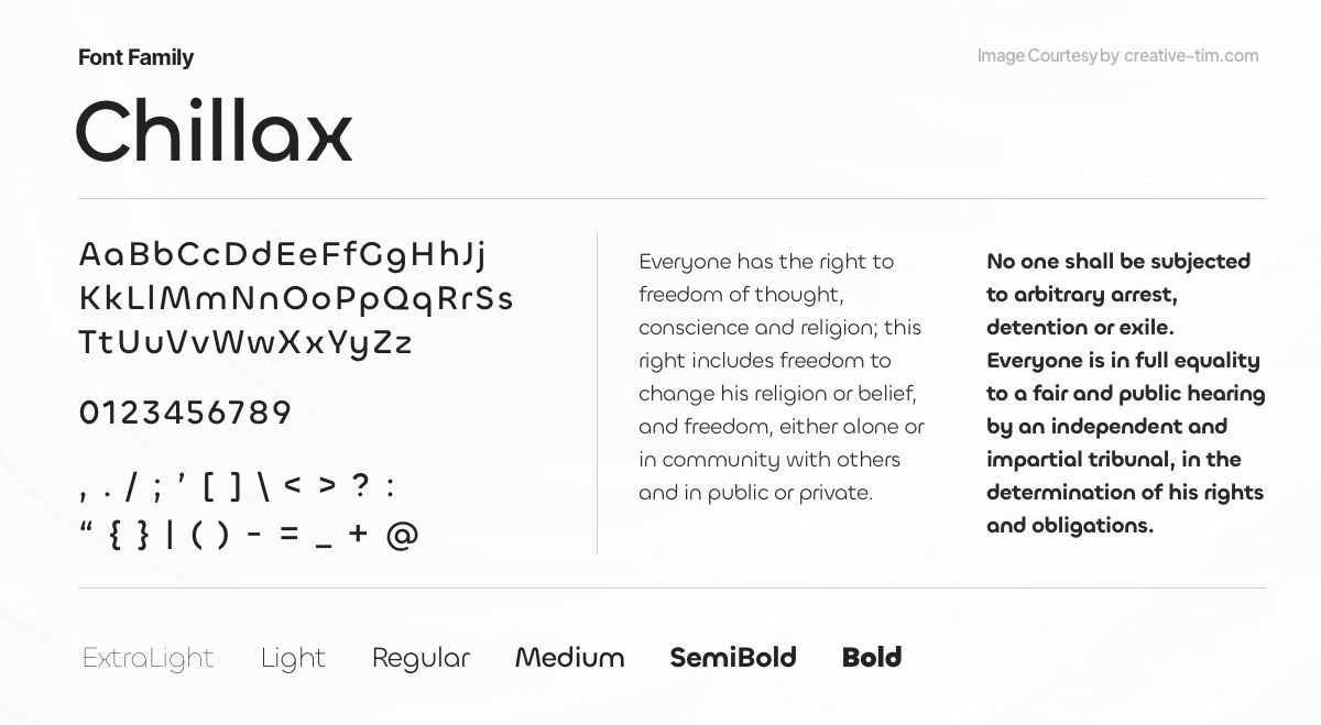
Introducing Chillax, a geometric sans-serif font inspired by 1920s modernism. Perfect for online and print headlines, it brings a touch of sophistication to contemporary editorial designs. With a 'Bauhaus' style and alternate letterforms, Chillax offers versatility. Available in standard and variable font formats, it allows precise stroke thickness selection. Enhance your cultural or lifestyle app with Chillax's unique charm.
31. Supreme
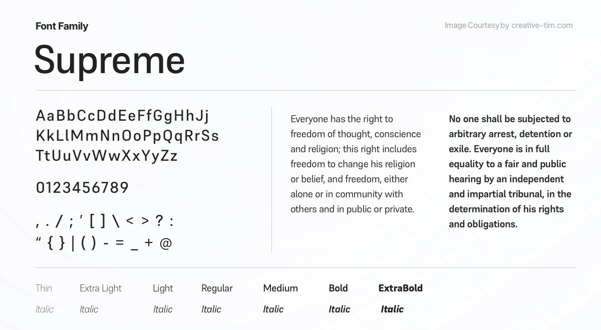
Supreme, a constructed-style sans-serif font family, pays homage to engineers with its straight-sided letters and monolinear strokes. Ranging from Extralight to Extrabold, Supreme's moderate x-height and prominent ascenders/descenders make it stand out. Originally used in engineering and tech branding, it now finds popularity for on-screen text. Ideal for body copy in print or on screen, Supreme's weights excel at larger sizes. It was designed by Jeremie Hornus and Ilya Naumoff.
32. Styro
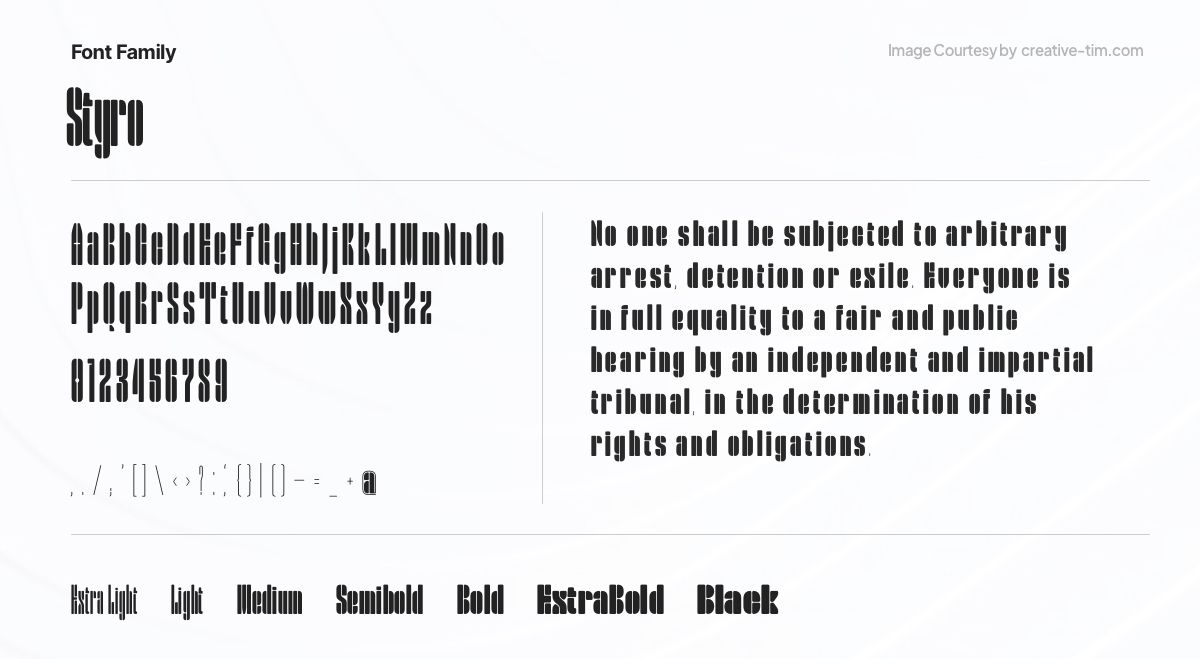
Styro, a modernist-style stencil font family, offers eight weights from Thin to Black. Its virtually monospaced design features condensed characters with thin lines as counterforms. With geometric stroke terminals, Styro captures a reductionist aesthetic. Developed by Aarya Purohit at Indian Type Foundry, it's an excellent choice for editorial design on modern art.
33. Pally
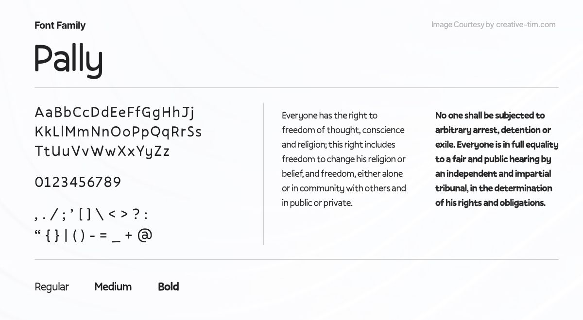
Pally, an informal sans-serif design by Jean-Baptiste Morizot, offers wobbly letterforms and varying sizes, adding character and charm. Ideal for children's services projects, Pally's unique rhythm reveals underlying typographic sophistication. With ascending lowercase letters, a double-story 'a', a single-story 'g', and a diagonal stroke 'e', it brings a playful touch. Each Pally weight maintains a monolinear style, leaving space for diacritics.
34. Azeret Mono
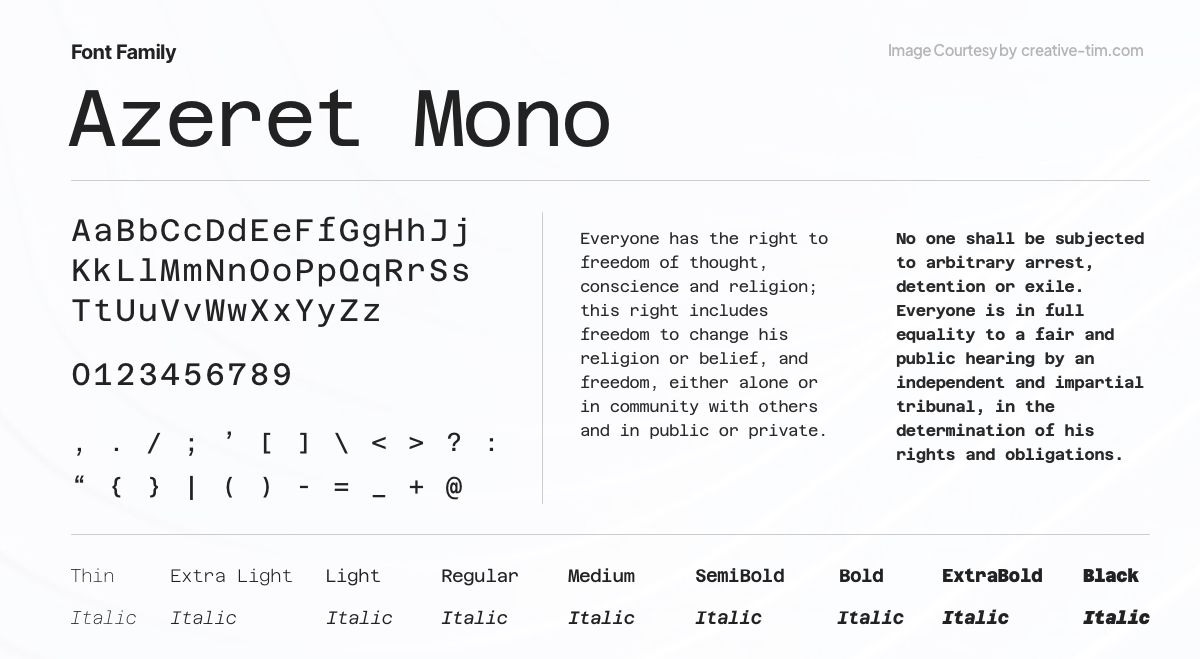
Azeret Mono, a monospaced typeface, features a mono-linear character. Inspired by OCR fonts, past and futuristic operating systems, and interfaces, its design evokes a nineties aesthetic. Created with the goal of serving in operating systems, Azeret Mono combines various influences to create a distinctive and personality-filled appearance.
35. Aileron
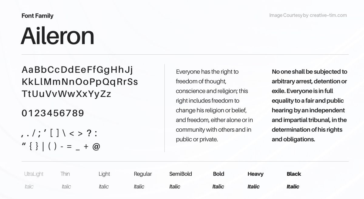
Aileron, a contemporary sans-serif font, blends elegance and versatility. With its clean lines and balanced proportions, Aileron offers a sleek and modern aesthetic. This font is ideal for various design projects, from branding to editorial layouts, adding a touch of sophistication and professionalism with its timeless appeal.
36. Ferrum
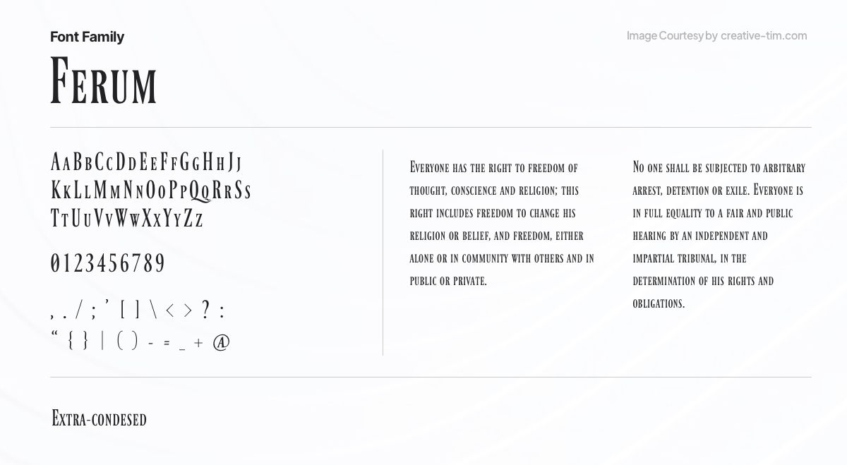
Ferrum, a bold and powerful display font, commands attention with its strong and impactful letterforms. Inspired by industrial aesthetics, Ferrum evokes strength and resilience. Perfect for headlines, logos, and branding materials, this font adds a robust and authoritative touch, making a lasting impression.
37. Crimson Text
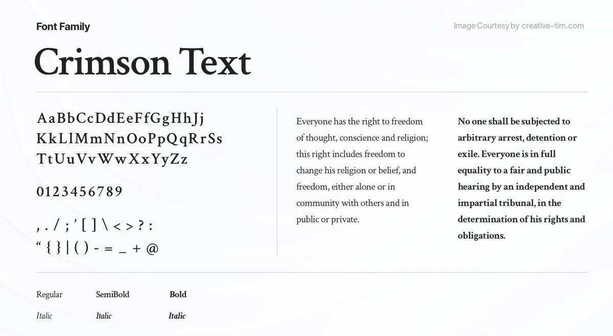
The adaptable serif typeface Crimson Text blends classic beauty with modern readability. Crimson Text has a classic appeal and is created for easy reading in print and digital media. This typeface is a dependable option for editorial projects, books, and long-form material because of its balanced letterforms and wide language compatibility, which results in a timeless and elegant typographic experience.
38. Rubik

The contemporary sans-serif font called Rubik perfectly balances friendliness and geometric accuracy. Rubik has outstanding readability and adaptability across a range of design projects because of its clear and basic style. Due to its distinctive character, this typeface is a great option for branding, interfaces, and display typography.
39. Courier Prime
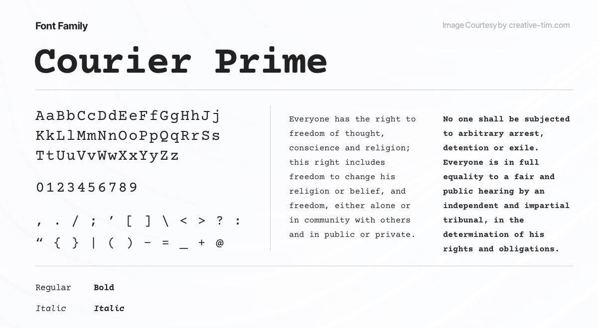
Courier Prime, a monospaced font, pays homage to the classic typewriter aesthetic while offering enhanced legibility and refined details. With its fixed-width characters and distinct typographic heritage, Courier Prime is an excellent choice for applications that require a vintage and reliable look, such as screenplays, coding, and nostalgic design projects.
40. Anek Devanagari
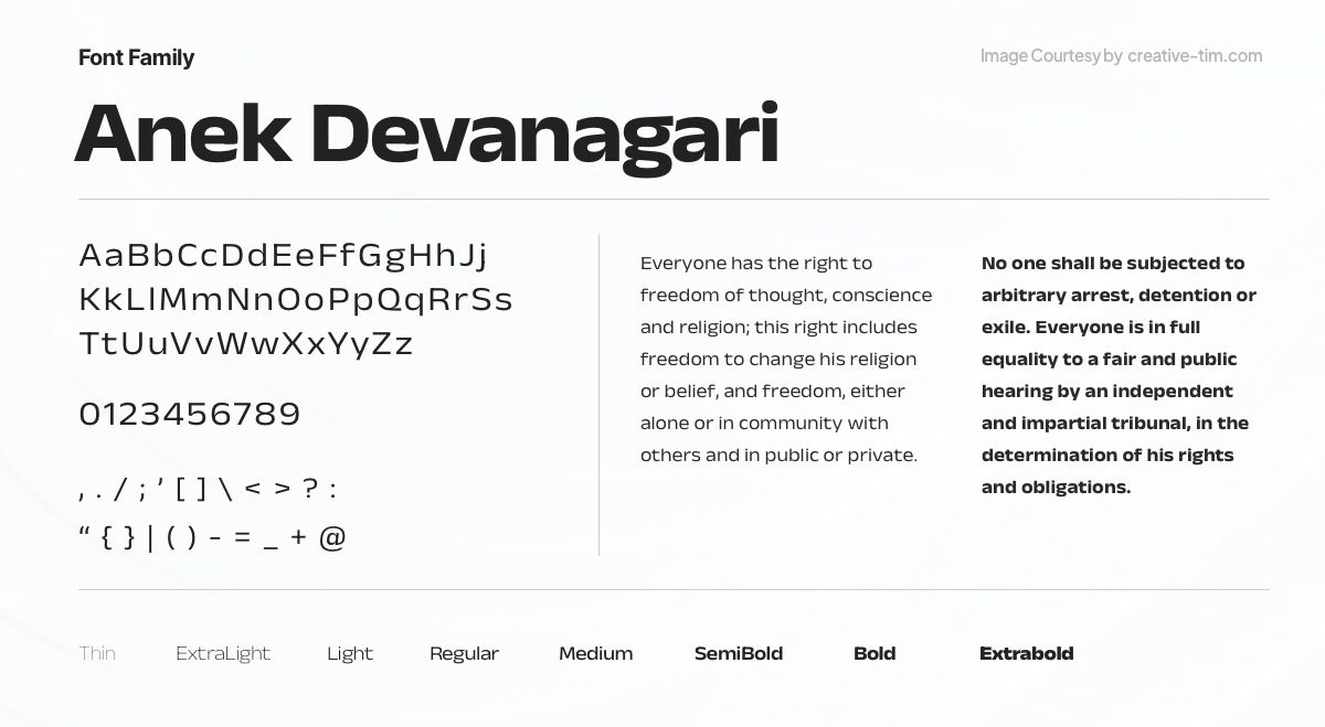
The Devanagari script's elegance is brought to life by the beautiful and adaptable typeface Anek Devanagari. Anek Devanagari reflects the grace and harmony of the script's letterforms thanks to meticulous design and cultural authenticity. It is a great option for presenting the rich legacy of the Devanagari script in a variety of design projects because to its vast range of weights and styles.
41. Work Sans
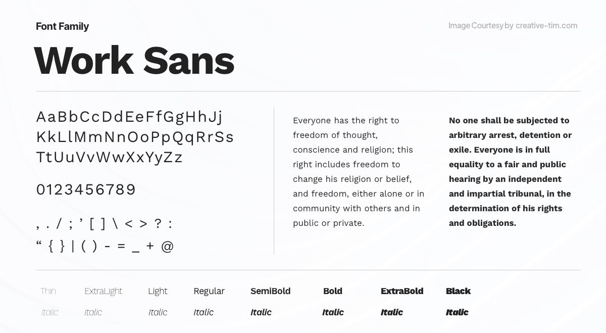
Work Sans is a sans-serif modern design font that combines aesthetic and usefulness. Work Sans provides exceptional readability thanks to its clear and balanced letterforms. This typeface was created for the best readability and is a dependable option for both print and digital media, making it perfect for editorial designs, user interfaces, and websites.
42. Fira Sans

Embrace the versatility of Fira Sans, a font that effortlessly marries elegance with functionality. Its balanced proportions and crisp letterforms deliver impeccable legibility across diverse mediums. From digital interfaces to print masterpieces, Fira Sans injects a contemporary allure into every website, becoming the trusted companion for unleashing creative expression.
43. Outfit

Outfit is the official typeface of brand automation business Outfit.io. It is a geometric sans-serif font. Outfit.io proudly introduces its own font family, which was inspired by the ligature-heavy outfit wordmark. This typeface automatically provides on-brand communication due to its seamless relationship to the Outfit writing voice and product marks.
44. Public Sans
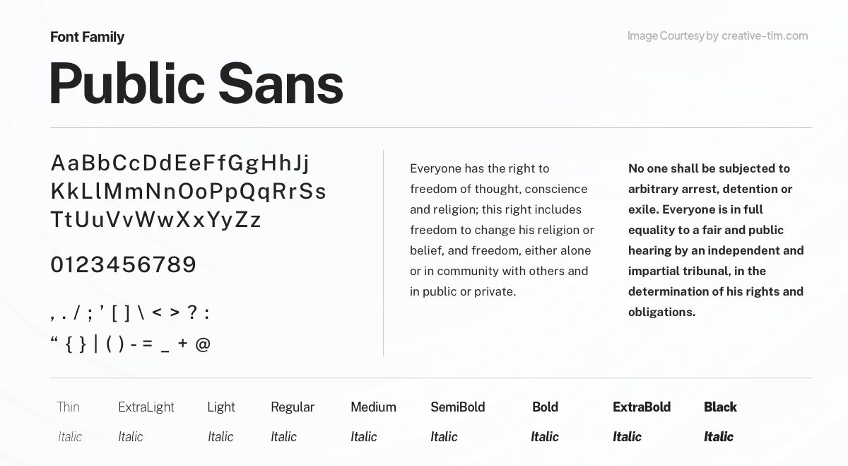
Public Sans, built upon the foundation of Libre Franklin, is a robust and neutral typeface designed for interfaces, text, and headings. Developed by the United States Web Design System, it offers a versatile and reliable solution, ensuring clarity and readability in digital environments.
45. Be Vietnam Pro
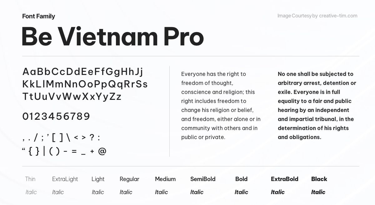
Be Vietnam Pro, a Neo Grotesk typeface, caters specifically to tech companies and startups. With its refined Vietnamese letterforms, including adaptive diacritics, it prioritizes optimal readability. Engineered with care, Be Vietnam Pro ensures clear communication and visual harmony, making it an excellent choice for modern digital environments
46. Manrope
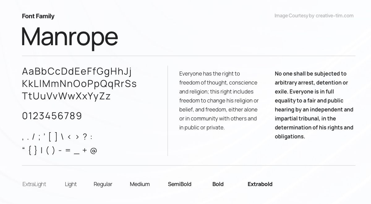
Manrope, an open-source sans-serif modern free font family, was created by Mikhail Sharanda in 2018. In collaboration with Mirko Velimirovic in 2019, it was transformed into a variable font, offering enhanced flexibility and adaptability. With its clean and contemporary design, Manrope is a versatile choice for UI projects.
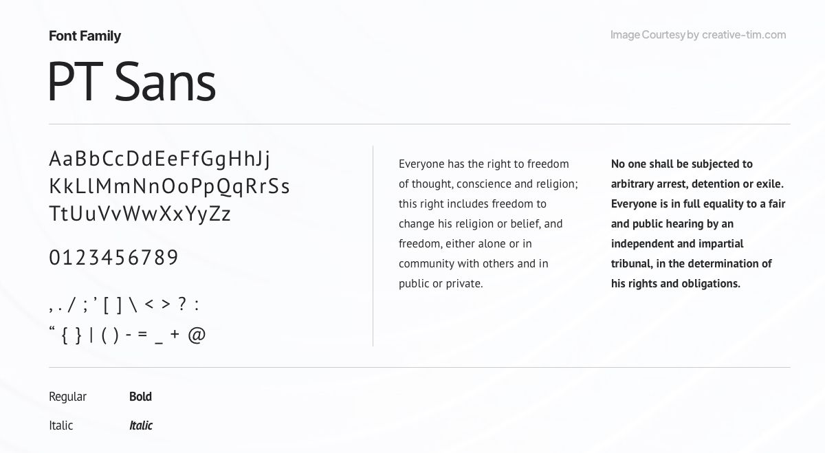
47. PT Sans

PT Sans, part of the "Public Types of Russian Federation" project, is a font designed to promote native language usage. With a blend of Russian sans-serif and contemporary humanistic design, it offers eight styles suitable for diverse typographic needs. Released by ParaType in 2009, it commemorates Peter the Great's civil type invention.
48. San Francisco
San Francisco, a neo-grotesque sans-serif typeface, was created by Apple Inc. and introduced to developers on November 18, 2014. Serving as Apple's first new typeface in nearly two decades, it draws inspiration from Helvetica and DIN, resulting in a modern and versatile design that complements Apple's visual identity.
Disclaimer:
This font is licensed to registered third-party developers only for the design and development of applications for Apple's platforms. If you want to use it in your other projects, you must contact Apple.
49. Raleway
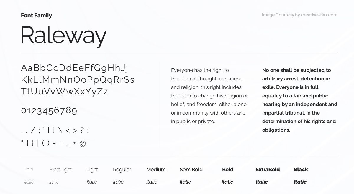
Raleway, an elegant sans-serif typeface family, offers a range of weights and styles. Designed by Matt McInerney, it was expanded by Pablo Impallari and Rodrigo Fuenzalida. With versatile features like numerals, ligatures, and alternate characters, Raleway is a refined choice for displays. It also has a dotted variation called Raleway Dots.
50. Merriweather
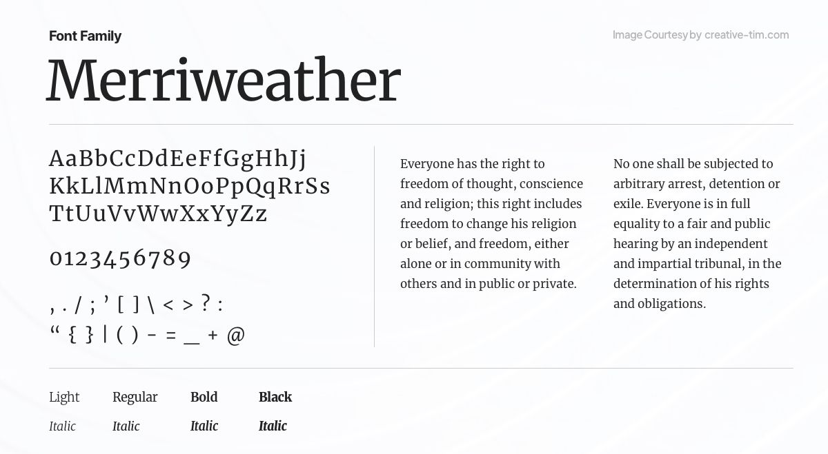
Merriweather, a text face optimized for screen reading, offers a large x-height, slightly condensed letterforms, and sturdy serifs. Its open forms and mild diagonal stress enhance legibility. Additionally, Merriweather Sans, a complementary sans-serif version, harmonizes seamlessly with the weights and styles of the serif family, providing versatile typographic options.
Ready To Choose Your Font?
Typography plays a vital role in web design, contributing to the overall user experience and visual appeal of websites. Choosing the right fonts is essential for effective communication, branding, and establishing a cohesive design language.
With an abundance of good-looking fonts available, designers have the opportunity to explore a vast collection of typefaces suitable for various purposes. From elegant and timeless serifs like Libre Baskerville to modern and versatile sans-serifs like Montserrat, our selection of fonts has something for everyone.
By understanding the principles of typography and utilizing good free fonts, UI/UX designers can elevate their web designs to new heights, delivering captivating and engaging experiences to users.
If you want to learn more about UI/UX design, then make sure to check out our UI/UX Design Book!