You can see quality development with the naked eye, and you don’t need to be a mega expert to estimate how long you want to stay on a website. An unreadable text curve is the first reason why a visitor will leave your link in 10-15 seconds after login.
Secondly, the uniqueness of the web resource: given the fact that at the current rate of Internet space’s progressive development, to find absolutely unique content is simply an unrealistic task (but possible with this service), your job is to make the submission of this content unique. In the battle of competing sites, always wins the one who does not neglect the simple rules of development, but on the contrary – effectively applies them and gets the most out of them.
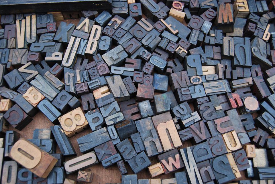
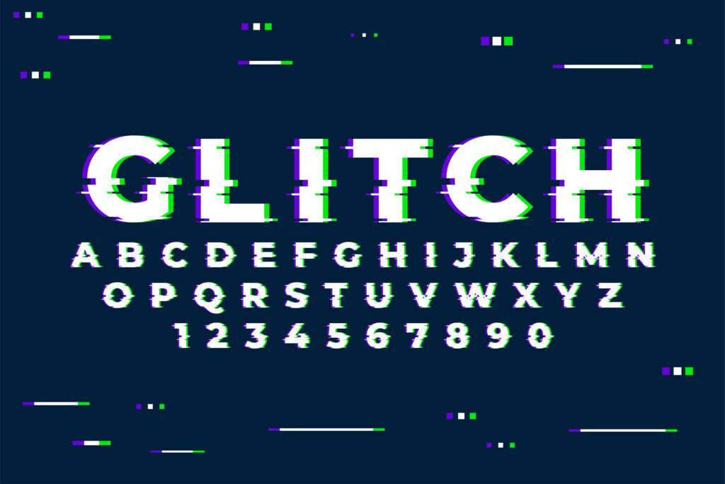
Basics of typography in web design
Fonts in web-design
Typography in web design has quite natural laws and rules. Let’s start with the fonts. The right choice of fonts will largely determine your development concept and will affect the overall perception of the resource.
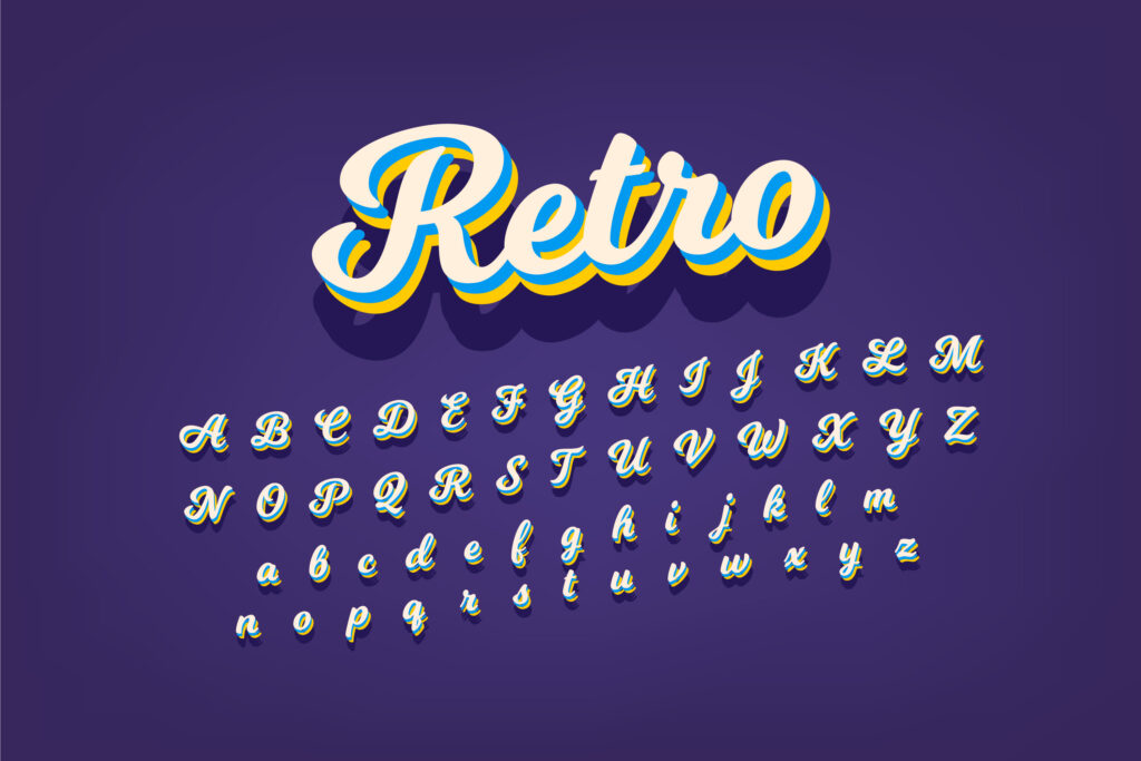
Even in the recent past, designers could use only those fonts that accompanied the operating system. All the great versions were nothing more than an image or a flash. There were workarounds, but there were a lot of distractions.
Implementation of the @font-face CSS property simply untied the designers’ hands. It prescribed a link to any font file, and it is now used on the pages of the site. There are some dissatisfactions on the part of developers on this topic, but it turned out to be quite a solvable problem.
I note that not all fonts are suitable for competent web-design. Mainly due to their illegibility and difficult perception from the screen. Some fonts are too heavy and hamper the work of resources – be sure to pay attention to this. I will also add a technical feature when working with fonts: their display in different browsers – there is such a problem of processing the file or even the whole family.
Macro and micro typographic
As you probably already understood from the name of these terms:
macro-level – builds the general structure of the text, determines the location of content relative to the design;
Micro-level – pays attention to the smallest details, spaces, intervals, indents, etc.
The macro typography task is global – to make text blocks alive, active, but harmonious and integral. In micro typography, the task is simpler but no less important – to ensure readability. There are many examples of successful and failed solutions to these problems on the Internet.
Building a complete composition, first and foremost, lies in understanding the space. Web-designer must see the whole picture, but at the same time, intelligently spread it out in detail. There are no insignificant elements here: title, paragraph, vertical distances between elements, registers, thickness, and so on.
Fonts for web design should preferably be specified in relative units (% or “em”). This promotes the adaptability and flexibility of the content. The more familiar “px” pixels make sense for non-adaptive containers, where blocks move as the screen size changes, and the font remains stable.
Summary
Web design consists of 95% typography. Believe it or not, everyone will decide for himself. But the text that can not be read is a product without purpose. My advice to you, start paying attention to the quality of information presented at once; do not delay. That’s all I have. Subscribe to updates, and you will not miss the most exciting things!


![15+ Top Black Friday & Cyber Monday Deals for Developers and Designers [2023]](/blog/content/images/size/w960/2021/11/black-friday-deals-developers-1.jpg)