Colors are crucial in web design, impacting how users feel, where they look, and how they remember a brand. Picking the right colors isn't just about looks—it makes the website easier to use and more appealing. In fact, colors really affect how people experience a website, shaping their feelings and actions; they're also a big part of branding, making a brand recognizable and unique.
Continue to read to discover practical tips for effective color choices in web design to convey the essence of a brand's personality and values.
How to choose and use colors effectively in web design
There is no doubt that strategic color selection shapes user emotions and reinforces brand identity for a distinct and engaging online experience. So, let’s discuss how to select and apply colors proficiently in web design.
1. Consider the Brand Identity
In web design, colors should match your brand's identity. By using colors that represent your brand's values and feelings, your website becomes a true reflection of who you are. When you stick to your brand's color rules and use them well, these colors not only make your site look good but also help people remember and connect with your brand. Additionally, all the branding materials you will place on the website have to follow the color rules, even your logo, so you can use a logo maker to create a logo that will stick to these rules.
Colors do more than just look nice; they talk to people. They can make people notice things, understand what's important, and know where to go on your site. So, when you're designing your website, think about the people who will visit it and how they might feel about different colors. Make sure the colors you choose tell the story you want your brand to tell.
2. Understand target audience
To effectively utilize colors in web design, it's crucial to grasp your target audience's preferences and demographics. Tailoring your color palette to their age, cultural background, and industry expectations can evoke emotions that resonate with them, fostering a stronger connection to your website. Furthermore, aligning your color choices with your audience's preferences can positively impact the customer satisfaction index, enhancing their overall experience on your website.
Striking the right balance between aesthetics and usability is key. Colors should not only align with your brand's message but also ensure readability and accessibility, enhancing the overall user experience. By empathizing with your audience's preferences and understanding the psychology of colors, you can create a visually appealing and engaging web design that leaves a lasting impact.
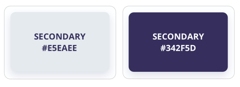
3. Start with a Neutral Base
To effectively harness the power of colors in web design, it's prudent to begin with a neutral base. Neutrals, such as grays and soft tones, establish a versatile backdrop, allowing accent colors to shine and effectively communicate your intended messages and emotions to your audience.
Tailoring your color choices to resonate with your target audience is paramount, as discussed in the context of demographics, cultural nuances, and the psychological impact of colors.
In this stage, you can get guidance from the UI/UX Design Book, which helps readers grasp fundamental website design elements like buttons and cards, as well as gradients and color palettes as well. Whether it's an experienced designer seeking to refine your skills or a newcomer venturing into the realm of UI/UX, this book stands as their reliable partner in achieving design excellence.
4. Limit Your Color Palette
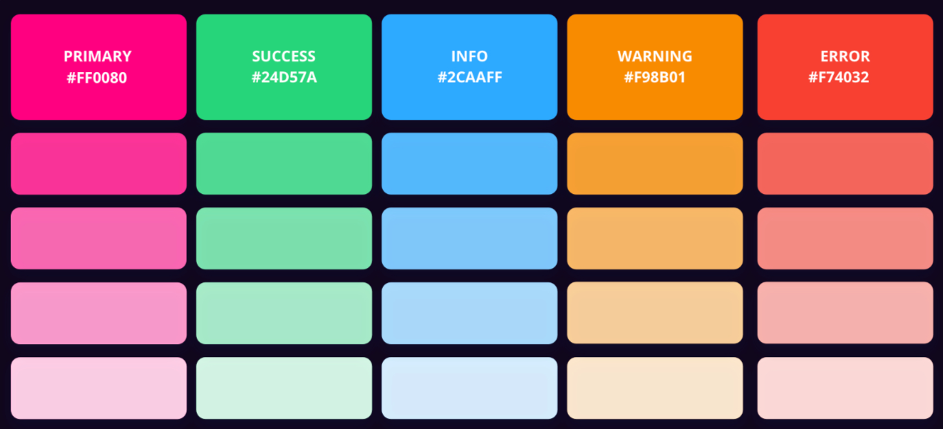
When choosing and using colors effectively in web design, limiting your color palette can lead to a cleaner and more cohesive visual experience. Restricting the number of colors used on your website ensures a harmonious and focused design, preventing overwhelming or distracting your audience from your core message. In addition, integrating a white label video conferencing solution can provide seamless virtual interactions, complementing your web design's simplicity and enhancing user engagement.
Select colors that align with your brand's identity and the emotions you want to convey. Consider the psychology of colors to evoke the desired feelings from your audience. This approach not only enhances the aesthetic appeal but also strengthens the overall impact of your website.
Prioritize the user experience by ensuring that your chosen colors offer sufficient contrast for readability and accessibility. Colors should guide users' attention to important elements, such as calls to action. By placing your audience at the center of your color decisions, you can create a web design that resonates and engages effectively.
5. Use Contrast Wisely
Effective web design hinges on skillful contrast incorporation. Carefully chosen color contrasts, especially between text and backgrounds, are essential for readability and accessibility, making your content friendly to all users.
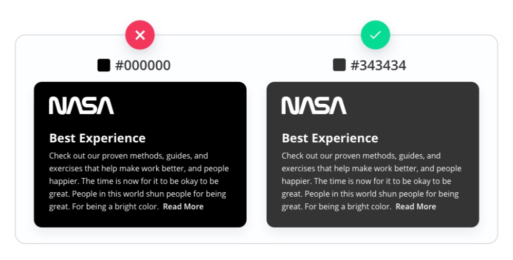
Moreover, using contrasting colors for key elements like navigation buttons grabs attention and encourages user interaction, enhancing engagement on your website.
Contrast isn't just practical—it's a powerful tool for blending style with function. By orchestrating a play of colors with different strengths, you establish a clear visual hierarchy that guides users seamlessly. This harmonious fusion of looks and usability creates an engaging user experience, adhering to modern design principles and bolstering your website's impact.
6. Prioritize Readability and Accessibility
When it comes to effective color use in web design, making sure your content is easy to read and accessible is really important. Using color contrasts that make text stand out helps everyone enjoy the website, and following accessibility guidelines ensures that the design works well for people with different needs, showing that you care about all users.
Choosing colors that help people read and access your content lets users engage smoothly. Getting the contrast right between text and background doesn't just make things clearer, it also encourages users to explore your website, making their browsing experience positive and enjoyable.
7. Maintain Consistency
Consistency is key in effective web design, especially when it comes to colors. Using the same colors across your website makes your brand recognizable and helps users feel comfortable. When you stick to a consistent set of colors, it creates a nice look that reminds people of what your website is all about.
Here are five important things to remember when keeping colors consistent in web design:
✓ Unified brand identity
Consistent colors reinforce your brand's identity and help users associate specific hues with your business or organization, establishing a memorable visual impression.
✓ Visual flow and navigation
Employing consistent colors for navigation elements, buttons, and links creates a seamless visual flow, guiding users intuitively through your content and encouraging interaction.
✓ Enhanced user experience
A consistent color palette simplifies the user experience by reducing cognitive load. Visitors can quickly identify recurring elements and understand their functionalities.
✓ Cross-platform recognition
Maintaining color consistency ensures your website retains its recognizable look across various devices and platforms, contributing to a cohesive user experience regardless of screen size or technology.
✓ Professional aesthetics
A harmonized color scheme exudes professionalism and attention to detail, instilling confidence in your visitors and signaling a well-thought-out web presence
Overall, maintaining color consistency in web design not only creates an appealing and professional aesthetic but also contributes to a cohesive, user-friendly, and memorable online experience.
To sum up
Effective color choices play a pivotal role in user engagement, influencing emotions and guiding attention on websites. By harnessing the potential of colors, you can elevate the user experience and effectively communicate your brand's identity.
Implementing the actionable tips that the article suggests, designers can craft successful web design color schemes, ensuring a visually appealing and engaging online presence.