We all know fonts are the way text appears, but they’re so much more than that. When you open a Word document, the font is one of the settings you tweak before submitting your material. Not sure which font to provide your English paper in? Times New Roman is the default. Yet, why is this? There are reasons as to why specific fonts are used in certain situations, and although we may be subconsciously aware of this, the facts can’t lie.
Not sold yet? Keep reading.
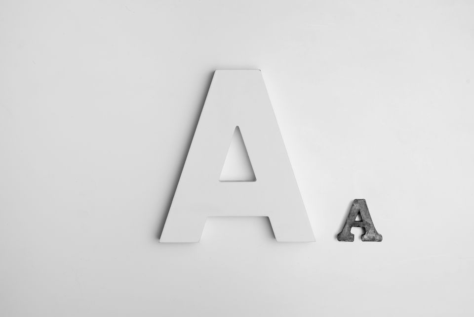
Let’s start with a short exercise just to set you up for my claim.
Look at the fonts![]() and,
and,![]() for example.
for example.
Imagine you’re writing a professional cover letter for your dream job. You’ve dreamed your whole life for this position, went to school to meet the qualifications, and tweaked your resume to present yourself in the best light. If you had to pick one of these fonts, which one would you choose? Que intense frustration now. Pacifico has a personality, but Syncopate is transparent and easier to read. In reality, you wouldn’t pick either of these. Most likely, the hiring manager wouldn’t even read your cover letter if you chose one of these fonts.
Fonts Provoke Feelings
Now I’m not implying that BlackJack is a tear jerker or Impact is going to make you want to punch a hole in a wall, but the fonts you use to project a message that your text cannot. It’s like when you get into a fight with your significant other, and they’re not mad because of what you said, but the tone you used. Fonts are the vehicle for your message, so use them wisely.
Did you know that Baskerville is considered a trustworthy font? Compared to other fonts, information put in Baskerville is more likely to be trusted. Perhaps this is due it’s a sense of British formality making it seem more credible, suggested professor David Dunning.
The impression is key! Your font is equivalent to the outfit you choose for an interview. Want to look classy, put-together, and professional? Times New Roman, Arial, and Baskerville are great choices. Seeming to appear tasteful and modern? Lato does the job.
Still, don’t believe me? Look around at the fonts used in various advertisements throughout the day. Depending on the company and the product they’re selling, the fonts will change to reflect a specific feeling. Choose your font wisely, and your message will become more productive!
A Power Couple Takes Two
There isn’t a secret potion for this. When fonts are paired well together, they just work. Don’t think you have the eye for it? Use this font combination tool, by Bold Web Design!
As they say, it takes two to tango, and sometimes one font isn’t enough to make your message really dance off the page. Picking a font that reflects the message you want to present can be challenging enough, but add another font to the mix, and you may find yourself lost. You want a font that compliments the other, and supports the same message the different font is projecting.
Font overload? There are tools to help. Whether you’re just looking for inspiration on a font that best fits your work or you’ve decided on one font but haven’t found it’s perfect pair, a font combination tool can take away a lot of the headache.
Author Bio
Creativity and a flair for everything fonts, Debbie Morgan, from Bold Web Design, an Adelaide, South Australian based web design agency loves all things about fonts.

![15+ Top Black Friday & Cyber Monday Deals for Developers and Designers [2023]](/blog/content/images/size/w960/2021/11/black-friday-deals-developers-1.jpg)