Color is a vital part of any visual design — it can set the tone, influence emotions, and establish trust. Color psychology shows that the colors of your site can affect how your visitors perceive your business. This is why it’s essential to choose colors aligned with your brand identity and message.
However, with so many different colors available for use on websites, it's easy for designers to get lost in the mix when trying to find inspiration for their websites.
Here are some inspiring website color schemes and trends for 2022 that can help you create a unique design that will attract more visitors and boost sales.
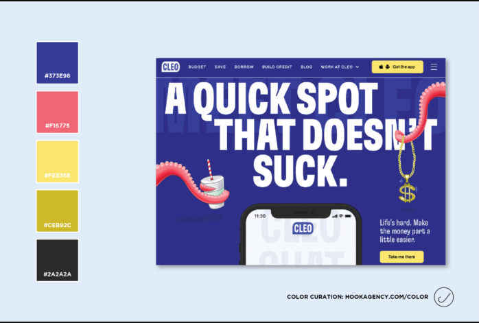
1. Colors that energize and uplift
For companies that want to energize, motivate and instill action in their target audience, using the color red in their branding — be it red logos to entire red-themed websites — can work well. The history of red is rich and varied. From battles to bullfights, the color red has always been associated with courage, power, and energy.
At the same time, people want to see colors that soothe them and are refreshing at the same time.
Have a look at this site color scheme from Mamma Mia, for instance:
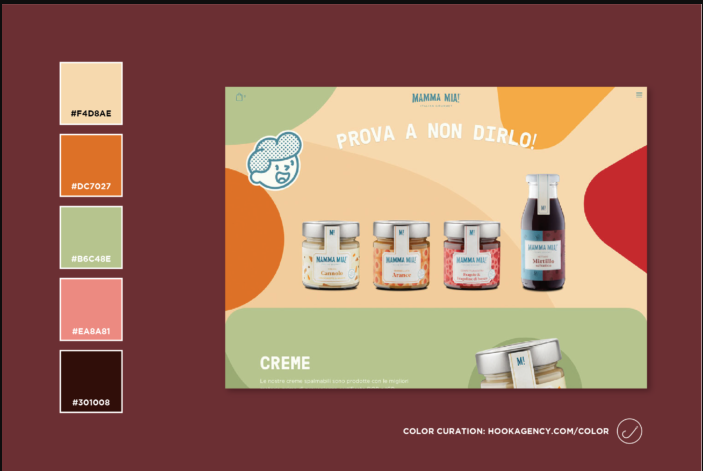
It has organic shades that are soothing as well as stimulating.
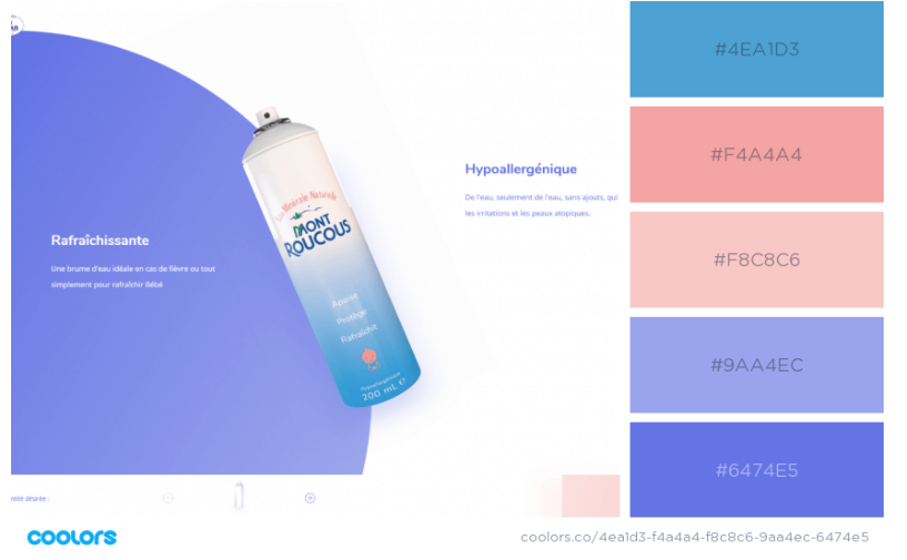
2. Creating an edgy design with pastels
Pastels are an amazing color palette that is both versatile and timeless. They can be used to create anything from a soft, feminine style to a minimal and edgy design.
At the same time, you can incorporate pastels in a maximalist design style of filling space with colors, patterns, and objects that look artistic. This web design trend is picking momentum.
Safe to say, website designs that give pastels a twist are going to be popular in 2022 – used in an unconventional way to exude an avant-garde charm and grace. It could be line illustrations, geometric shapes, or simply showcasing them in funky patterns.
Here’s an excellent example from Mont Roucous:
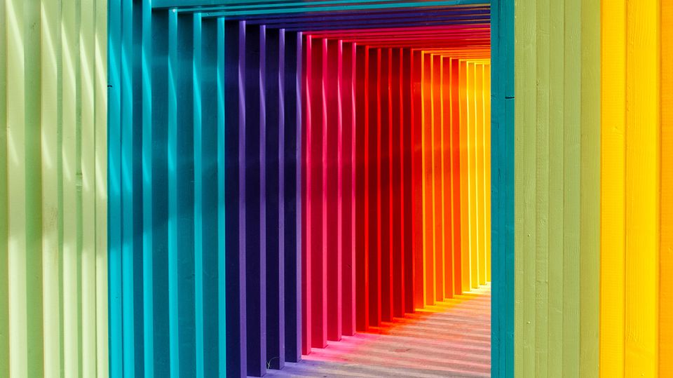
3. Traditional shades revitalized by bright and bolder tones
In the past years, we saw a continuation of minimalism. These days, we're witnessing an increase in busy designs and bold colors, but also some interesting choices for minimalism.
You will see a lot of traditional shades, such as classic blue. At the same time, there are also going to be bright and bolder tones to revitalize the color scheme they are blended in.
Book Release: Fundamentals of Creating a Great UI/UX by Creative Tim
The best way to start using bold colors is to pair them with a neutral color. This will make your UI design feel more modern and dynamic without overwhelming users.
Another thing to keep in mind is that bold colors aren't limited to bright ones. You can also use dark shades usually associated with heavy or severe emotions.
Here’s an excellent example:
4. Color of the Year: Muted green
When Better Homes and Gardens created a for the “2022 Color of the Year” publicized to date by painting companies, some variation of the muted green color emerged to be the most used shade.
Here’s an excellent use of green by an e-commerce website, The Cool Hunter.
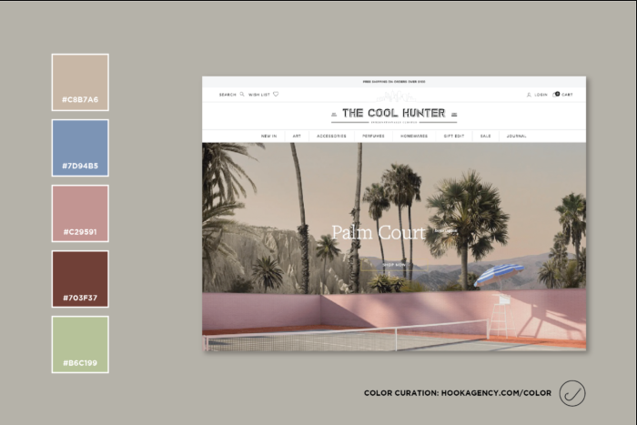
They’ve used the shade muted green simplistically as a backdrop. It shows that your site design doesn’t necessarily have to be complex to look organized and professional.
5. Neutral and earthy colors
The use of neutral colors in site design is perpetually increasing. They can include everything from beige, brown, and green to white, black, and beige.
If you are a brand with a more natural design, you can take inspiration from earthy tones, muted colors, and raw materials like plants and wood.
Jen Pierce Photography website is a good example:
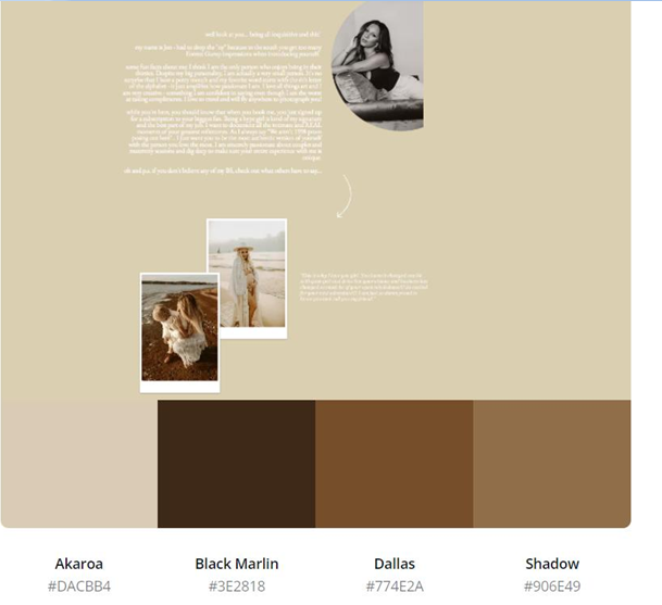
The color evokes nature and growth, which is why it's especially common to see it used on sites dedicated to gardening, health, and other topics that have some connection with the natural world. Its "muted" quality also makes it a great choice for sites that want to give users a calming and relaxing experience.
6. Simple colors and white space
The use of white space throughout website designs is a trend that began a couple of years ago and will continue through 2022.
White space is a term that refers to empty spaces of varying sizes in a design layout. Designers use white space to draw attention to certain elements within a composition and direct viewers’ eyes toward specific points on a page.
With white space, designers have an opportunity to create contrast between text, images, and other elements. The judicious use of white space can also help make your website appear cleaner, brighter, and more appealing overall.
If you look at Revise Concept’s website, it uses simple colors and white space to draw attention to the colors and designs of the clothes instead of relying on colors in the site’s color palette.
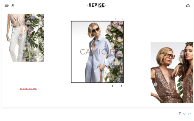
If you are an e-commerce site, you will want to steal this idea and let your products speak for themselves instead of creating a punchy design to tell your product story.
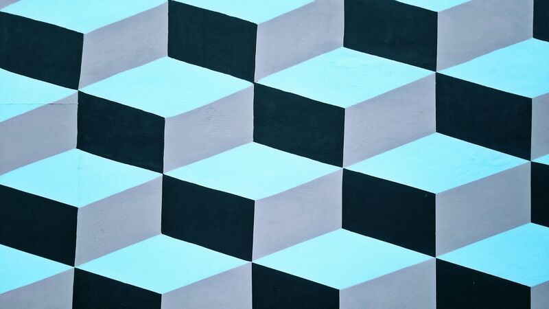
7. Art deco motifs
The art deco style focuses on geometric shapes and bold color combinations. This time around, web designers are taking inspiration from the neat, curving lines and recurring graphic shapes of art deco illustration and architecture to create websites that are visually pleasing and stand out.
It is characterized by its use of bold motifs, such as zigzag lines or chevron patterns, and was often embellished with glitzy detailing.
Popular palettes included:
- Lime Green/Pink
- Turquoise/Gold
- Mint Green/Purple
- Lilac/Orange
- Periwinkle/Coral
- Navy Blue/Pink
Websites created in this design are elegant, bold, and intuitive. It merges elements of the natural world with the symmetry and power of the progress of technology and recreates the typical modernist approach to design.
Over to You!
Contrary to popular belief, there is no one-size-fits-all solution that guarantees a successful color scheme for your website.
So take some time to experiment with different color schemes for your website based on your target audience and the underlying theme of your site (e.g., serious, fun, or vibrant).

