What happens when you click onto a webpage only to find it completely overwhelming and hard to use? Maybe there are too many menus, the colors are too bright, or you don’t really know where to look. If you’re like most users — you guessed it — you click away. All of this boils down to the user experience (UX).
While there’s so much attention online nowadays about optimizing your website for search engines, writing good content, and using the right design elements, what really matters more than anything else is your user experience. There is simply too much competition on the internet to ignore how users interact with your website.
Most users stick around on a website for less than 15 seconds. This is a pretty generous estimation. Frankly put, if you haven’t generated any interest within 15 seconds, you aren’t going to. Why do visitors leave? There are a few culprits:
- They didn’t find what they were looking for
- Your website isn’t usable (i.e., it takes too long to load, or it’s broken)
- They don’t know what steps to take next
The right WordPress user experience says, “Welcome! You’re in the right place. Look here first, and stay a while.” The wrong WordPress user experience feels a bit like scrolling the internet in the early 2000s. It’s uncomfortable and awkward.
Whether you’re setting up your WordPress website for the first time or updating your existing website, there are some basics you should follow if you want to be successful. Make sure you consider these 5 things below to come out on top with your user experience.
1. Clean and Simple Design
Think back to the early 2000s metaphor we mentioned a minute ago. We can all agree on the late 90s, and early 2000s were a strange time in cyberspace. All traditional design know-how was promptly thrown out the window. All that mattered was that your website was flashy and exciting. It basically screamed, “Isn’t technology cool?” in huge, scrolling Comic Sans.
Thankfully, we’ve come a long way. Today, most designers know it’s better to leave Comic Sans and flashy designs in the past where they belong. A clean and simple design is always better than something that’s too distracting.
This is where things get tricky. You want a clean, classic design that’s functional, but you also want to pay attention to the aesthetic. 38% of people will indeed stop engaging with a website if the content/layout is unattractive, but your website isn’t an artistic statement. It’s a platform for connecting with your audience.
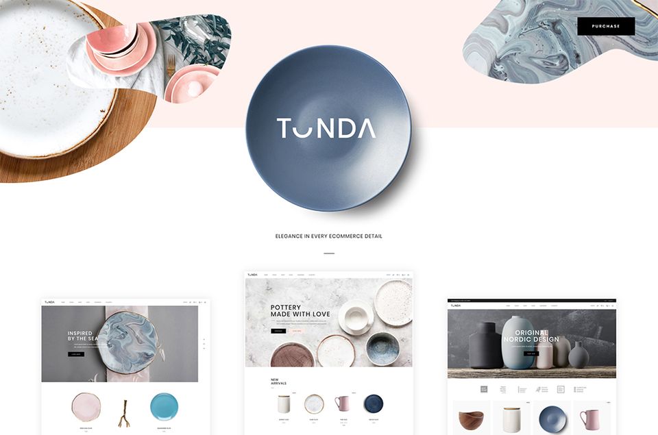
With that being said, feel free choosing some simple design elements that achieve your goal of connecting with your audience, but know when you’re taking things too far. There is a ton of clean-designed themes for WordPress that represents the perfect balance of function and design.
2. Mobile-Friendly
In early 2018, Google announced they’d be introducing “mobile-first indexing.” What does this mean? It is merely a way of Google saying that they’ll list mobile-friendly websites first in search engine rankings. However, the search engine incentive isn’t the only reason to make sure your website is mobile-friendly.
Frankly, the world is becoming a smartphone-driven place. Why pull out a laptop or use a desktop when you have a mini-computer right in your pocket? If your website doesn’t display correctly and functionally on all screen sizes, you’re missing a huge component of the user experience.
People are more likely to enjoy using your website if it’s optimized for mobile devices. In fact, 72% of people want mobile-friendly websites. Luckily, most WordPress themes come with mobile-friendly designs, but it’s still worth testing this yourself for functionality.
3. Website Speed
When your website spends too much time loading…and loading…and loading, you’re doing more than just annoying your visitors. You’re actually scaring them away. If it takes over 3 seconds for a page to load, over half of your visitors will click away.
While you could make the argument that people need to work on their attention spans and patience, at the end of the day, you need to take steps to improve your page speed. Additionally, page speed is a ranking factor in search engine results, so you can’t afford to turn a blind eye to your lengthy load times.
How do you improve your website speed? Three simple solutions might do the trick depending on your WordPress website:
- Image and file size – Decreasing your image and file sizes can greatly speed up your load time. You can use a free plugin like Smush Image Compression to do this for you.
- Website Hosting – If you’re using inexpensive shared hosting, this might be a great way to cut down on your budget, but you’ll run the risk of loading issues. It might be time to invest in better hosting where you’re not sharing space with other websites you can’t control.
- Caching Plugin – Another option is to install a caching plugin. This helps your website store files in your users’ browser so when they revisit, they won’t have to load as much to see your page correctly. WP Rocket is the most popular caching plugin for WordPress.
4. Contact Information
Nothing is more frustrating than having a question and not having a way to get it answered quickly. In the online world, things are more sped up. If you don’t have your contact information quickly and clearly displayed on your website, you’ll miss out on these quick questions.
Over half of all users think having thorough contact information is one of the most critical elements missing from many company websites. When it comes to contact info, more is more. The more contact options you have, the better. Start with a contact page that’s easy to access from your menu. It should be visible from every page.
From there, make sure you have a contact form, email, and any other relevant information about how to get in touch. If you want to really go above and beyond, including a Chatbot or messenger tool can help you respond even faster.
5. Human-Focused
Last but not least, you need to design a website for humans and not search engines. As we said before, there’s too much noise online today about how to make an impact when it comes to search engines and marketing. Both of these things are important, but what’s more important is making sure your website is designed with humans in mind.
What is a human-focused website? It’s simply a website created for humans first. Everything else is secondary. At the end of the day, if you make a website for search engine bots, what’s even the point?
Here are some tips for creating a human-focused website:
- Use natural keywords. Don’t go overboard with keywords that don’t make sense or sound native.
- Include a single call to action. Calls to action show your users what you want them to do, whether it’s asking them to sign up for your email list or make a purchase. Don’t overwhelm users with calls to action. A single step per page is enough.
- Create a simple navigation menu. Having too many things on your list is overwhelming. Make sure you’ve got all of the basics there like about pages, contact info, and a shop if you have one. Don’t overfill your navigation menu.
- Include a search bar. Make sure your website is easy to search so users can quickly find what they’re looking for.
- Ask for feedback. Ask for feedback regularly from your top users as well as other experts in your industry. Take this feedback to heart and make the right changes when needed.
A little bit of effort goes a long way. There’s no one-size-fits-all design that works for every website, so don’t put too much faith in trends that come and go. It’s about knowing your audience and building a WordPress website for them.
The Future of the WordPress UX
WordPress is rapidly growing as a platform. It’s become the standard when it comes to web design, and that means there are so many tools and resources at your disposal. When thinking about your WordPress website user experience, we have to change our perspective.
Would you ever publish a book without any text? Or open a store that doesn’t have any signs outside? Obviously, you wouldn’t do any of these things, so why would you create a website that’s not easy for your users to use?
The goal of your website is to cater to users. You want to anticipate user needs and push these users in the right direction. When your website is sloppily put together or not functioning correctly, this doesn’t happen.
In this day and age, your brand reputation matters, as does your relationship with your customers. Since you value both of these things, it’s time to get serious about your WordPress UX with the tips above. Where can you improve?


![15+ Top Black Friday & Cyber Monday Deals for Developers and Designers [2023]](/blog/content/images/size/w960/2021/11/black-friday-deals-developers-1.jpg)
